In this training session, I'll tell you a bit about our agency practice. The agency behind PSD-Tutorials.de is 4eck Media and last year we were invited to pitch to a medium-sized company here in the region.
And this pitch had two stages: the first stage was about whether we even qualified as an agency and whether we would progress to the next round, where the actual contract would be decided.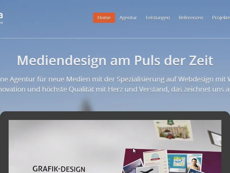
Handout - Overview
And for this company presentation, I also made a handout that I wanted to give to the managing directors. You can see what it looks like here: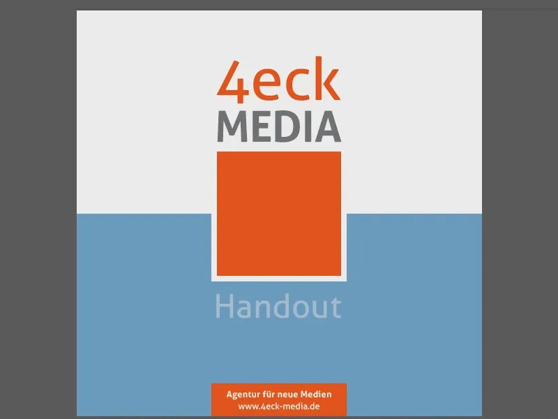
So this is actually the handout I gave out there.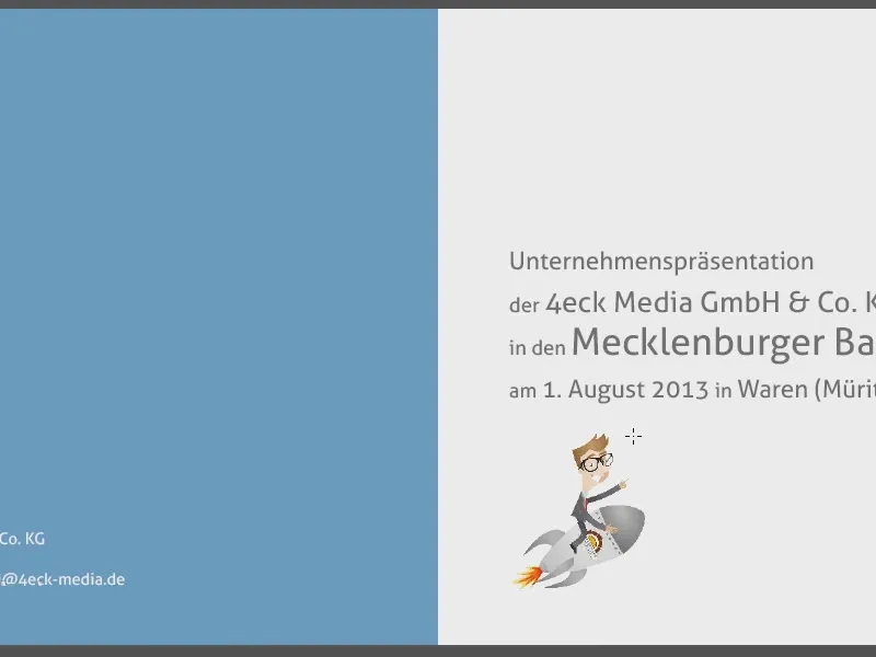
I have visualized the stations of my presentation on the left, on the right there is the possibility to create notes.
Here is the reference overview.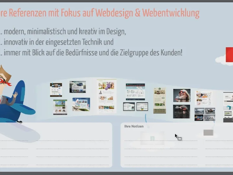
I've removed a few pages because I don't want to show them here ...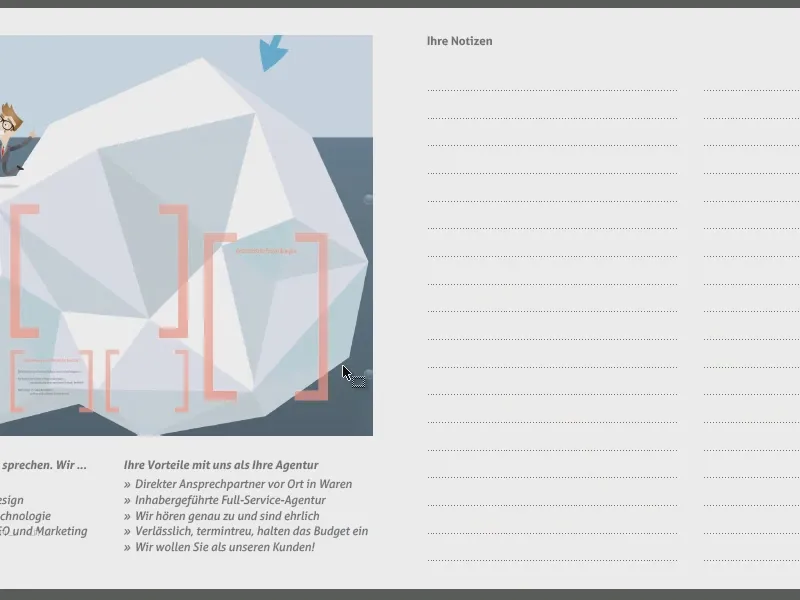
On the last page is an overview of the entire presentation.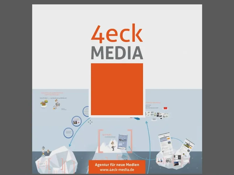
Basis for the handout: the presentation
If you're thinking: "What kind of strange presentation is this?", I'd like to give you an insight into what the whole thing looks like. I created it with Prezi. I'll just open the presentation and go through it so that you can understand why this handout is structured the way it is. This is the start page.
And I use Prezi for the presentation, a software that zooms and pans a lot in the focus and thus gives the viewer, who is not yet familiar with it, ...
... can also create a very good aha effect. The introduction was like this: "We are Müritzer".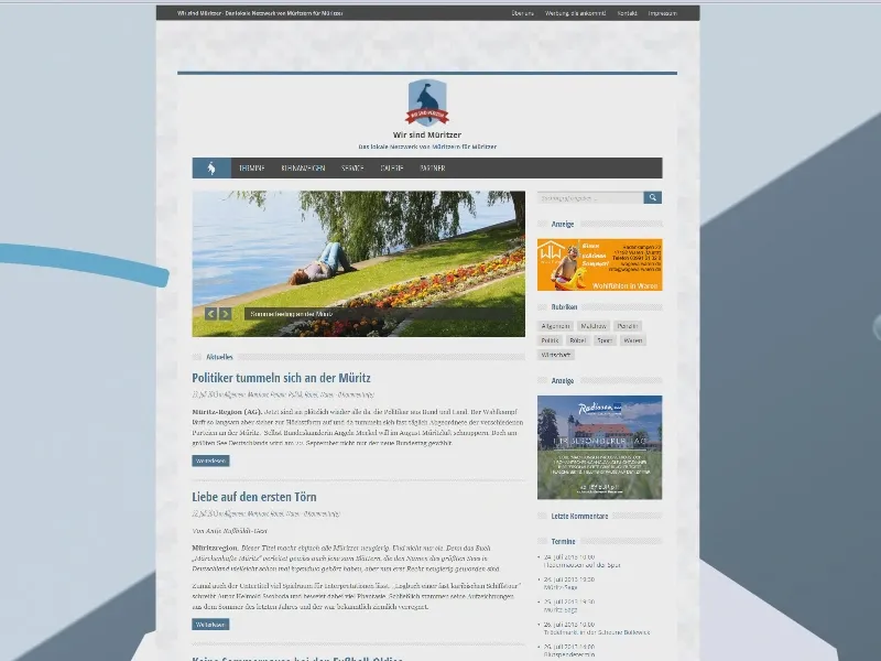
So I talked a bit about the project, ...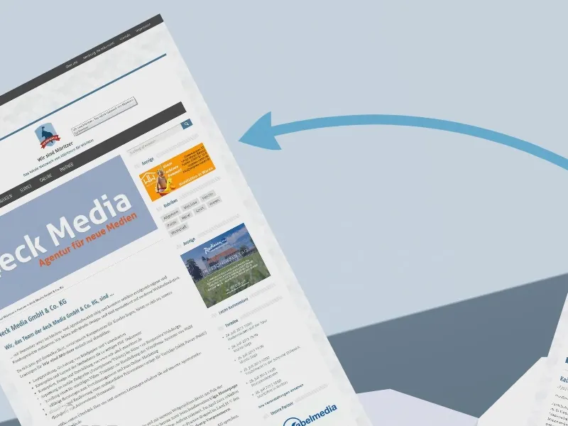
... all the things we did, including media products, brochures that we created and video training sessions.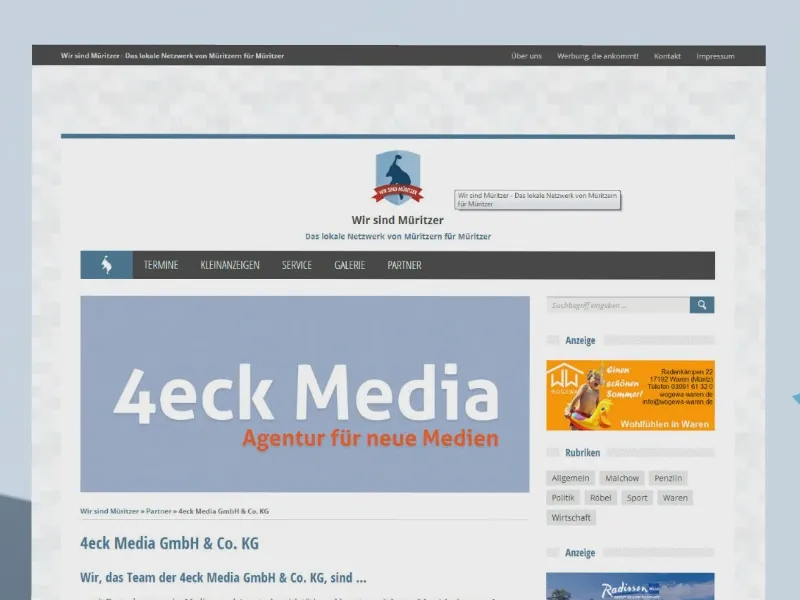
And I packaged the whole thing into an iceberg.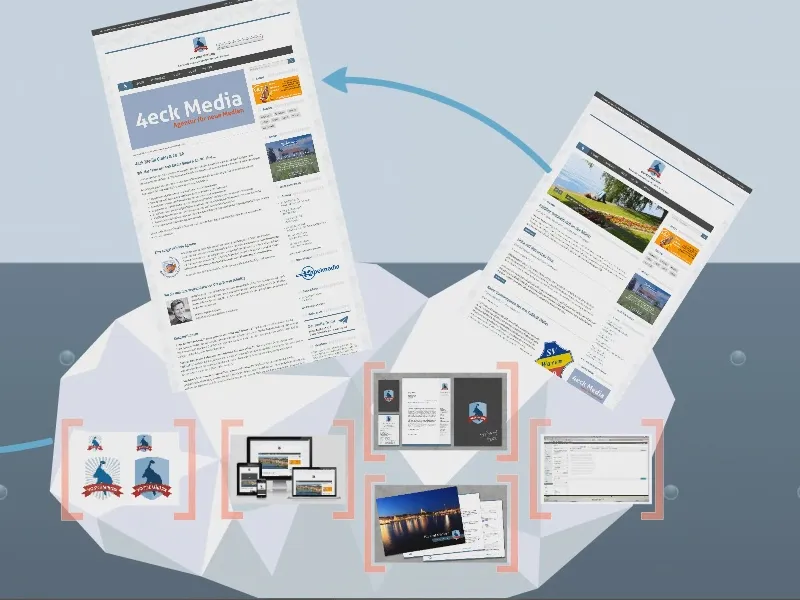
Then it was on to the next iceberg, the 4eck Media one, where I presented our overall performance.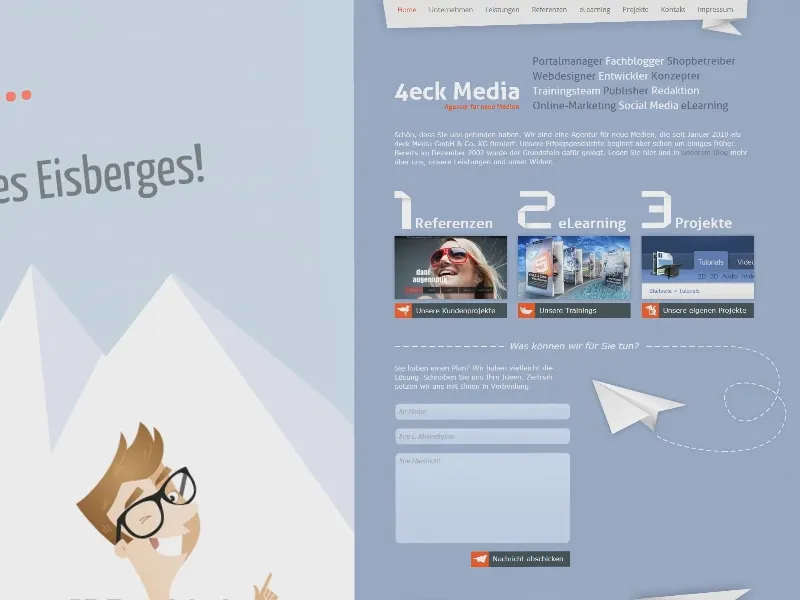
Then I moved on to the things that we did for customers. I zoomed in on the various jobs and was also able to play videos. Prezi is pretty good for this, I have to say - I liked it and the people there liked it too.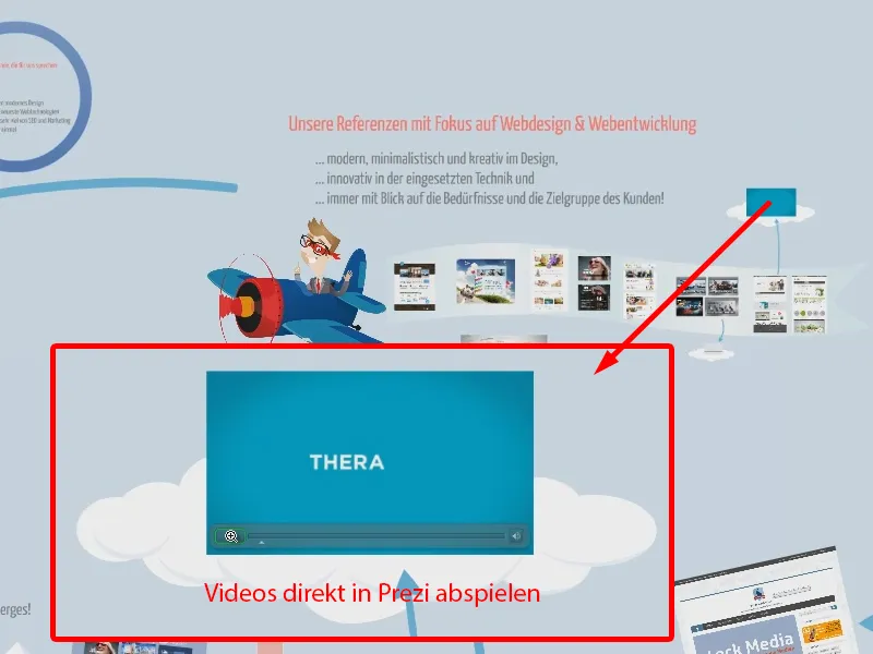
Here are a few more reasons why we fit together quite well.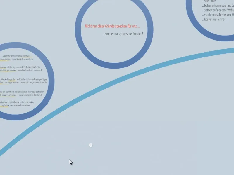
And as a gimmick, here's a rocket with the logo that takes you to the sky ...
... and it picks up on a phone call I had with the managing director beforehand. I presented the whole thing in an hour.
That's the background to why my handout is structured like this. This is how I depict the individual stages in my handout that I made in the Prezi presentation.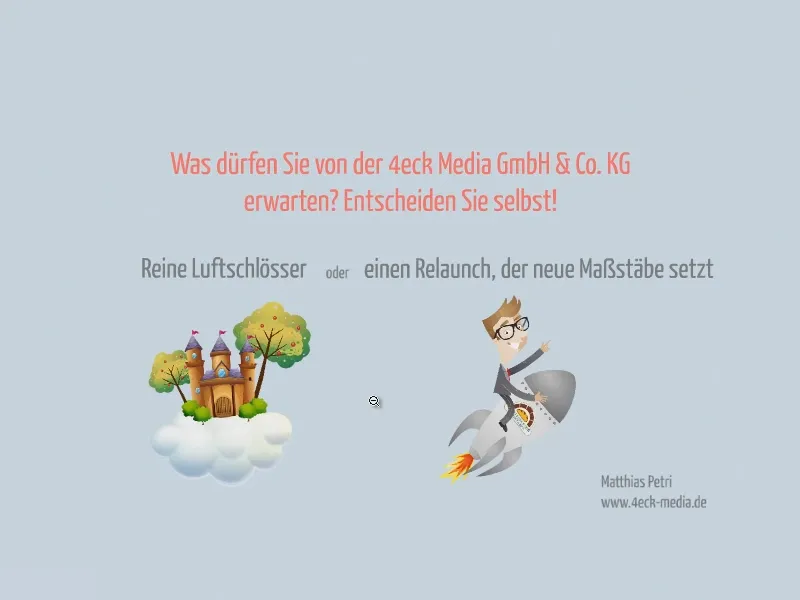
Printer and specifications for the brochure
I used InDesign to create the brochure, of course. But the question is: what's the best way to go about it, especially if it's going to be printed in the end?
I looked for various print providers who could offer me a brochure in the format I wanted. And I found one at viaprinto.
There I found square brochures in the size 21 x 21 cm (1). I only had twelve pages, so the staple binding was enough for me. The print run was a little smaller, I think I had printed 10 at the time (2).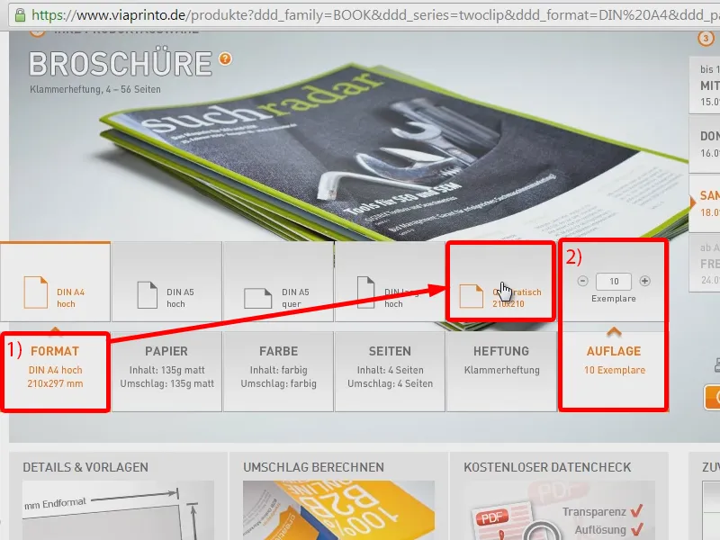
Of course, the question is always: How do I make sure that my document is print-safe at the end? And here viaprinto already has some print templates ready for me, which I can download under Details and Templates (1). In the content I have a data sheet (2).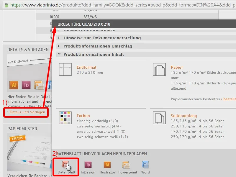
This already shows me what I have to pay attention to when creating a square brochure, i.e. which bleed, which border elements, which format the images should have, ...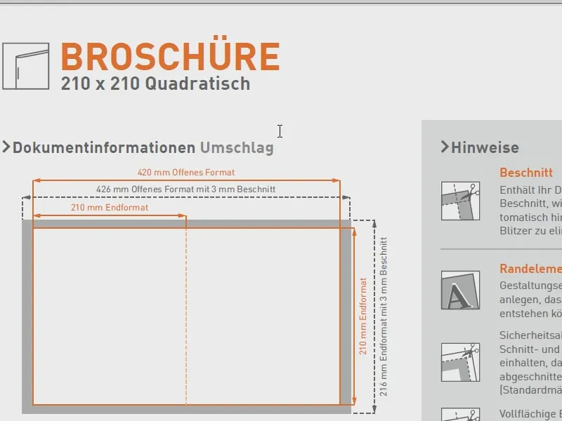
... how it looks with the stitching, which types of paper are available to me. I can read through this first and should then take it into account.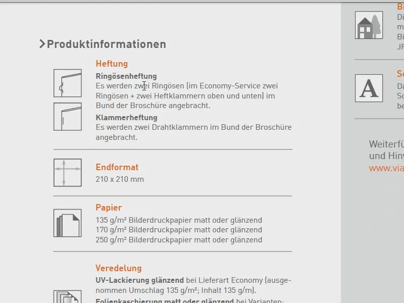
And then, of course, it makes sense to simply download the print template for InDesign.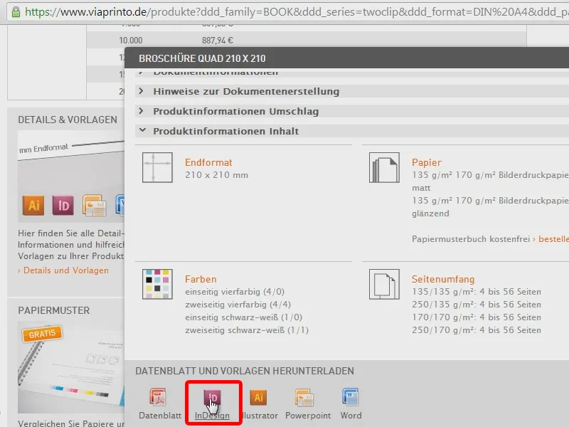
Set up the document
I'll just start it in my InDesign CC. But I'm pretty sure that all the steps I'm showing you now can also be followed in CS2 or CS3, because these are very basic things.
Here, too, I can now find the important notes that viaprinto gives me on what I should pay attention to (1). The instructions are in a locked layer, which I simply hide (2), because I don't need them any more.
I can start with that: I first take a look at how the document is structured. This is the front and this is the back (1). Of course, I'm still missing a few pages, because I want to end up with twelve pages.
So now I set up my document (2 via File>Document setup... or Ctrl + Alt + P). Here I enter the number of pages of 12 (3), as a double page (4), i.e. output as a printed sheet. OK (5).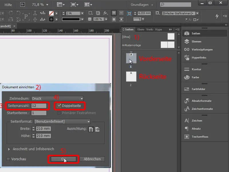
And now I have the pages as I imagine them. I'll take the second page all the way to the back (1). Here (2 and 3) I have set the column margins to the edge. Page 1 and page 12 are exactly the pages that viaprinto gave me in the print template.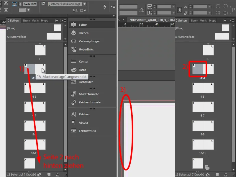
Designing the title page: Graphics
I now start to layout my first page (1). To do this, I use the rectangle tool and drag it open (2). I want a different color (3): Cyan should have 60 %, magenta 25 %, yellow 10 % and black 0 % (4). As I will probably need the color more often, I can also save it as a CMYK color field (5). Confirm with OK (6).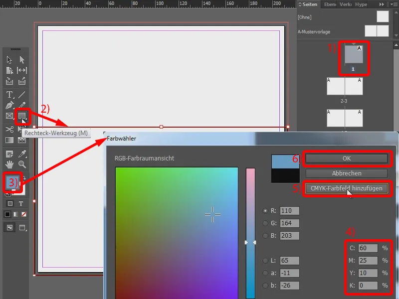
I have now drawn the rectangle intuitively, but I know that I need a height of 108 mm. So I change the height accordingly (1) and drag the rectangle down to the edge. It is also important that I always make sure that it lies on the edges of my bleed (2). It can also protrude a little beyond this, which is theoretically not a problem. So that would be my blue area.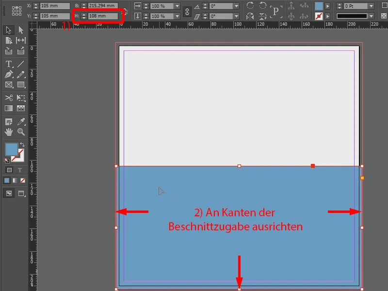
The next color field is this orange field. I simply draw it intuitively. However, I hold down the Shift keyso that I get a square (1).
Here I rotate my outline with the color fill and enter the following values: Cyan is 0 %, magenta 85 %, yellow 100 % and black is 0 % (2). I also add this color as a CMYK color field because I may need it again later (3). Confirm with OK (4).
The surface also has an outline. So I activate it and give it a white color (5 and 6). I set the thickness to 7 pt (7).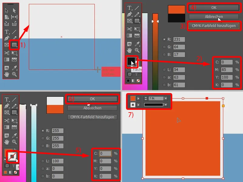
And now I simply adjust the size again, in this case the edges should be 70 mm long. So I link the pages (1) and enter the value for width, which it then also uses for the height (2).
And when I now try to align my square, I see these automatic guides that help me to find the exact center (3).
I only need an orange area at the bottom, which is also 70 mm wide, but only 20 mm high. So I use the rectangle tool again (4), click once in my document and enter the values in the window that opens (5).
I use my orange tone as the color, which I have already added as a CMYK color field (6). And I can now simply move the rectangle over here again and, thanks to the guide lines, I can also see the center (7).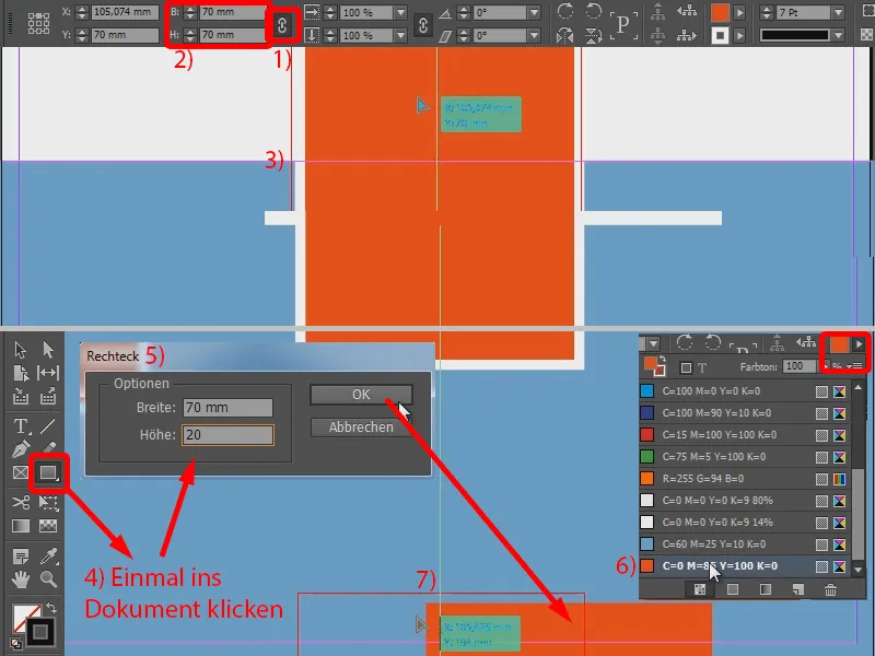
Designing the title page: Text
Now the caption is still missing. I use the text tool for this (1). I select Aller Regular as the font and set the size to 87 pt with 62 pt line spacing and a width of -15 (2). I use this to write "4eck" (3) in the drawn text field. However, I don't want black, but the orange tone and use the already defined color field (4).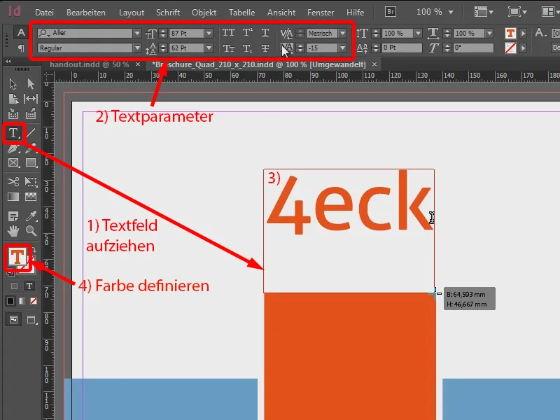
I want "Media" to appear below it. I now set this to my gray and then change the font size to 62 pt with a width of 0 so that it fits (1). I center the whole thing and place it above the square (2).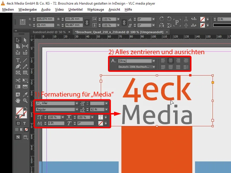
A text box with "Handout" is also missing at the bottom. I give the font 48 pt and a white color. And I adjust the opacity to 40% using the effects panel (Window>Effects). I also center it and move it a little lower.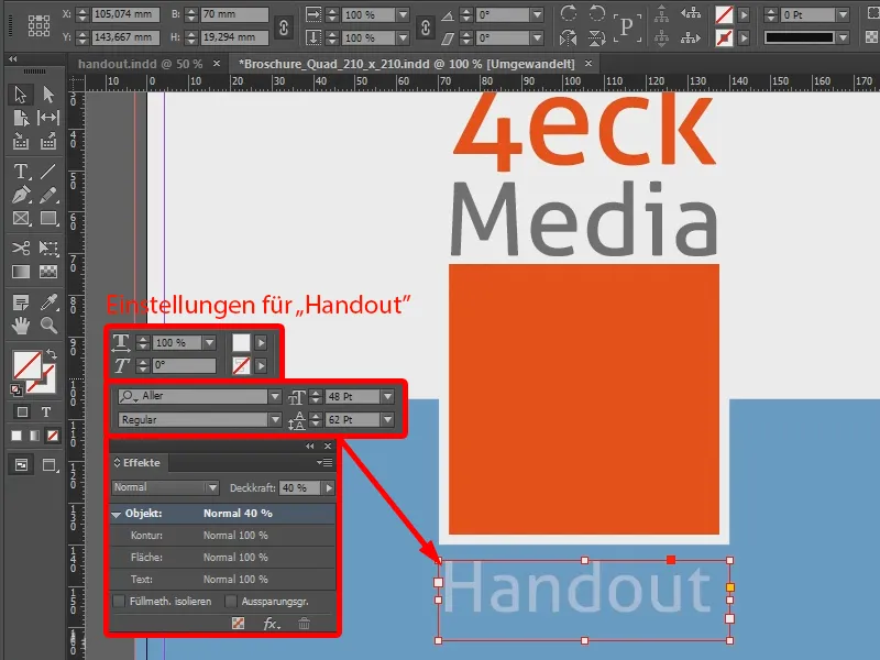
Now the last font block is missing, which goes into the lower rectangle. I set the font here to a size of 13 pt and choose Bold: "Agentur für neue Medien". This is also in white, and I reduce the line spacing to 18 pt (1). Now I add the Internet address and set it to Regular (2). I center it (3), place it at the bottom bleed edge (4) - and my first page is designed.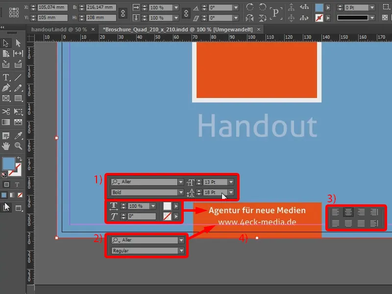
Designing the second page
Let's move on to the next page. This was completely blue. To do this, I simply draw a blue area (1).
At the bottom are a few contact details that I copy from a text document. I draw a text field (with 2), font size 15 pt, line spacing 19 pt, font color white (3). And here I copy the contact details and place them a little more.
Design of the third page
I continue with the next page, which should contain the opening text. I also copy this directly into a text field with a font size of 23 pt and line spacing of 40 pt. I set the font color to gray, which I previously defined as a color field with 70 % black, everything else is set to 0 %.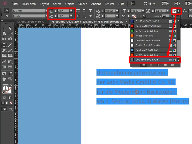
And I thought I'd format the two companies a little larger: I set our agency at 27 pt and make the client company even a little larger, so they feel flattered when they see that they are the brightest star in the firmament.
I also place the first figure that I had in the presentation. To do this, I press Ctrl + D. I have already prepared my pictures. I had previously pulled them out of the presentation as screenshots and edited them in Photoshop so that I had them available in the highest possible resolution. This is the figure ("Rocket Man Rudie") that I want to use here ...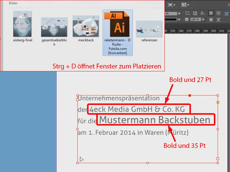
This page is now finished.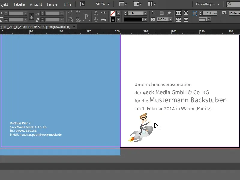
Creating margins and columns
For the next pages, I change my layout again and add margins. To do this, I go to Layout>Margins and Col umns... (1 and 2), because I want to place text and images there and always have a margin to my document border. I also set up the whole thing in two columns (3) and give them a column spacing of 10 mm (4).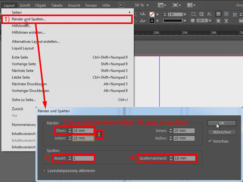
I now do this for all other double pages (repeat the steps for margins and columns on all previously empty double pages).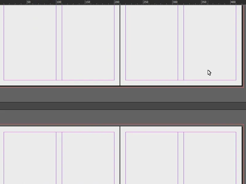
Designing the fourth page
I use Ctrl + D (1) to place the first image (2), cut it a little smaller (3) and then move it to the top edge of the frame (4).
In addition, a text in gray with Aller Bold Italic, 12 pt font size and a line spacing of only 16 pt (5).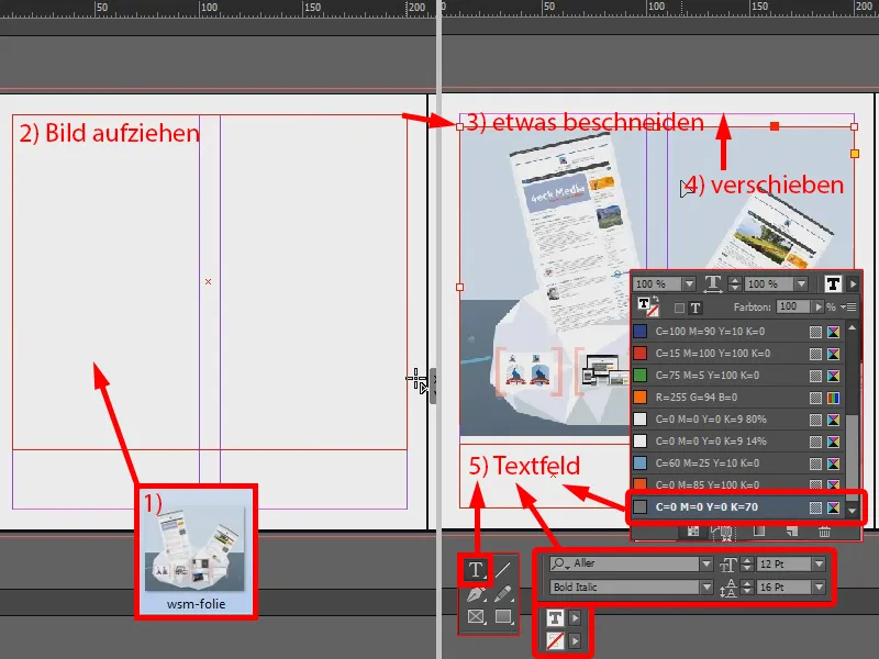
I write "Services for the customer:". I need this font more often, so I create it as a character format: I select it (1), go to Character styles (2) and create a new character style here (3), which I double-click on (4). In the window that opens for character format options (5), I change the heading and confirm this with OK (6).
Under (1) I write individual benefits, but this time not in Italic Bold, but only in Italic. I also create a character format for this by selecting the text and repeating steps (3) to (6) (8).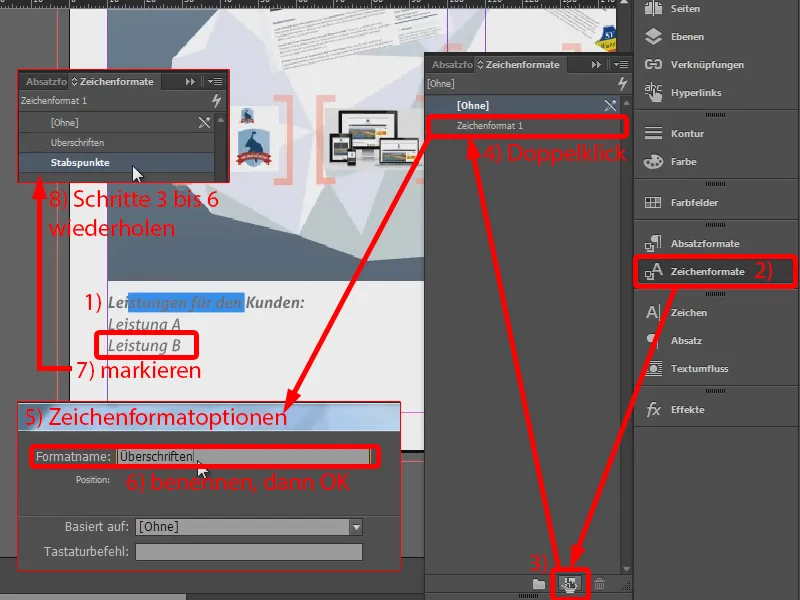
Character styles are there so that InDesign remembers the styles. So if I take a look at what is in the basic character formats, everything is stored there.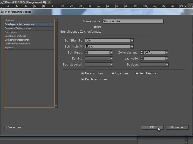
However, I would also like to add an enumeration here. To do this, I go into the paragraph formats (1) and create a paragraph format (3) for the selected "Service A" (2). I go into this by double-clicking (4) ...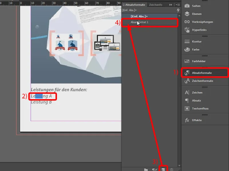
... and name it "Enumeration" (1). In the tab Bullets and numbering (2) I select the list type Bullets (3) and this character (4).
There it is, but it is too far away from the text (5). I move it further away in the tab position, to 4 mm (6). That fits.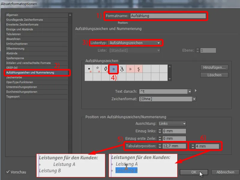
And now I can say for "Service B" that it should also be an enumeration (1). And so it is with all services ...
I then continued the whole thing in the next column. I say here (2), the text frame should continue here (3), and drag the text field to (4).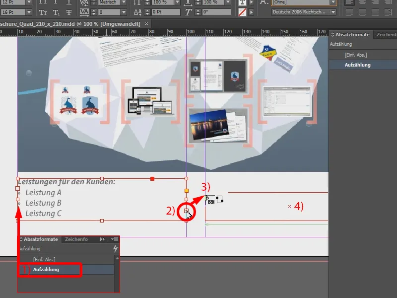
Now I can use an auxiliary line (1) to check whether the lines are at the same height - no - so I drag the text field a little higher. And then I can add the other services that I have planned for the project (2). This page is now complete.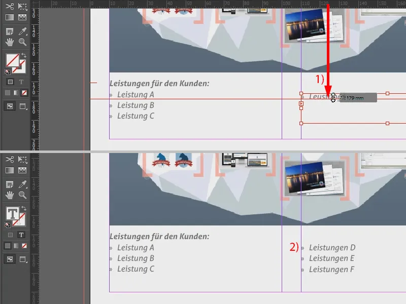
Designing the note fields
On the next page, I set a heading: "Your notes" (see 1: 12 pt font size, bold, grey color).
And now I want to insert dotted lines here. I can easily do this by using my line drawing tool and drawing a line while holding down the Shift key(2). The outline has already been created, so I reduce it to 1 pt. I also select a 70 percent black and set the outline type to Dotted (3). The line then looks like this (4).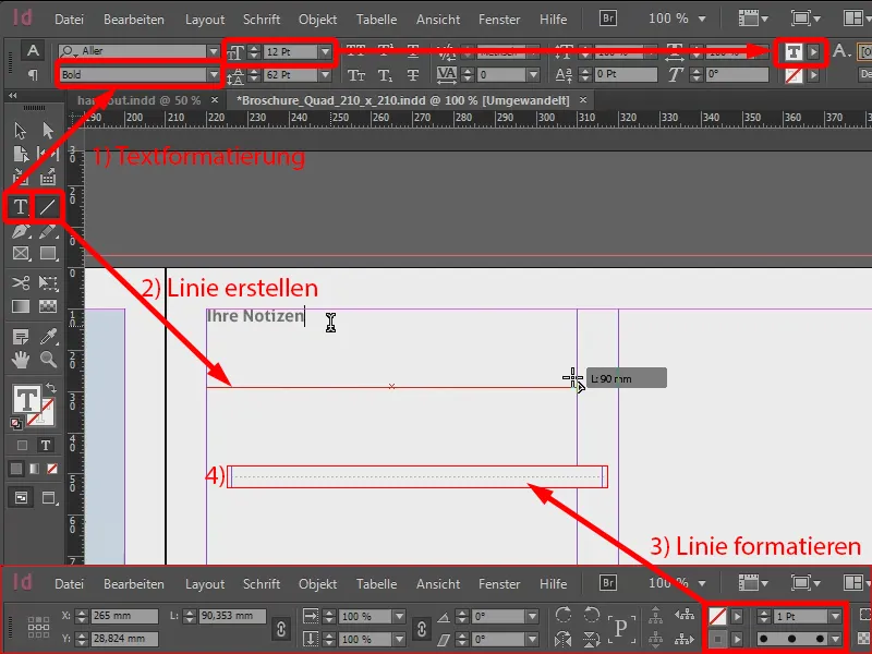
Of course, I now need the line in multiple versions. So I select it (1), go to Object>Transform>Move..., which opens the Move window(2).
I set the value for Vertical to 10 mm (3). When I click on Preview (4), it moves (5).
But I don't just confirm this, I press Copy (6). And lo and behold: the line has been copied with an offset (7).
The cool thing about InDesign is that I can repeat this command. If you look under Object>Transform Again, there is Transform Again - Sequence and the corresponding shortcut Ctrl + Alt + 4. I just press that. And when I press it, nothing happens, but if I select my copied line and press the shortcut, I can duplicate the dotted lines one after the other (8).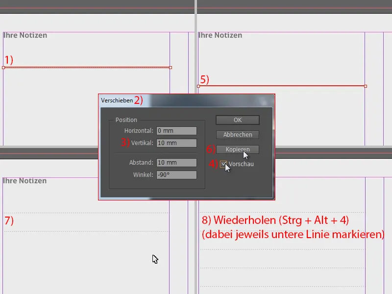
I now select the whole thing, Ctrl + C and Ctrl + V. I move the copies to the right-hand column.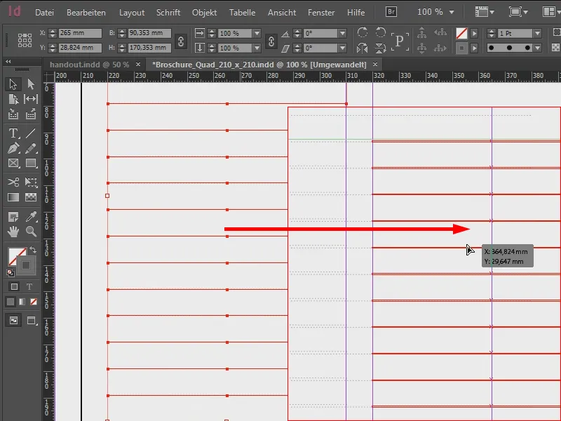
This is what it looks like (1). Now I take the whole page (2), copy it ...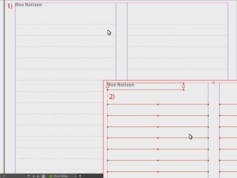
... and paste it on the next page and on the penultimate page. To do this, I press the right mouse button and select Paste in original position.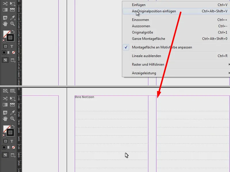
The next steps are almost identical to what I have just shown. A large image is added here again to fill the format (1). There were also notes here, so I insert them again and drag them to this position (2).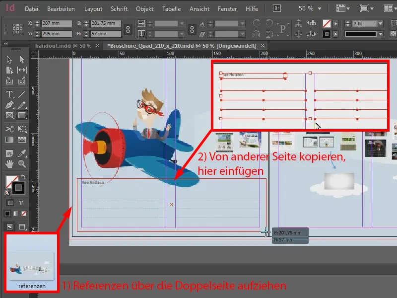
Now it doesn't quite fit because the background is colored. I can easily correct this by using my rectangle tool and drawing a rectangle (1). I give it a white color (2) and reduce the opacity in the effects panelto 70 % (3). Then I change the arrangement and move the rectangle backwards step by step (see 4: Right-click>Arrange>Backwards step by step).
If I now want to have rounded corners, I go to Object>Corner options... and select Rounded (5) with the anchor activated.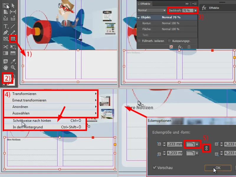
And that's it. And I now transfer the whole area. I select it, copy it and paste it again with Ctrl + V to position it in this area on the right-hand side.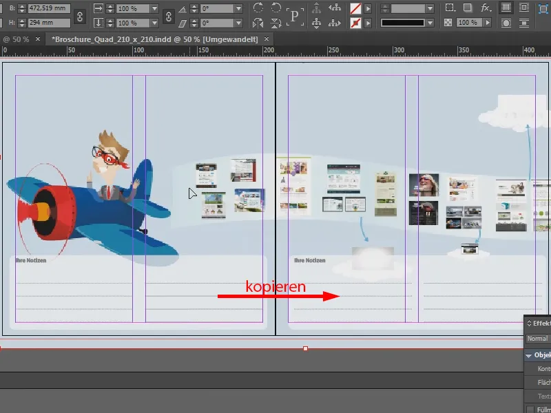
Remaining pages
For the other pages, I then add my images in a similar way as shown above and add text accordingly.
This part is interesting because I have recreated it in InDesign (framed in red in the image). This means that the area was there in my presentation in Prezi, but I painted over it in Photoshop. I then redrew it in InDesign. I got the font I needed for this, Yanone Kaffeesatz, which is available from Google Webfonts, for example.
It was then 28 pt with a line spacing of 36 pt. And I did this so that this font area would also be sharp in print, because my original screenshot would have made the font pixelated. And if I set this with the font, the area remains vector-based and is also crystal clear when printed.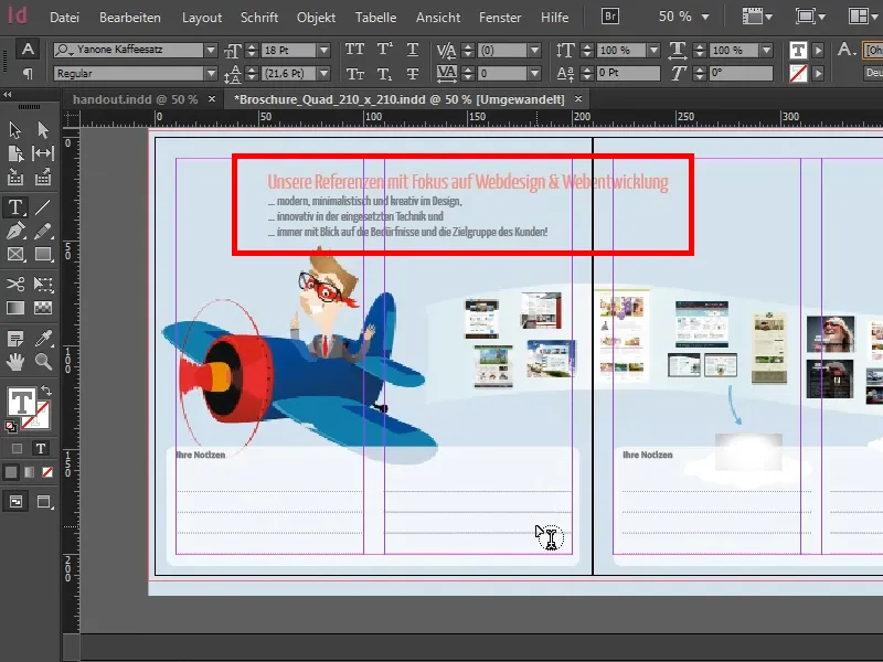
As for the last page: I simply took the first page (1) and inserted it on the last page. I throw out the "handout" (2). And now I can use my blue area as my frame for the overall view. So I select it and insert the image using Ctrl + D (3).
My handout is now finished. I have deliberately avoided page numbers, as this was a very short brochure.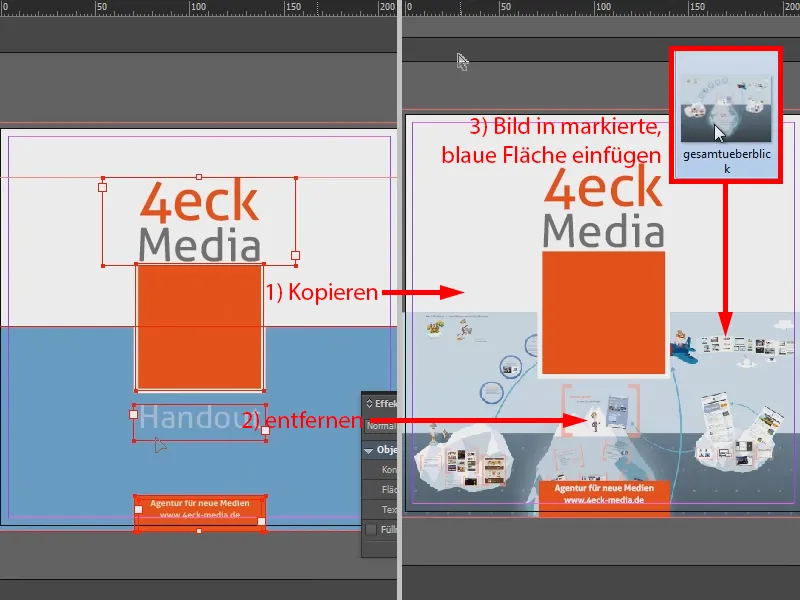
Exporting for printing
And now it's all about: How do I export it so that it's really print-proof in the end? That was also my consideration: This medium-sized company called me and said that if I wanted to recommend myself for the project, I could come by in a week and introduce our agency. So there wasn't much time for the handout and I wanted my first attempt at the print shop to be a hit.
That's why I chose viaprinto: firstly, the reviews were great. Secondly, viaprinto also has a help section. I go in there (1) and have a look at what's important. I go to the instructions (2) and here to Create source documents (3). I work with a PC (4) and use Adobe InDesign for PC (5).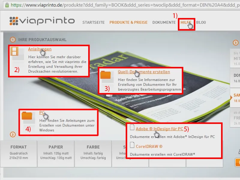
And viaprinto now tells me exactly what to do, including when exporting. It says here that I should output the whole thing in PDF/X-3 with PDF 1.3 as compatibility. I can see the information on the compression settings, bleed and output - that's now the decisive factor ...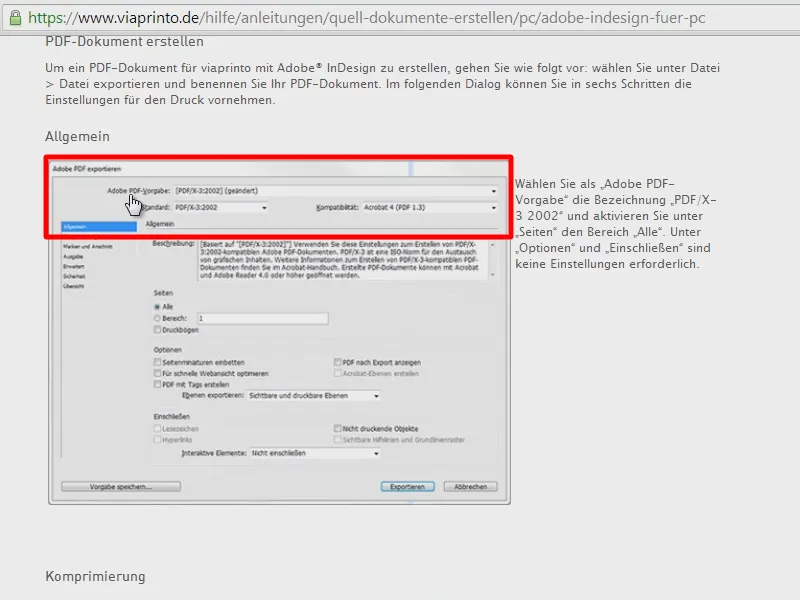
I had output it the way I always do: I go in, use the highest standard PDF/X-4 (1) and give the brochure a name (2).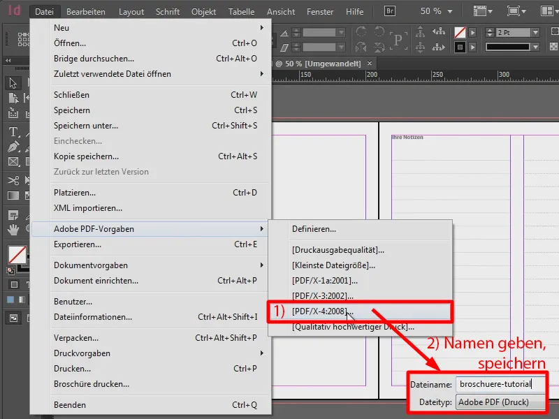
I have left the compression as it is (1). Marks and bleed (2) - I take these from the document (3).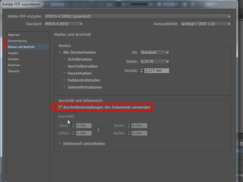
And for the output, I simply went in, Convert to target profile (keep values) (1) and took my working color space (2). And I would like to say: Even if viaprinto says we should use ISO Coated v2 for PDF/X-3 (see excerpts from the viaprinto help at 3 and 4) - the print was still great for me. I always try the highest possible standard first. However, I've also had experiences with other online print shops where I've printed business cards or flyers, for example, that almost always resulted in transparency problems. This was not the case with viaprinto. I did it as just explained and there was never a transparency problem. With other online printing companies, I always had to output the whole thing in PDF/X-1a (5) so that the transparencies were reduced and there were no problems.
But viaprinto has now said which standard they want. For my brochure with the ten copies, it certainly wasn't that much of a problem. If, on the other hand, I want to print a glossy brochure with 1,000 copies, I should do exactly what viaprinto wants so that the print is as clean as I expect it to be in the end. And now they say: I should take the CMYK working color space - ISO Coated v2 (ECI) as my target.If you take a look (see 6), you won't find it preset in InDesign's defaults. So I didn't find this color space in InDesign. I thought: "Where is it, why isn't it there by default in InDesign?"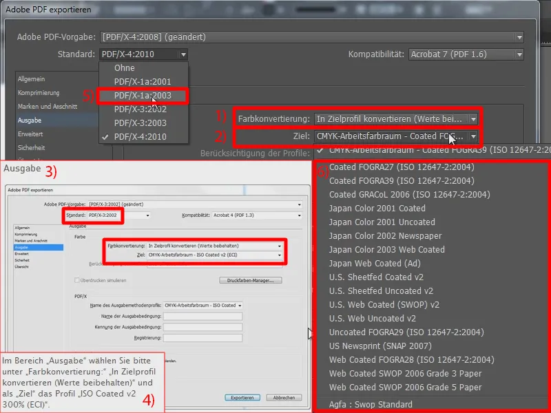
So my tip at this point: Just go to the ECI.org page, i.e. from the European Color Initiative. You can download these standards under Downloads. Here they are: ECI_Offset_2009. This contains exactly the profile that viaprinto wants. And it's not just viaprinto that wants this profile, other online print shops also want these profiles. So download it.
Now the question is where to put it so that it appears in InDesign at the end. Let me go to my file browser. Here are the downloaded ECI profiles (marked in red). And for me they are now in the folder Windows\System32\spool\drivers\color. This may be different for you, even if you are working under Mac.
So here's a little tip: Just search your hard disk for the ICC formats, i.e. *.icc. This will show you where you need to place the files ...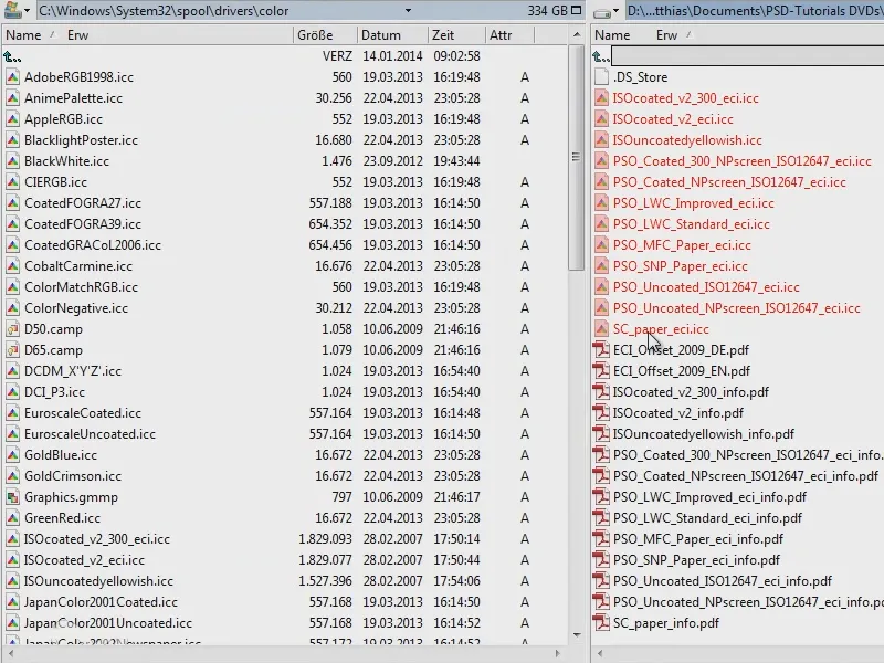
... and then InDesign will have exactly the profile I need.
Now I export my brochure. Now I have my document and I can easily upload it to viaprinto. Let me show you ...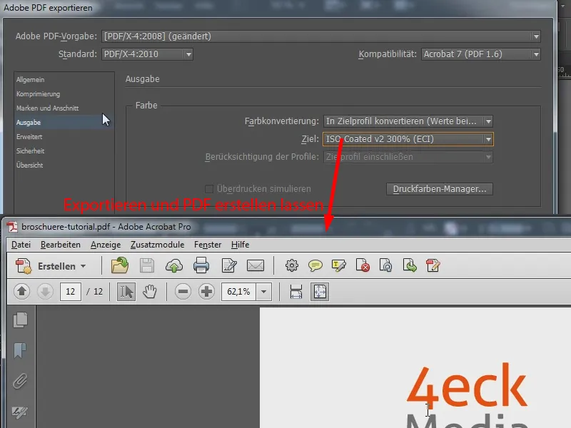
Upload document to online print shop
I go to the viaprinto homepage, select the brochure again (1), configure the format (2) and set the print run to 10 copies (3). Staple stitching is correct (4). The content pages should be 8 and the cover pages 4 (5). The color is right, the paper is also right. Now I can upload my document (6). It takes a little while ...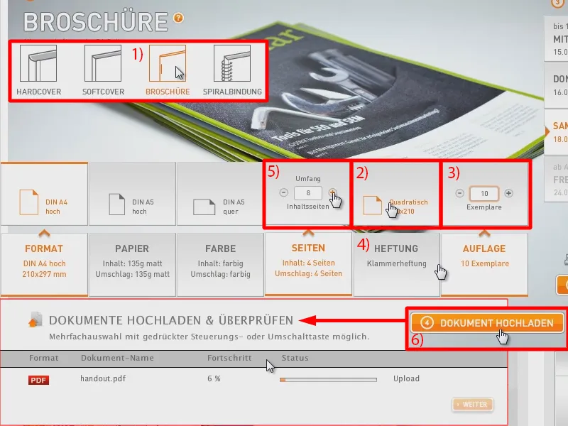
Okay, the file has been uploaded, converted, and what's really interesting: I can also configure the layout of my cover and content pages. To do this, I open the drop-down menu ...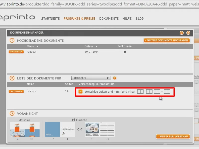
By default, I have the selection Cover outside and inside and Contents (1). You can already see: Here are my cover pages, the back cover, the front cover (2), the inside front cover (3) and here is the inside back cover (4).
If I have now created my document in such a way that I have not even taken into account that there are still inner cover pages, then I have the option of forcing certain blank pages (5). For example, if I simply have my cover page and then the table of contents, then of course I don't want this to be on the inside cover page. I then have the option of simply activating the outside cover and contents (5). This forces two blank pages for the inside cover pages (6). And I can do the same here at the front (7). So I have three different modes here.
But I've already taken this into account in InDesign, as I want it, so I'll leave it at the default setting (1). And in the preview, I can be sure that everything is set up correctly (2 to 4). Let me go to the preview ...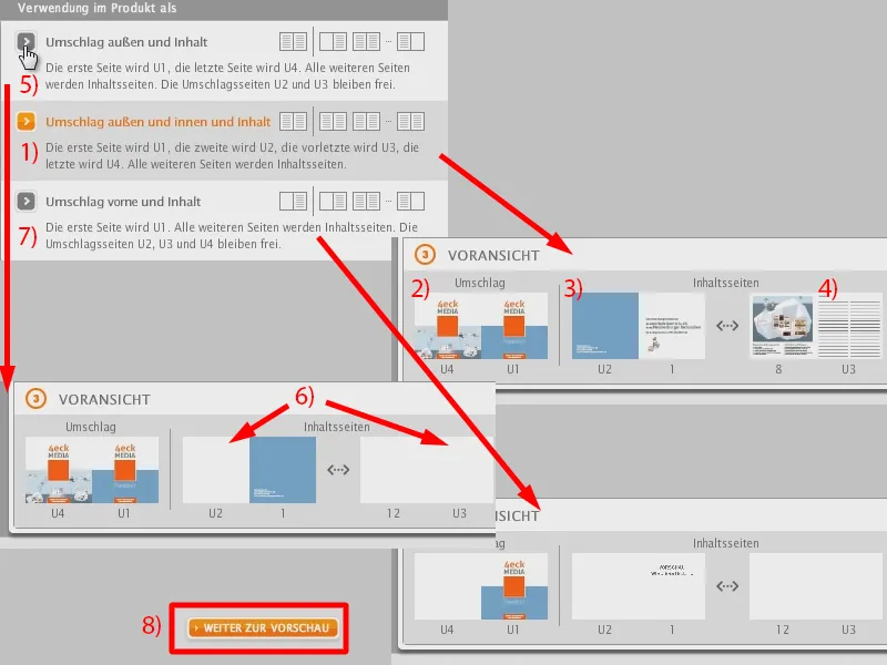
I found this quite practical with viaprinto, because now I have it like an interactive PDF and can scroll through it once ...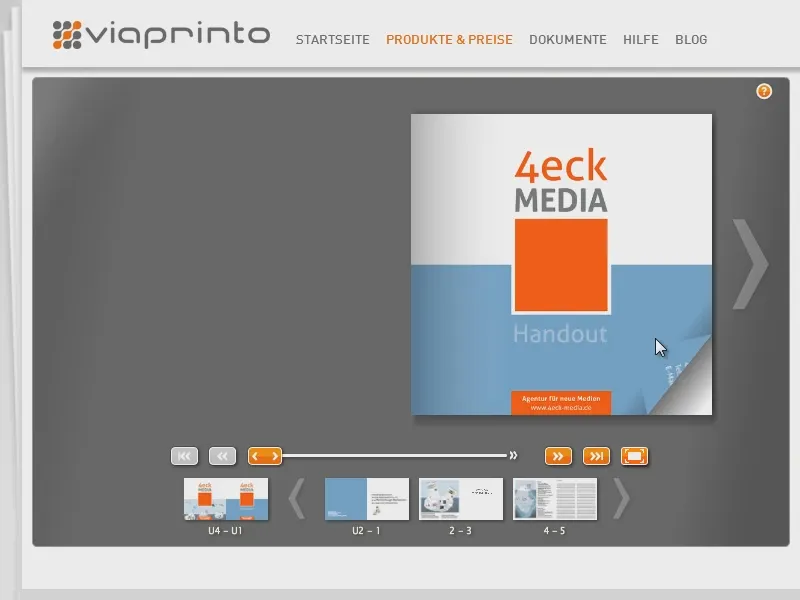
... and say: Yes, that's exactly how I imagined it, that's how I wanted the handout so that I can hand it over at the first pitch stage and leave a good impression as a recommendation for our agency.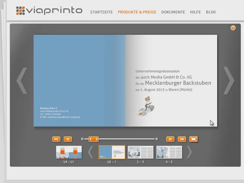
So that was actually my approach when I was preparing for the pitch. And so I had a really good feeling that I was going in well prepared.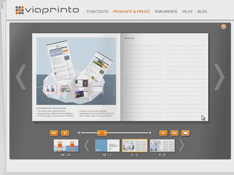
I think you really make a good impression with a little handout like that ...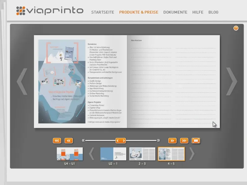
... and so I just wanted to give you a brief insight ...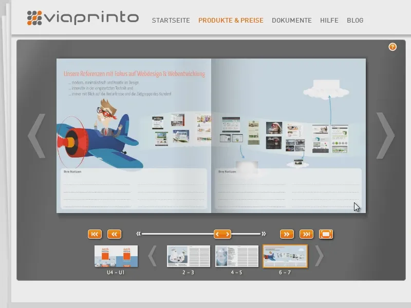
... how we handled it.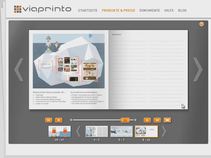
This is what the handout looked like in the preview - let's take a look at the final product.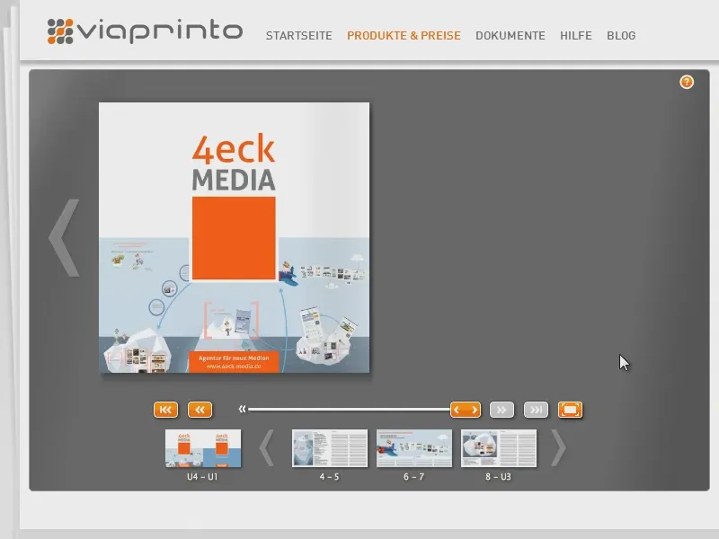
Unboxing: The handout in your hand
Here is my handout. I ordered it again especially for the training ... I'll get the printed copies out.
The handout is also shrink-wrapped again. Let's take a look at how the printing turned out.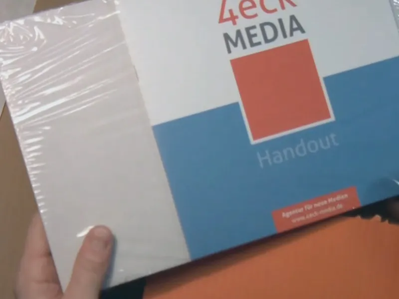
The cover looks very good.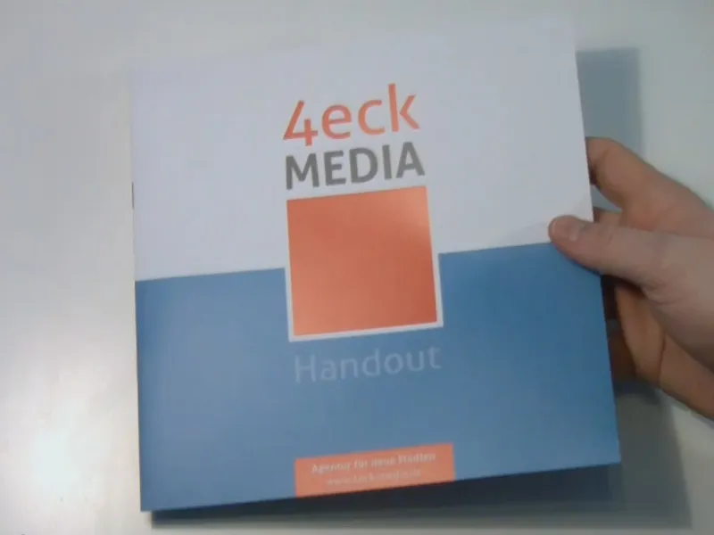
That's a success.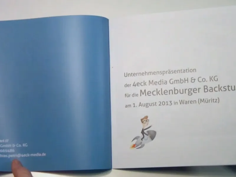
The pictures are also very good quality.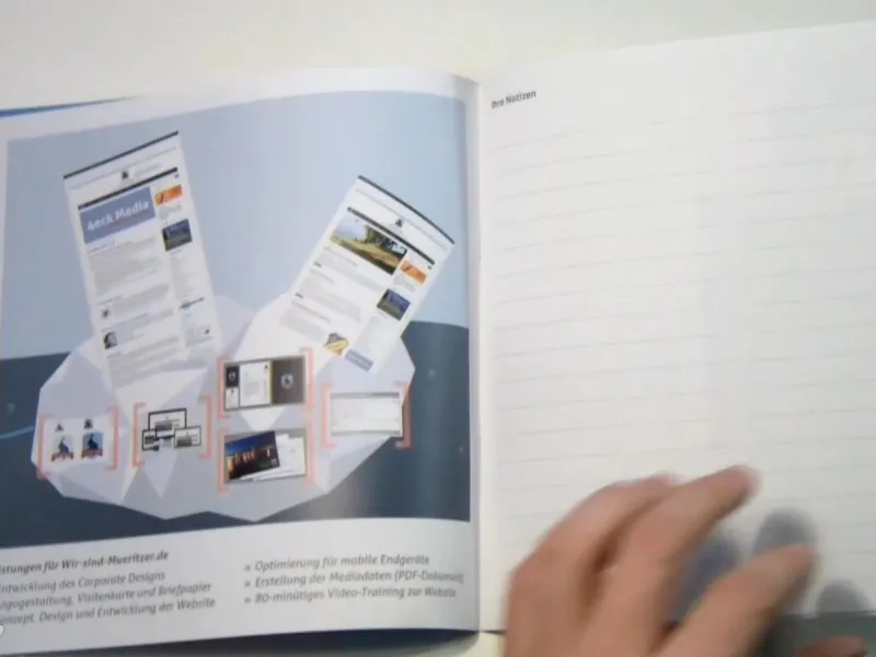
And I have to say, I had the screenshots ...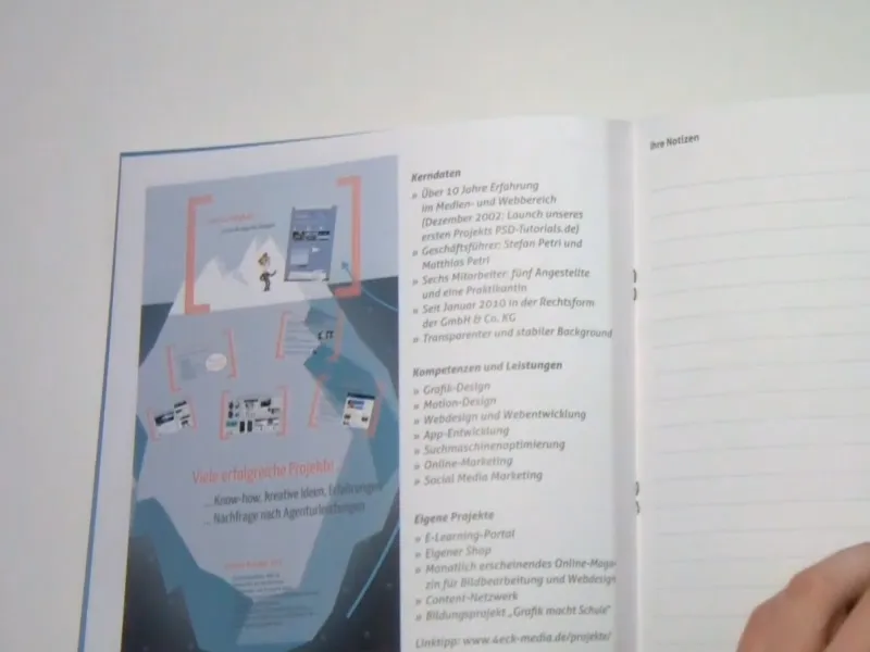
... where I hadn't always reached 300 dpi, ...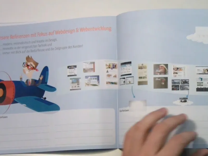
... just here with this middle image, I think it was only 130 dpi - and yet the quality in print is very good.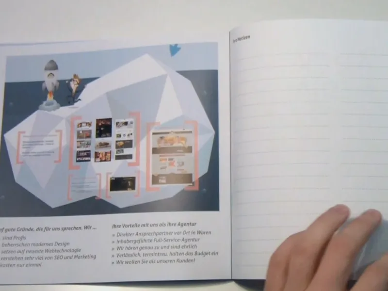
I think it cuts a very good figure overall.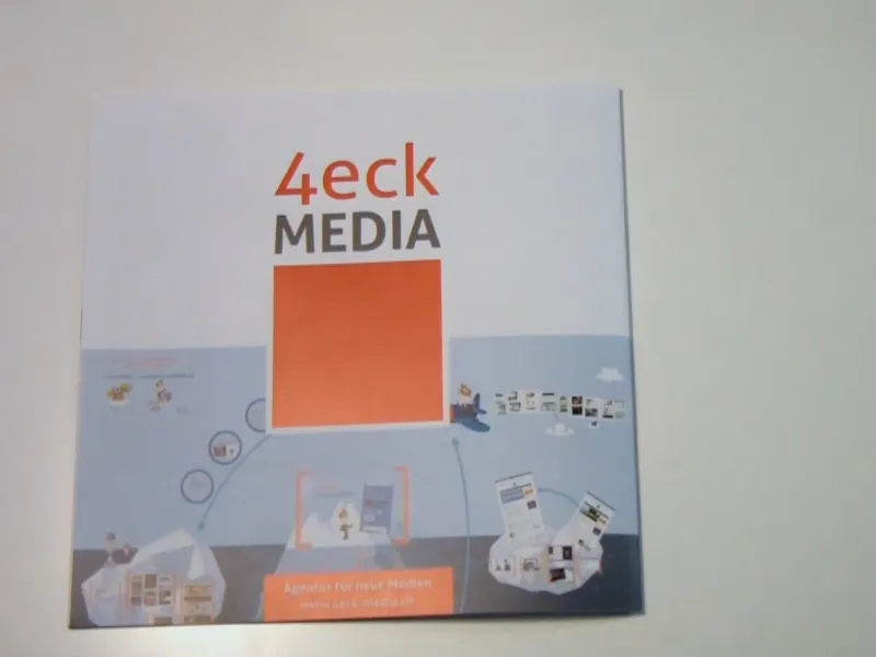
I hope you enjoyed it and that it was at least a little instructive. Maybe one or two of you can take something away from it. With this in mind, I hope you enjoy reworking and continue to enjoy your work.
Your Matthias
