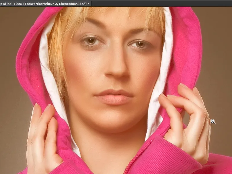
In many glossy magazines you see a certain look again and again and that is very creamy skin colors or generally a very creamy look. It looks like this: The depths are no longer really deep, really dark, really black, but the skin has a beautiful beige, creamy, brown sheen, and I'll show you how this look works, this cream look, in this tutorial.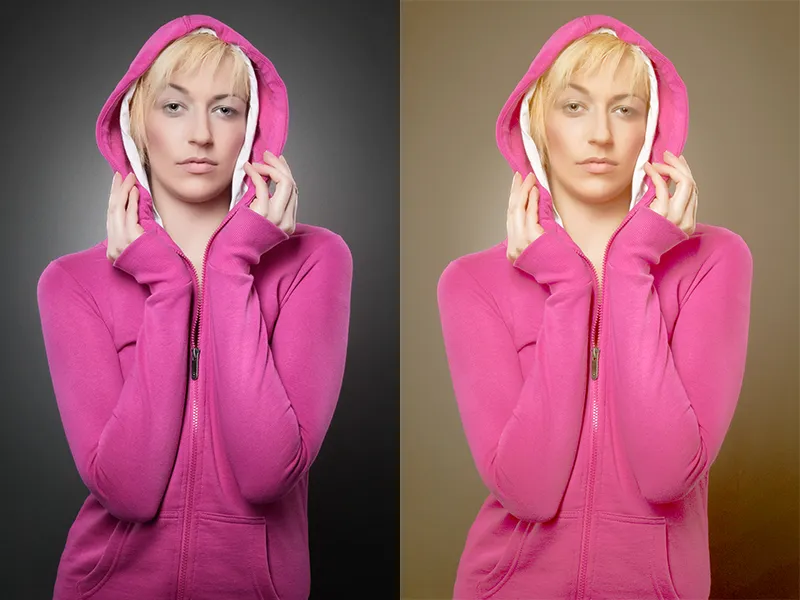
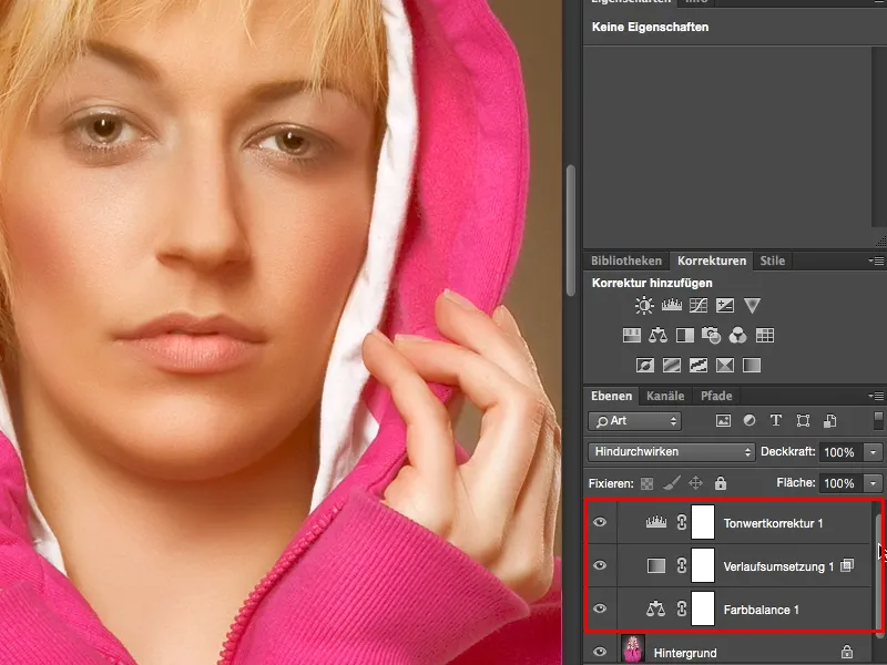
I've prepared it here and you can see that there's not much to it. The whole thing is a color balance, a gradient conversion and a tonal value correction, all with certain settings. And that's what I'm going to show you here using this image.
So the first thing you need is a color balance correction(1). The color balance is explained relatively quickly. I have three sliders here (2) and these three sliders always refer to the color tone that is selected here at the top (3). You can choose between shadows, midtones and highlights (4). This is very, very practical if you really only want to color the shadows or the highlights or the midtones as in this picture.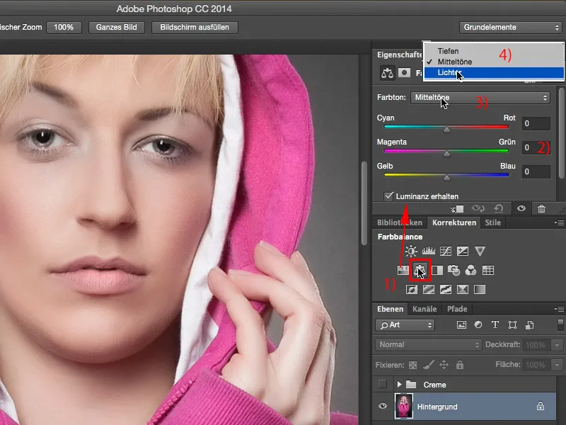
Yes, and then you can go wild here and mix the most colorful colors together. What I recommend, however, is that you remember a very simple rule: you can create warm and cold colors very quickly by simply thinking of an X with the corner points cyan, red, yellow and blue. Let me take this to the extreme and show you what happens if I move it to yellow and red. Then you have created an extremely warm image.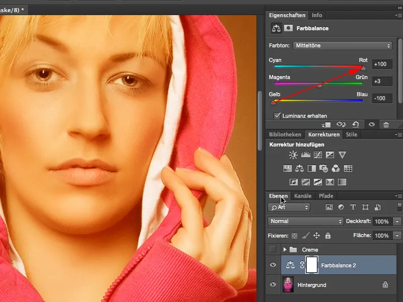
If you move it to cyan and blue, you have created an extremely cold-toned image.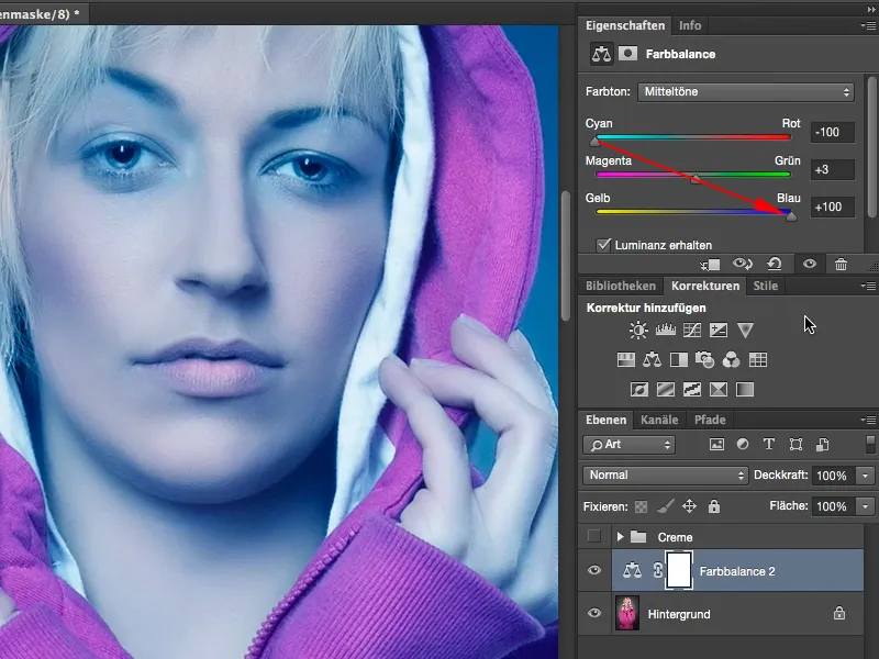
Yes, and we're going to make use of that here and set the whole thing to a moderate 15, 16, maybe even a little more. Yes, that brings us closer to the point. The values don't necessarily have to be identical here, but it shouldn't necessarily be only 10 for yellow/blue and 37 for cyan/red, then of course you'll have a slightly more red cast, but if you're playing in roughly the same league here, with the same numerical values, and you can draw a straight line, a diagonal, then the color tone usually fits.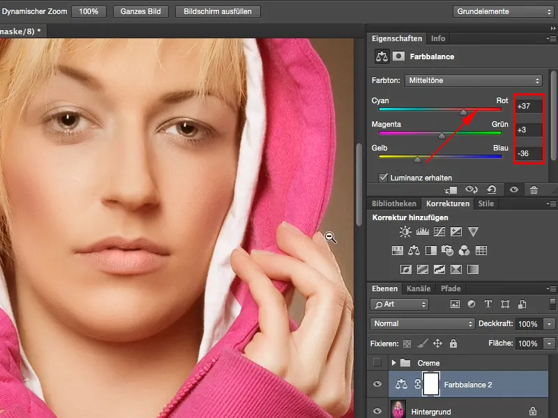
Next comes another adjustment layer, namely the gradient conversion. You will find it here at the bottom right as the last one (1). The gradient that is set here by default is always a gradient from the foreground to the background color, in my case from white to black (2). And that is exactly what you need. If you have set any other colors here, you can swap the colors at any time with these two symbols (3) or reset them to default (4). Alternatively, you can also use the X and D shortcuts. Yes, this looks more like an X-ray image, which is perhaps a cool look, but not exactly what I wanted here.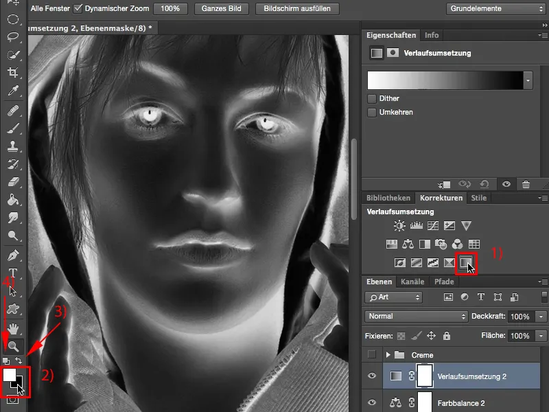
But I would like the effect that the whole thing has here if I set it to an offset mode, namely to Soft Light (1). This causes my highlights to fade out a little, but above all it also means that my shadows are almost gone. It actually looks a bit broken now, the image is actually too flat. In the histogram, I would probably now see a huge mountain in the middle and very, very little on the left and right. Almost nothing at all in the depths. Here (2) everything is already broken up into pixels. You can prevent this, you can improve the effect by simply clicking twice on the layer at the back here (3) to activate the layer style.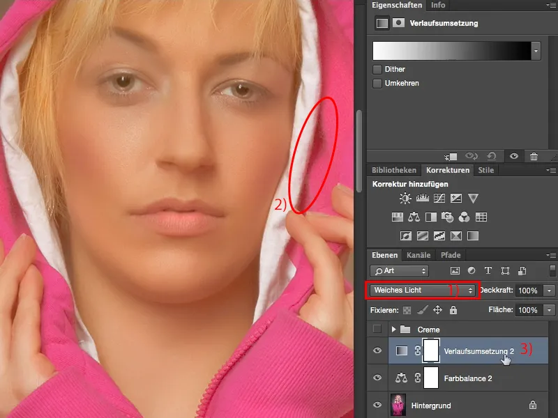
You can now hide various things down here. You have depths here (1) and you have highlights here (2). You can adjust it here on this layer or on the layer below. Yes, and on this layer here I would now like to fade in some depths. What happens if I drag this slider here (3) forward? The depths return, but the interference also increases (4). "So I can't use the slider like this", you think to yourself. Well, you can!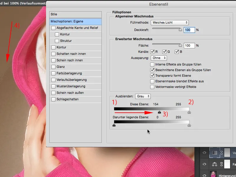
All you have to do is hold down the Alt key. The Alt key has been the magic button in Photoshop for years. Whenever you press it (or almost always) and activate any function, any slider, what usually happens is exactly what you imagined. Namely, this slider splits here. In other words, those ugly tonal value breaks that you got here before because you increased the entire depth, that no longer happens. Photoshop now remembers what you want to offset and displays it here on this layer. Then you can confirm the whole thing with OK.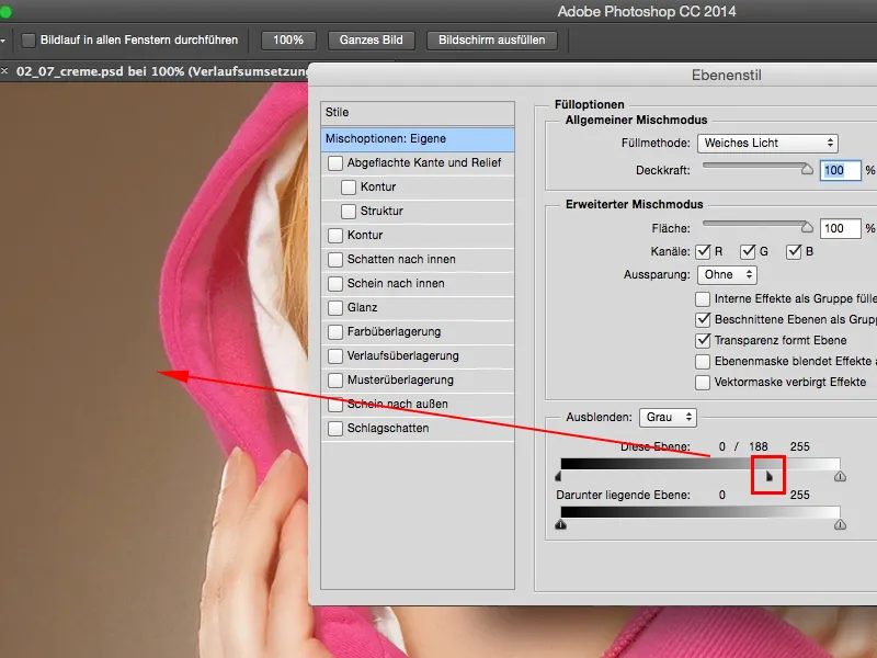
All we need now is a tonal value correction (1). A tonal value correction to give our depths a bit of a boost. You can see here in the front, there, in this area, nothing more is happening. And here we go with the depths and there, or a little bit further, I'll just drag this slider (2). If you want to tighten the highlights a little more, you can do that too (3), and your highlights will be back.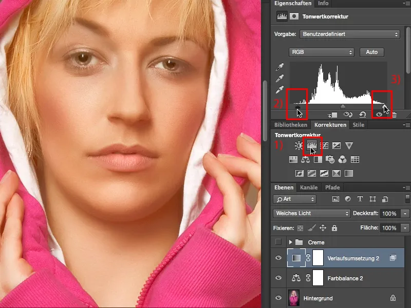
This is a beautifully creamy look, which doesn't necessarily have to apply to the whole picture, but can really only serve as a skin color look, because this cream look is very, very trendy at the moment and simply looks warm and soft and appealing. I hope you enjoy this creamy look.