As announced in the last part, we will draw the green area here. Then we will create the background and finally we will create the water. This looks quite complicated when you think about tracing every single detail with the path tool. But don't worry, there is a special tool that makes this very easy. But more on that later.
Drawing the green area
First, let's start with the green area. To do this, we go to our layers panel, unlock the green area and lock the rest so that we don't accidentally work on the other layers.
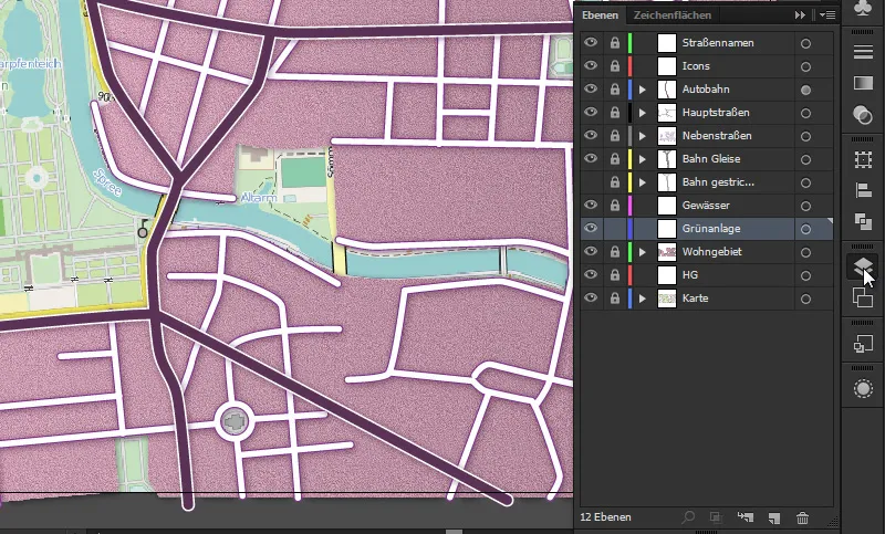
We mark these and select a relatively clearly visible outline. In other words, a brightly colored outline with a thickness of 2 pt (in my case, this is any green - we will determine the exact color of the meadow later). We deactivate the area. We use the path tool and then start tracing the green areas. This is relatively quick. It's not that much area. We can also go under the Spree, as all the streets are above the green area. Since we are drawing above the residential area when we look at the level panel, we should design the meadow as precisely as possible.
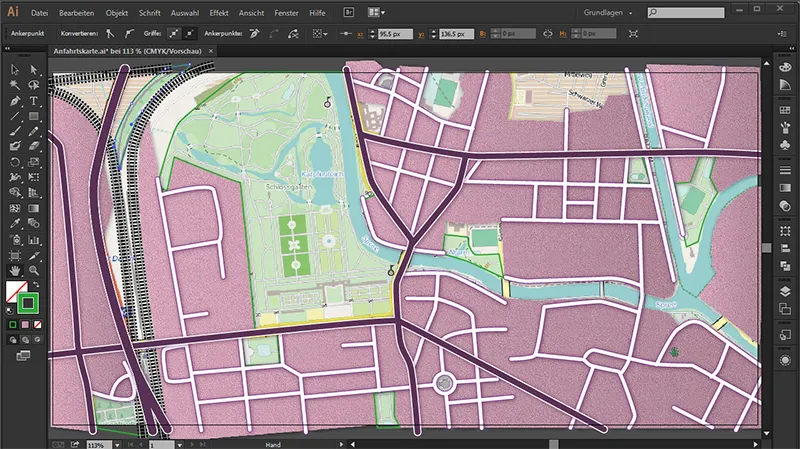
And afterwards the area will be filled accordingly:
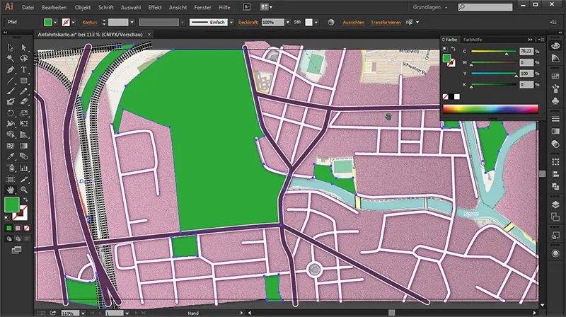
Coloring the green area
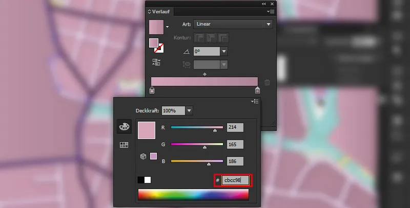
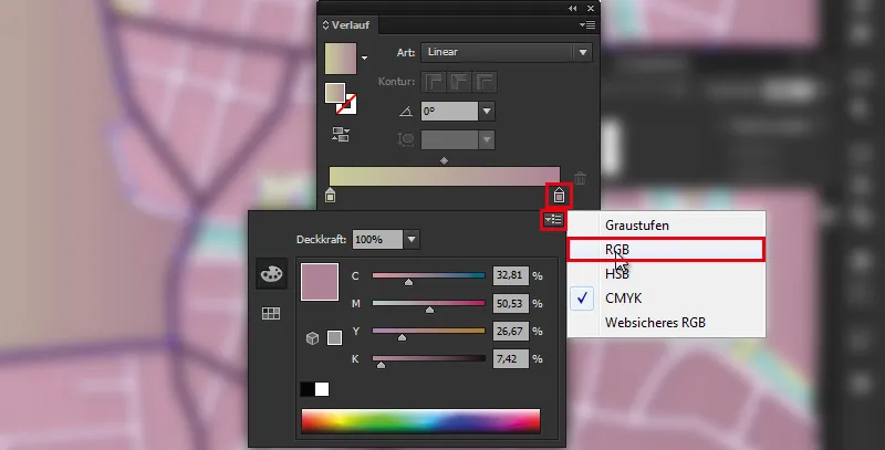
Then we want to give the green area a color. To do this, we go to the Layers paneland first select all the layers. Then we deactivate the outline we used to create the outlines and go to the gradient area. This opens the gradient panel. Double-click on the left slider and click on the right triangle. In the flyout menu, we change it to RGB, ...
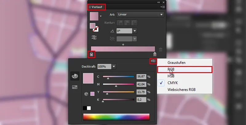
... because only then can we enter the following hexadecimal value: Color: #cbcc98.
We also double-click on the right-hand slider and set it to RGB...
... and give it the color: #dbe6b6 ...,
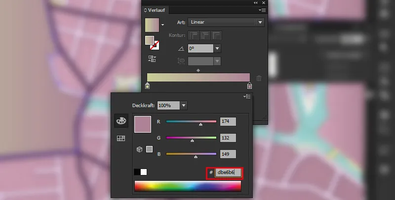
... press the Enter keyand we have a nice green surface.
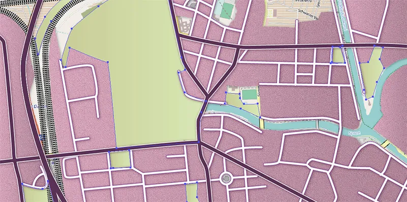
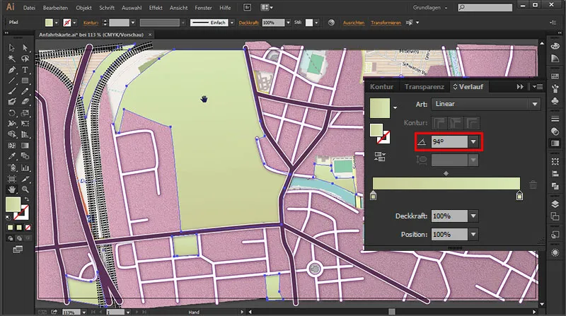
So that our area does not run so smoothly from dark to light, we give it an angle in the gradient panel : 94°. This gives us a nice natural gradient that no longer looks too artificial.
Meadow structure
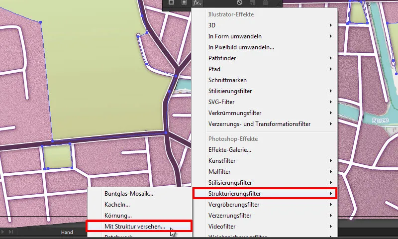
Next, we want to give the meadow a bit more of an appearance - in this case, that would be a texture. To do this, we go to the Appearance paneland go to ...
fx>(Photoshop effects) Texture filter>Add texture.
- Texture: Sandstone
- Scaling: 200 %
- Relief height: 3
- Light: Top right
Due to the relief height of 3, the relief is less pronounced than our residential area and therefore ideal for a meadow.
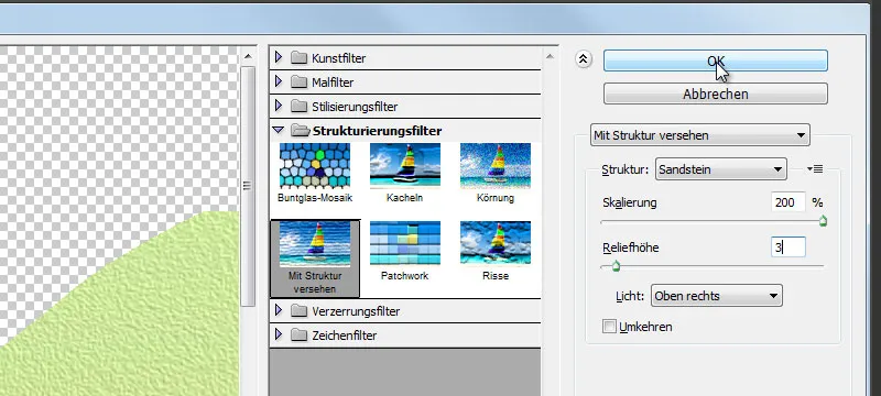
We click on OK and our filter has been applied.
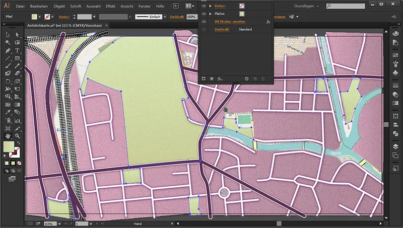
We don't want to give the meadow a drop shadow. This is because a meadow is always very flat and therefore does not need any spatiality, as would be the case with a tall building, for example.
Meadow options
Option 1
I would like to show you another option for creating meadows: let's duplicate the green area and hide the lower green area.
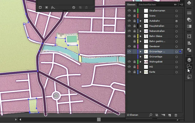
If we now go to the graphic styles control paneland click on the bottom left icon, with which we can open the libraries, we will see that we can load even more structures.
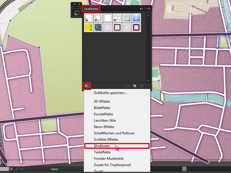
Let's just go up there ...
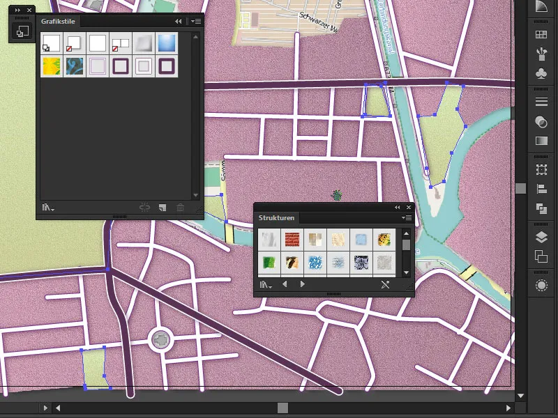
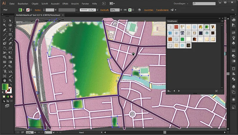
... and take a look at what we have there ... There we find an icon that is called RGB Cartography - Flatland when we hold it over.
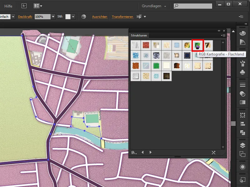
If we go up there once, this structure is immediately applied and we have a meadow structure. As you can see, with distorted edges that flow very smoothly into the residential area or the countryside. This also looks very nice.
Option 2
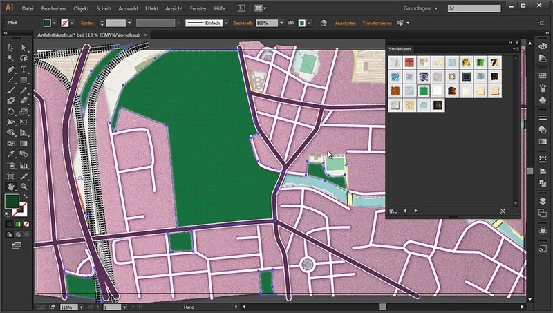
Then we have another option here called RGB Grass and if I go up here now, I can also activate this structure.
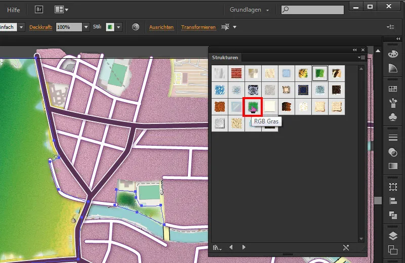
These things should just show you more possibilities of what you can fall back on if you don't feel like creating your own structures to represent the residential areas, meadows, subsoil and so on.
Soil
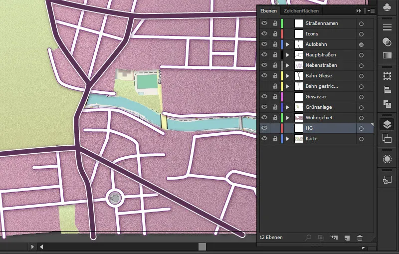
Now we need a real background in addition to the body of water. To do this, we go to the background layerand unlock it. We can now lock the green area.
We then go straight to the color area, where we select a suitable sand color.
Color: #f1efd8
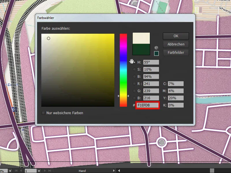
Press Enter once and we have our matching sand color. Then we take the rectangle tool and draw a large rectangle over the entire map area, which then appears in the matching color.
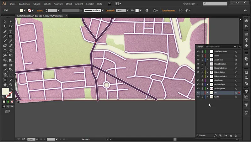
We also want to give it a bit of texture. Because a floor like this is more like sand and is therefore not completely structureless. So let's go back to the Appearance panel...
Appearance>fx>(Photoshop effects) Structuring filter>Add structure.
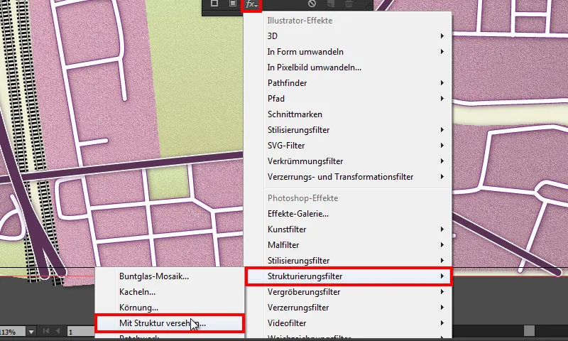
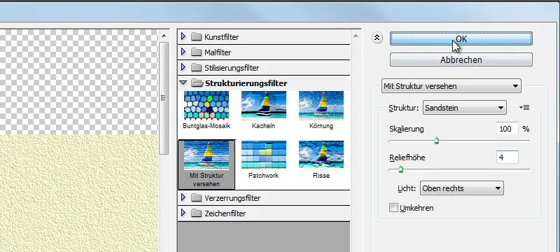
The dialog box opens.
- Texture: Sandstone
- Scaling: 100 %
- Relief height: 4
- Light: Top right
Because we want it to be a very fine floor, we set the scaling to 100 % and the relief height to 4 so that it comes out a little more clearly. This gives us a really nice stone texture.
Click OK once and the filter is applied. And we have a wonderful texture again.
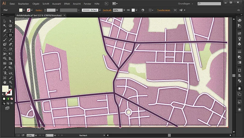
This always looks much more natural than if we simply had a smooth surface. Because no surface is really smooth and that usually looks very artificial.
Water
And then we can start with the body of water straight away. To do this, we go to the layers paneland hide everything that is covering the map. We want to see the water. Then we go to the water layer, unlock it and show it by clicking on the empty box, where an eye symbol immediately appears.
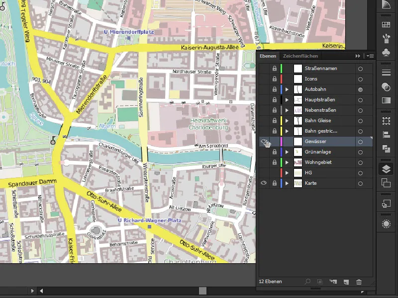
And if we now take a closer look at the water as it is structured here, we can see that there are already many bends and small branches. Sometimes the line gets a little thinner at the very narrow junctions. And we really have a lot of different ways and gradients in which we have to shape the contour here. This means that if we go through every single route with the path tool, we can really spend quite a long time on it. But there is another way to fill in these areas relatively quickly. We can do this with the drop brush tool.
With the drop brush tool, we draw areas without having to add individual points. We simply paint on the surface and when we are done with it, ...
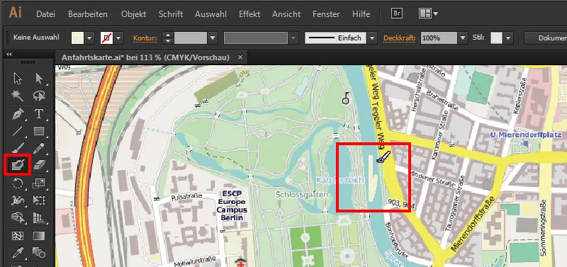
... we see that we have a path surface without having set individual anchor points beforehand.

If we double-click on the drop brush tool, we can set the size here:
Size: 5 Pt
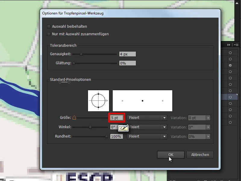
Then we zoom into the map and select a suitable color so that we can see something properly. A darker blue will do. And we choose the size that works best at the moment. We can therefore also reset this to 1 pt. It's also easiest if we start with a smaller size and then go around the edges. Then, once we have the outlines, we can simply color in the inside, so to speak. And if the edges are still a little too crooked - it doesn't matter at first. Because we can straighten them afterwards. I'll show you how to do this in a later step.
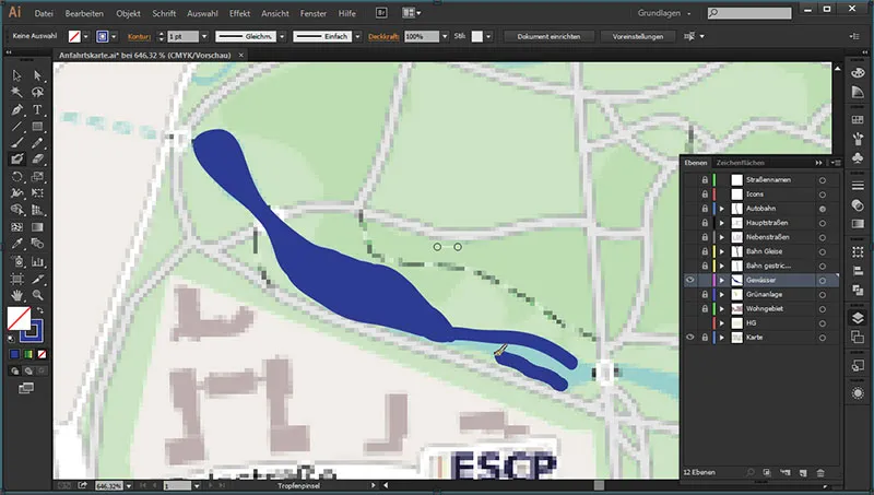
The good thing is that it's particularly easy for those who already have a graphics tablet to trace this. Just like with a pen and paper, for example when tracing, we can trace the edges here and then virtually color in the areas. And it's incredible how you can really quickly color in these difficult gradients from thick to thin lines. And if we want to speed things up a little, we can always adjust the outline a little and - as in this example of the carp pond - paint it in very quickly. By holding down the space bar, I can also easily move along here.
Straightening
And if we now look at the outline we have drawn, we can see that it is not quite perfect.
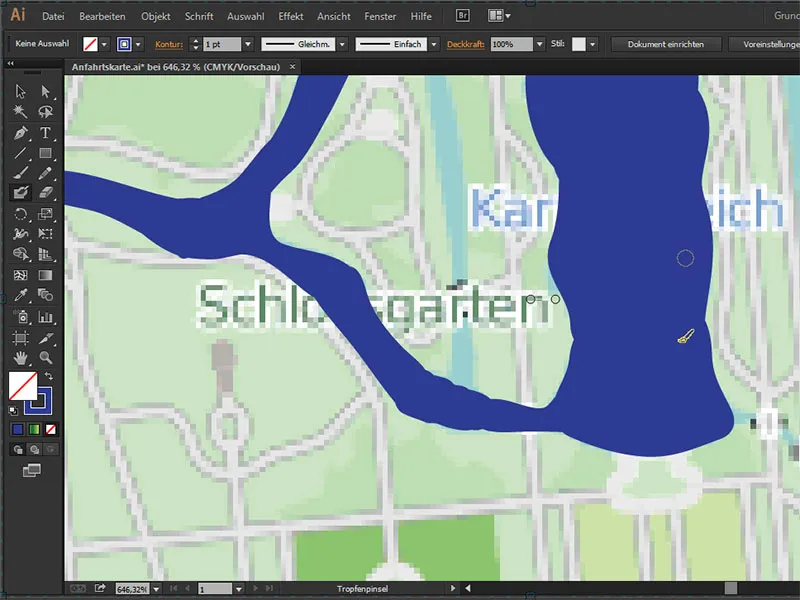
There's a corner here and another corner there. Water doesn't flow in corners. :) And there's a wonderful solution for this, which is to press the Ctrl key once and click on the path. Then we can see all the path points that have been created. And we can easily see that there are far too many. To smooth them out nicely, we press the Alt keyonce and temporarily switch to the smoothing tool. And if we now go through the contours several times with it, the superfluous path points are deleted and the path is straightened. This is a wonderful way to get the flow going. :D
Alt (hold down): (temporarily switch to) Smooth tool.
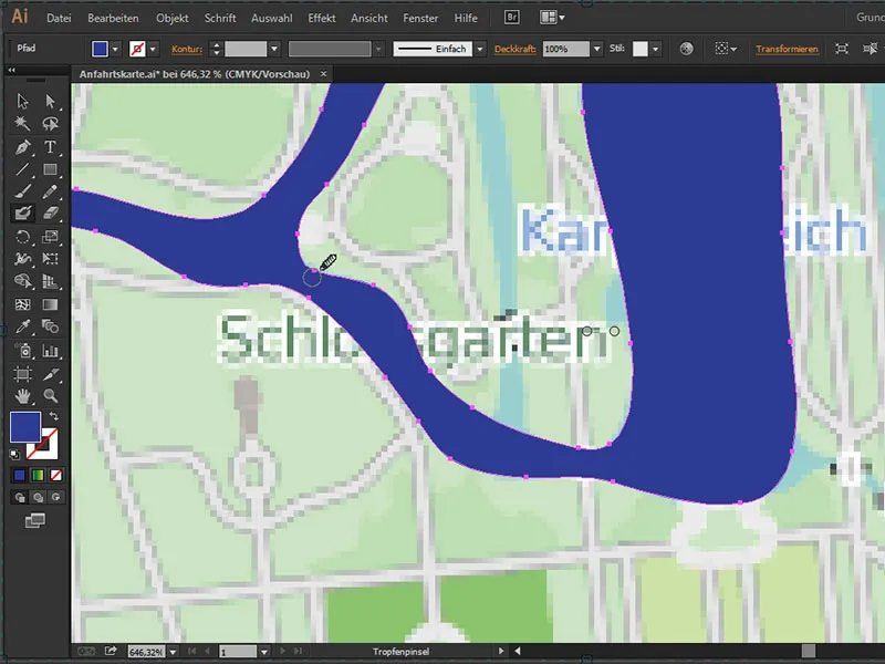
And we really have a wonderful result here.
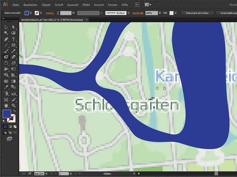
Press the Ctrl key once and click out so that we can assess the result more closely. And this really is a very convincing flow. We will now do the same with the rest of the watercourse.
With the even course of the river, all you need is a suitable contour with which you can trace the river in one go. Now you can see that we have drawn the watercourse over the roads.
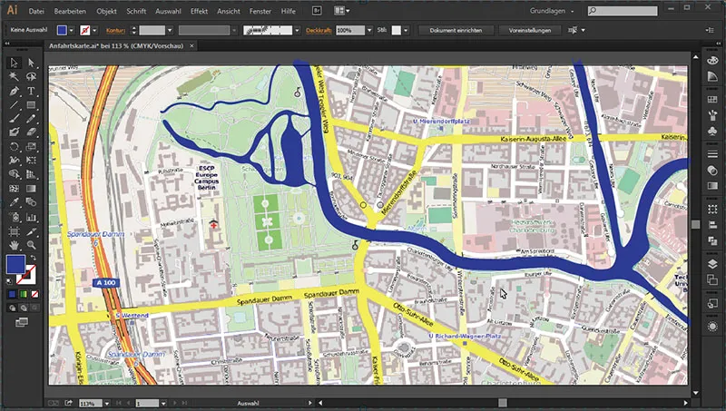
But that doesn't matter, because our water layer is below the road layer. If we show all the layers, we can see that it fits together wonderfully here.
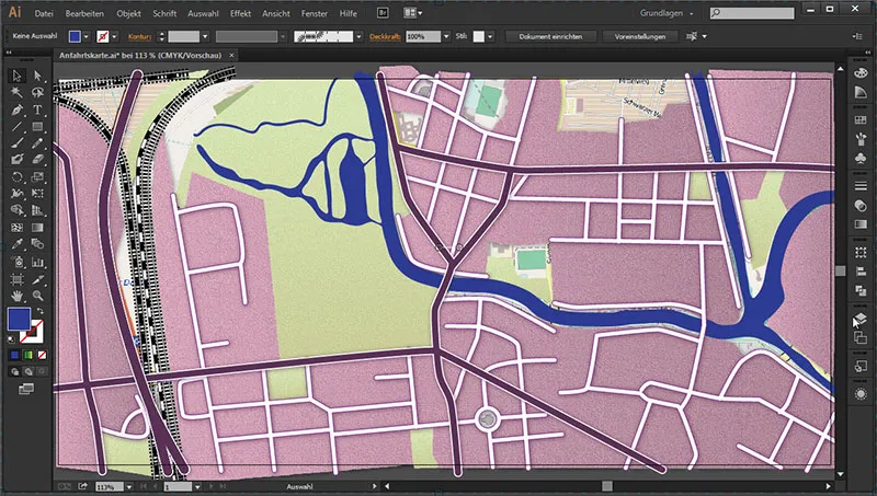
And with the rest, we can already see our interim result:
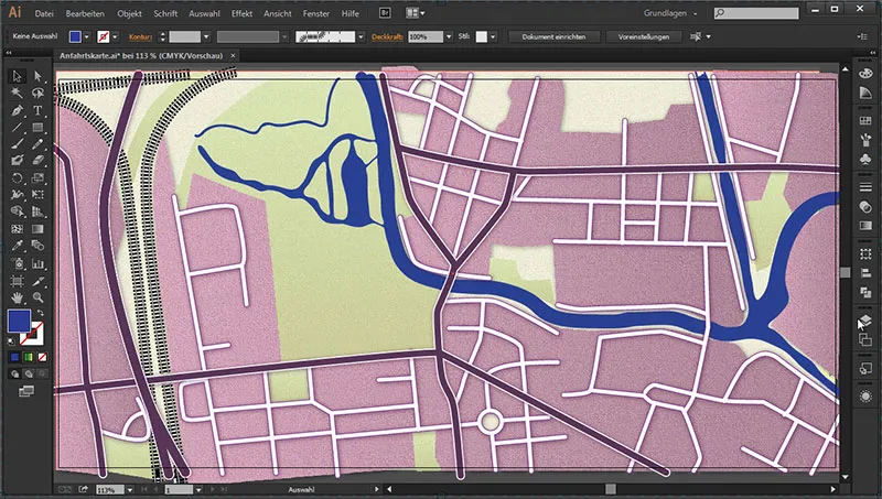
In the next part, we will then also color the body of water appropriately and in the green area - let's imagine that we have a forest there - we will create the corresponding forest symbols to match. We will also create the labels for the main roads.


