In the last part, we will deal with inserting the remaining symbols that are still missing and placing our location.
Adding missing roads
But before we do that, we will draw in the remaining missing streets. If we now display the map again in the layer view, we can see that we are still missing a few streets.
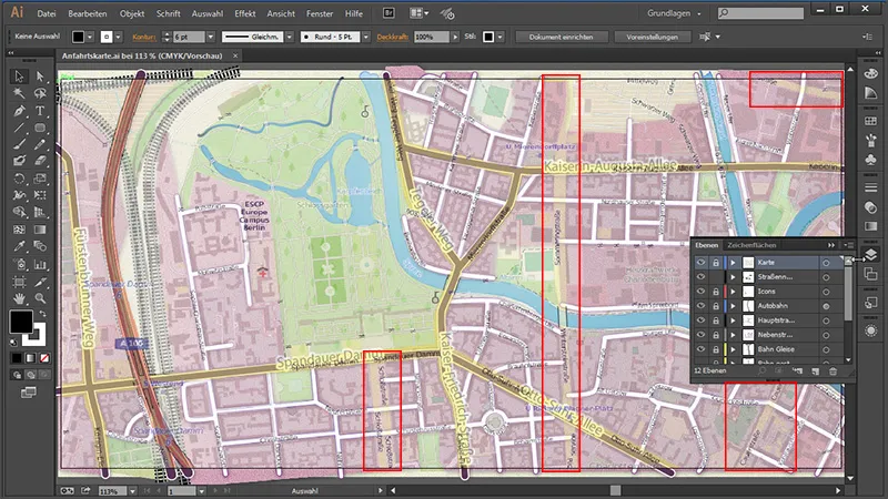
And of course we want to add them. We do this by again locking unused layers and unlocking our main roads. Then we take the path tool and trace our roads.
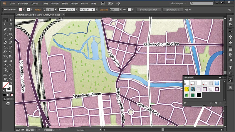
As we had previously saved our main roads as a graphic style, we now only need to mark them all and give them the graphic style for the roads.
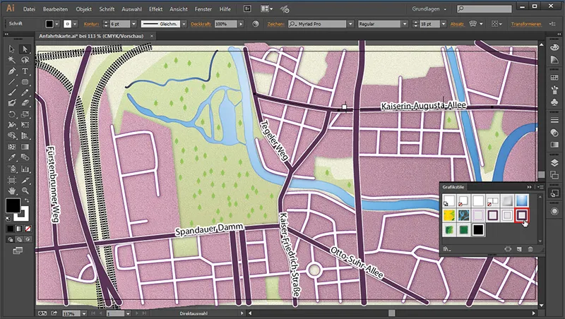
Now we just need to connect the streets we have just created. Because if we take a look at the whole thing, the "Kaiserin-Augusta-Allee" is here under our newly created street.

We simply join the two together by first resolving the compound path in the old main roads. Only then can we add the newly created streets.
So we first select the merged main roads and right-click on the road path. In the context menu, select Reverse merged path.
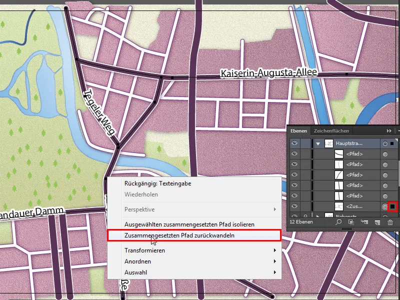
We have now separated all our paths. To check, we can see in the layers panel that all paths can be found individually again.
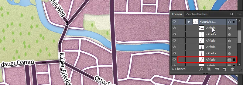
Now we can merge all the main roads back into a composite path by selecting them all in the Layers panel, ...

... right-clicking on one of the paths in the workspace and clicking on Create composite path.
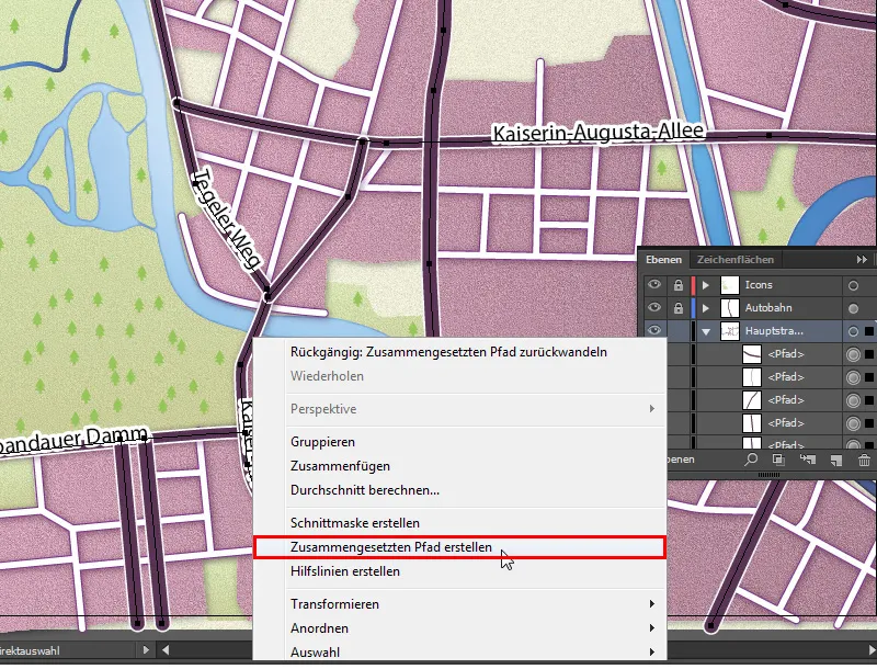
And now all the paths are merged together again.
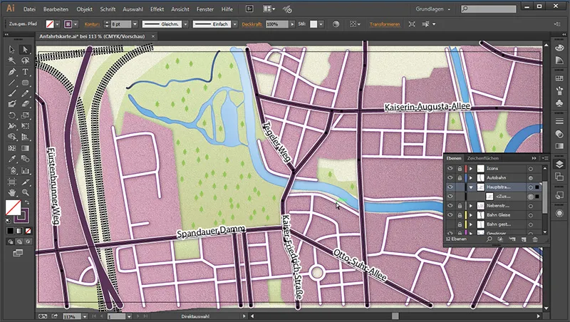
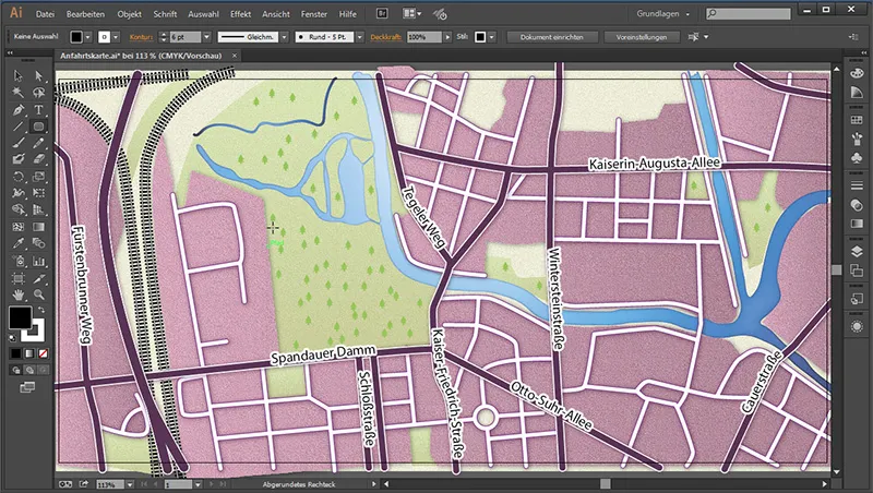
Finally, we just need to add the street names again.
Create signs - subway
Now we will create the signs. We'll start with a subway sign. So that we don't draw on our main roads, we lock all layers and unlock our "Icons" layer. First of all, we need the rounded rectangle tool. We use it to draw a rounded square on our workspace and give it the following values:
- Outline: none
- Area color: #293176
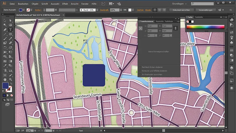
Then we draw a text box with the text tool and write a "U" in it. We can drag this until it fits into the rectangle. This can have the following values:
- Area: White
- Outline: None
- Font: Tunga
- Font style: Bold
- Font size: 129 Pt
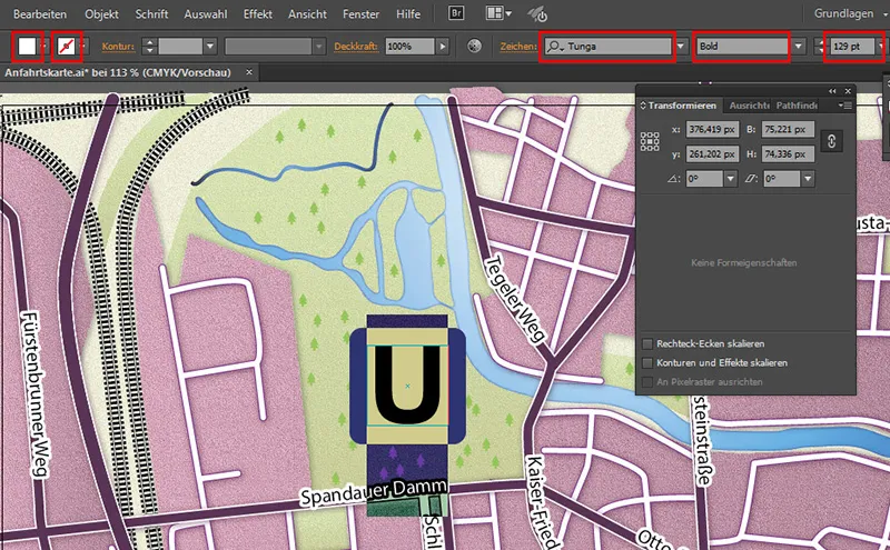
Then we can resize the symbol to fit.
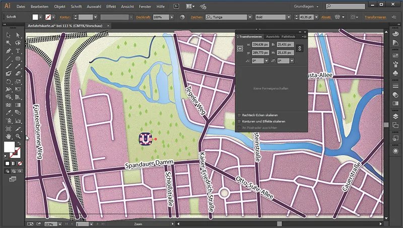
Then we zoom in once and reduce the corner radius, as they did not adjust when we reduced the size.
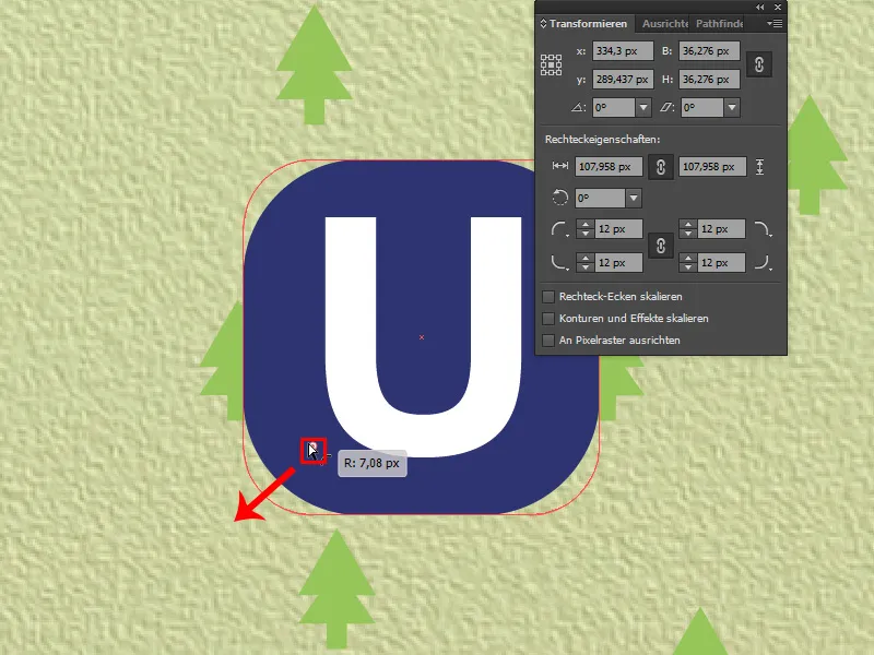
Do you want to avoid this next time? Simply go to Edit>Preferences and check the box next to Scale contours and effects.
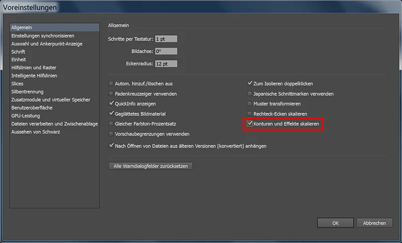
Then select both areas and convert them into a group with Ctrl+G.
To save the subway sign as a symbol, select it completely and press the F8 key. Enter the following in the menu that appears:
- Name: Subway
- Type: Graphic
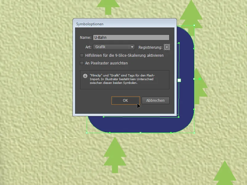
Now we can call up the symbols paletteand drag further subway symbols from the control panel onto the workspace.
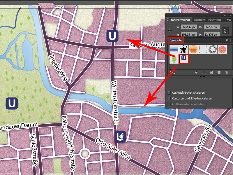
And if we find that our subway symbols are still a little too large, we can adjust the size and corner radius accordingly by double-clicking on the subway symbol in the symbol palette.
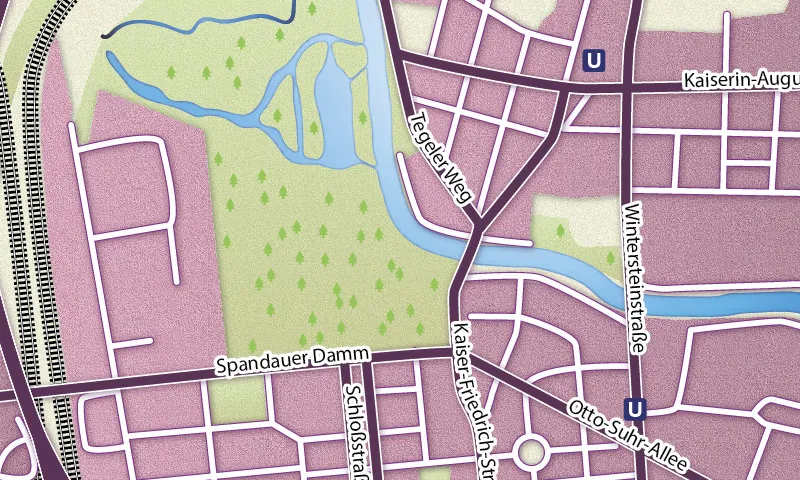
Subway symbol
Now all we need is a suburban train symbol. We use the ellipse tool for this. We use it to draw a circle and give it a gradient via Window>Gradient . To do this, click on the gradient bar and then on the left-hand color bucket. A small flyout menu appears with a small triangle downwards symbol in the right-hand corner. We go up there once to change the setting from grayscale to RGB so that we can set colorful color values.
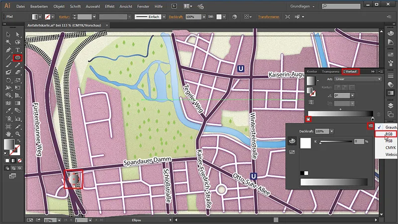
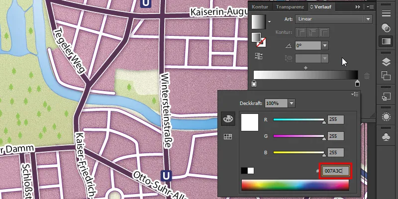
- Color: #007A3C
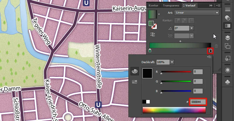
On the right-hand color bucket we enter (after we have also switched to RGB there)
- Color: #008B44
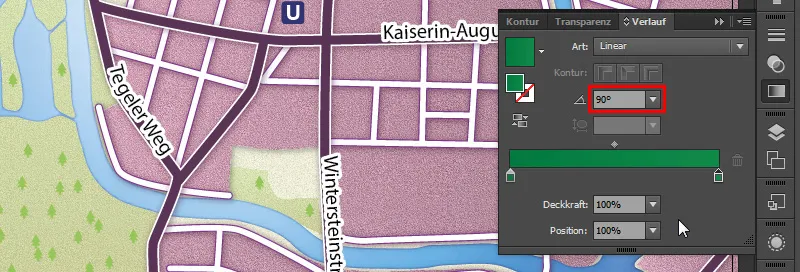
And an angle of 90°.
We click once with the text tool in the workspace, create an "S" with a white area color and move it into the circle.

Designation for icons
We have now created our icons. All we need now are the appropriate names for the stations. First, we go to our layer palette and lock the "Icons" layer. Then we create a new layer and name it "Icon names".

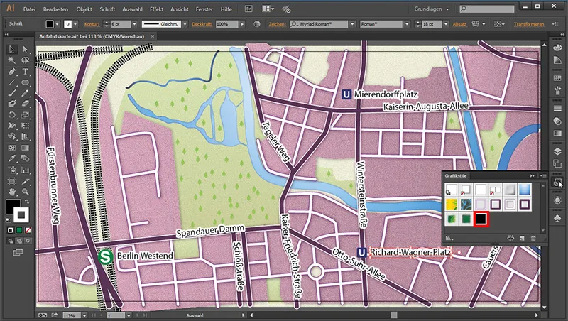
Then we click once in the workspace and name our S-Bahn station with 18 pt size "Berlin Westend". Then we simply assign it the style from our graphic styles panelfor street names. We do the same with the subway stations.
Create highway signs
The next thing we need is a highway sign to indicate which highway this is. To do this, we will once again use the rounded rectangle tool and create a suitable sign with a 3 pt contour.
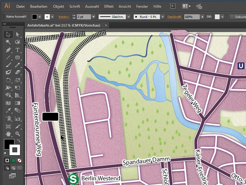
Then we give the surface a gradient:
- Color left: White (#ffffff)
- Color right: #dbdbdb
Angle: 60°
And we also give the outline a gradient:
- Color left: #524c67
- Color right: #6c346e
- Angle: 60°
- Contour thickness: 3 pt
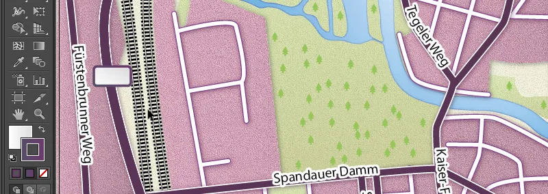
The only thing missing now is the name. My values are as follows:
- Font: Myriad Pro
- Font style: Bold
- Font size: 14 Pt
- Font color: #515150
And we just need to put that in the symbol to match.

Location
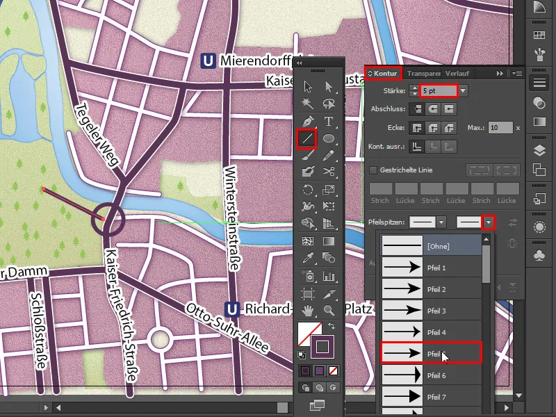
We create the location as follows: We take the ellipse tool and draw a circle with the following values:
- Area: None
- Outline color: #593055
- Outline thickness: 5 pt
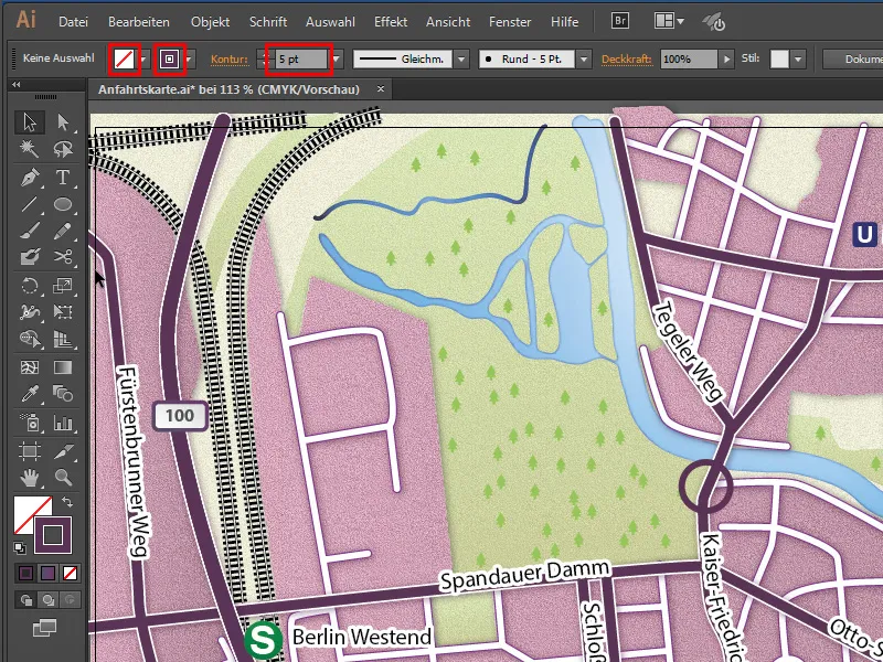
And we draw the location with the line drawer. For an arrowhead, we go to the arrowheads item in the contour paneland select arrow 5 in the second entry.
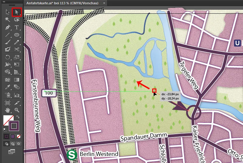
As the tip is a little too large, we can select the end of the arrow with the direct selection tool and increase its length slightly.
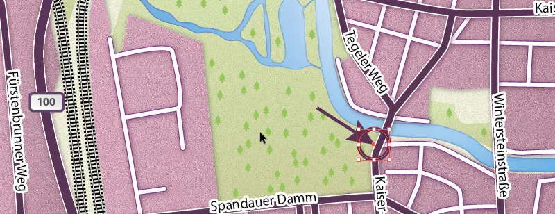
If we select the circle, we can see where the center of the circle is. We can use this as a guide and place the arrowhead in the correct central position.
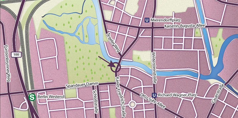
Now we are finished with the route map:
Export
To export the map, go to File>Export in the menu , give it a file name and set the file type to JPEG (*.JPG).
- File name: any
- File type: JPEG (*.JPG)
- Use artboards: Yes
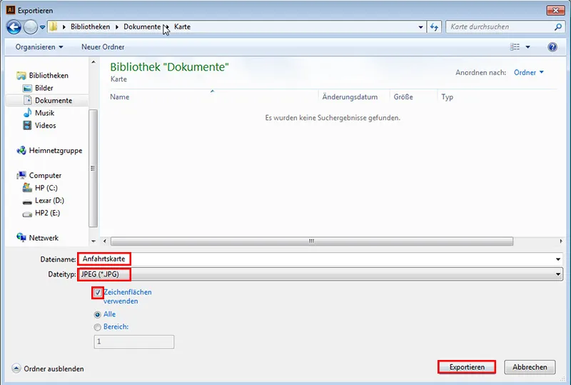
It is important that we check Use artboards, because if we take a look at our Illustrator document, we will see that we have a black frame around our map ...
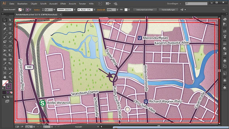
... and above it. After activating this option, it will be neatly "cut off" at the edge.
We set the JPEG options as follows:
- Color model: RGB
- Quality: 6 (High)
- Resolution: Medium (150 ppi)
- Embed ICC profile: Yes
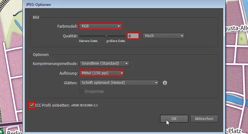
Here it is very important that we embed the color profile. Otherwise, the colors may be displayed incorrectly.
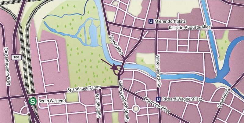
After clicking OK, our result will look like this:
I hope you enjoyed this tutorial. :)
