Here is the result. So, enough beating about the bush. Let's get straight to it ...

Step 1: Create the basic shape
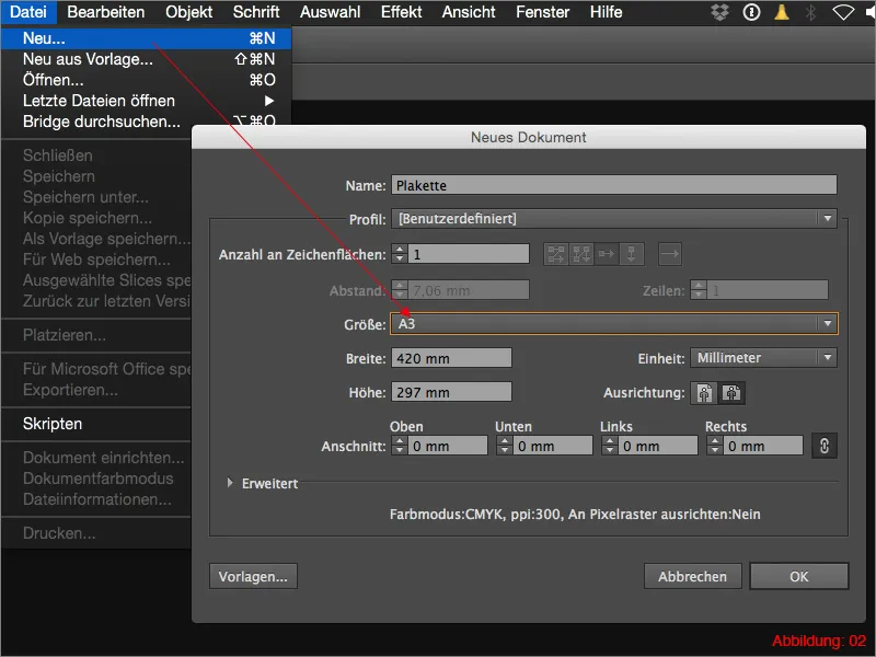
Before we can start with our actual work, you need to create a new workspace in Illustrator. To do this, go to File>New and then select a landscape format with the dimensions DIN A3.
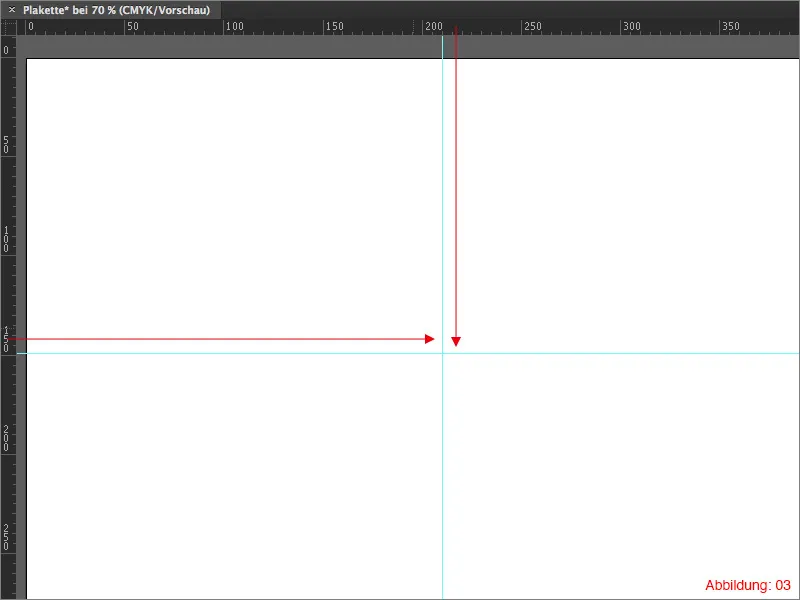
Now use the shortcut Command+R to display the rulers and create two guides that should cross approximately in the middle of your workspace. To create a guideline, simply drag and drop it out of the rulers.
The whole thing should then look something like this. (Figure 03):
All subsequent work steps now start from this center point.
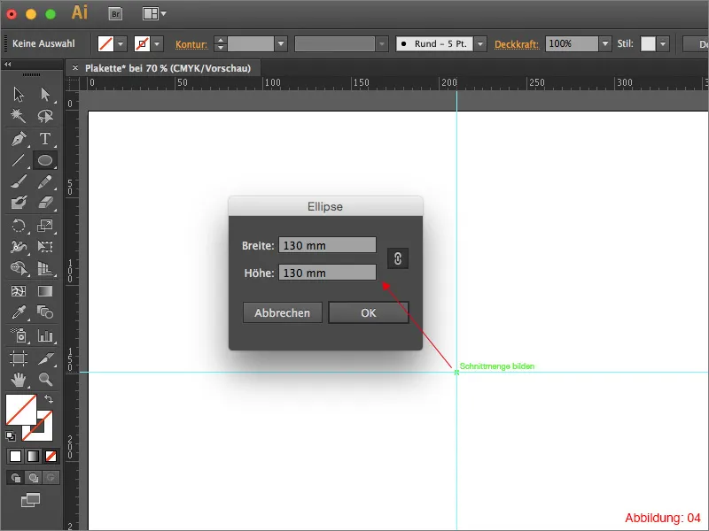
Next, grab the ellipse tool and click on your center point while holding down the Alt key. In the following window, select a size of 130x130mm and confirm with OK.
Information on the side:
Because you pressed the Alt key while clicking on the center point, the ellipse is created directly from the center.
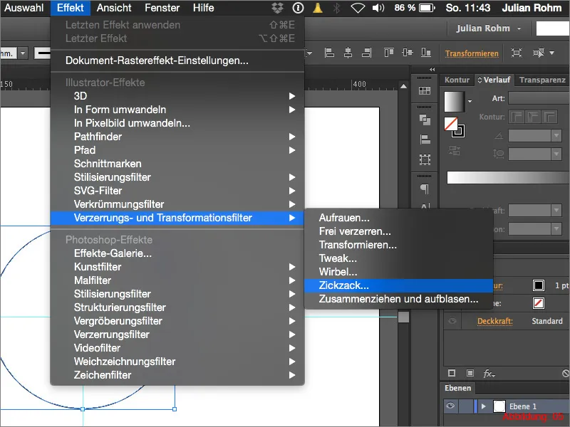
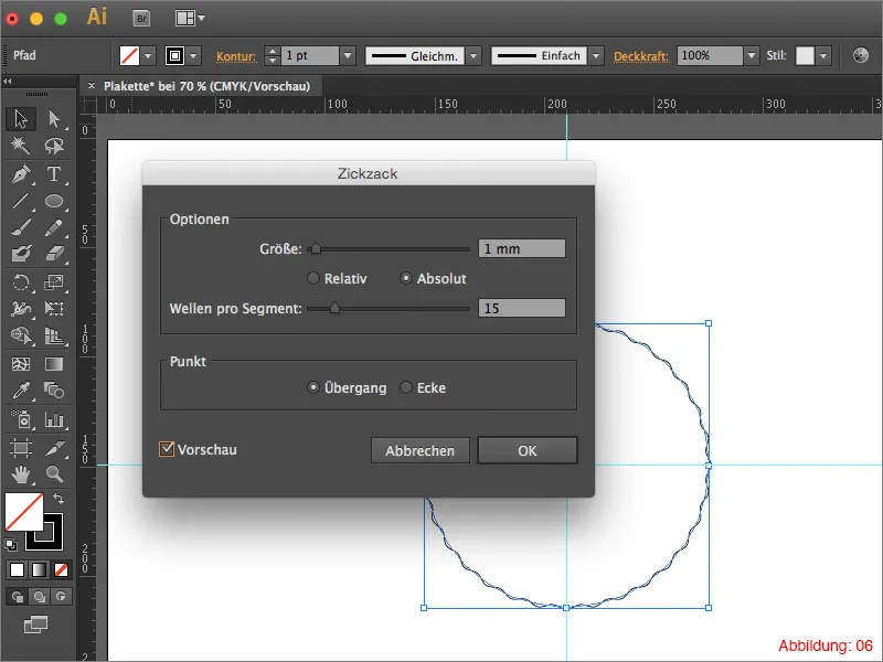
To create the even curves at the edge of the plaque, you need to apply the Zigzag effect to it. To do this, go to Effect>Distortion and transformation filter>Zigzag.
In the following dialog box, you can control the fine adjustments of the zigzag filter. For the size, select a value of 1mm and set the selection point to Absolute. You can set a value of 15 for the waves per segment. Before you confirm with OK, it is important that you select Transition in the lower area of this window so that no sharp corners and edges are created. (Figure 06).
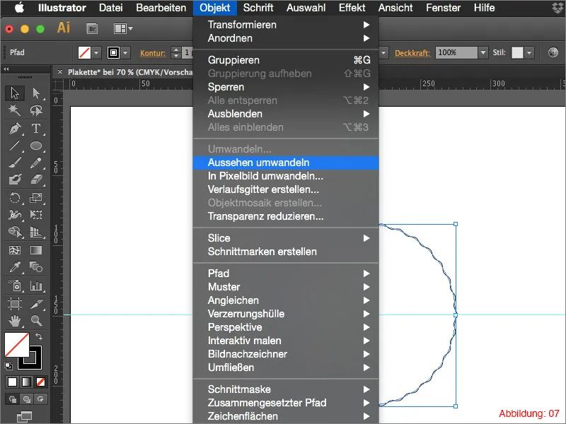
You must then convert this effect into an object so that the effect is actually converted into a path. To do this, go to Object>Convert appearance ... (If you forget to do this conversion, you will run into problems when you want to scale your badge. The values of effects always remain the same as long as they have not been converted. This means that if you want to scale your plaque very large afterwards, your waves will become very small).
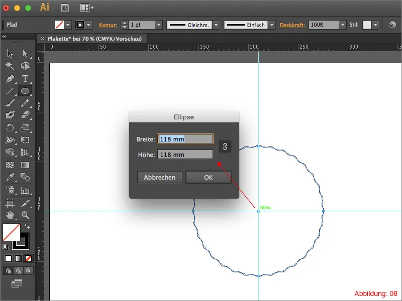
After you have converted the object into a path, you will need the ellipse tool again. Hold down the Alt key and click on your center point again, select a size of 118x118mm and then confirm with OK. (See Figure 08).
Deactivate the area color and create an outline with a thickness of 5pt. As we will be editing the outline with the Pathfinder in a moment, the outline color is irrelevant in this case.
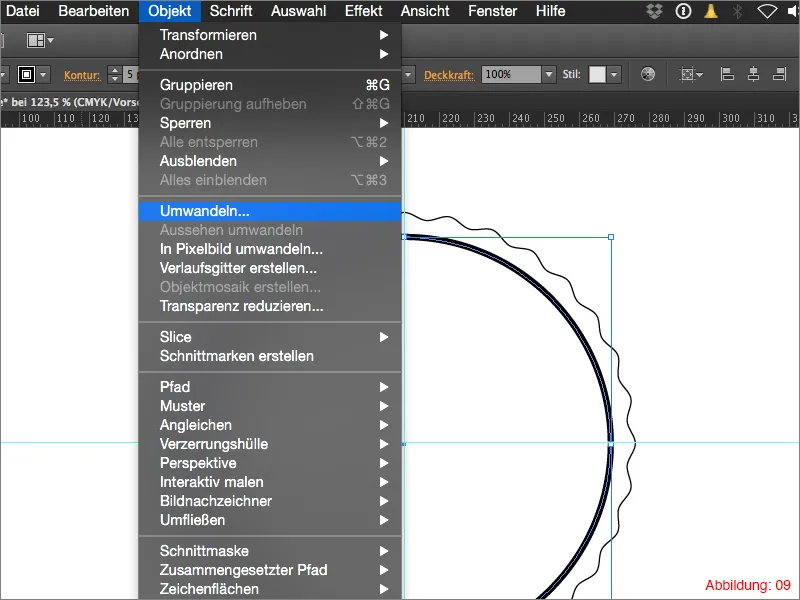
Select the circle you have just created and then go to Object>Convert. You can simply confirm the following window with OK. This command converts our contour into a surface. This is very important for the following steps with the Pathfinder. (Figure 09).
As already mentioned, you now need the Pathfinder. If you have not yet shown it, you can find it via Window>Pathfinder. (Figure 10).
Information in passing:
From my experience, I recommend that you always keep the Pathfinder handy on your workspace in Illustrator, as you will need it for almost all design work that you do in Illustrator.
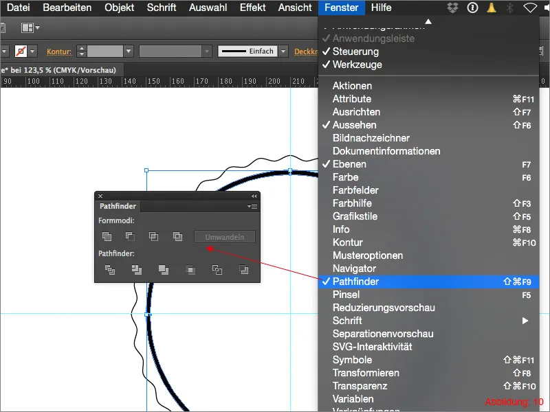
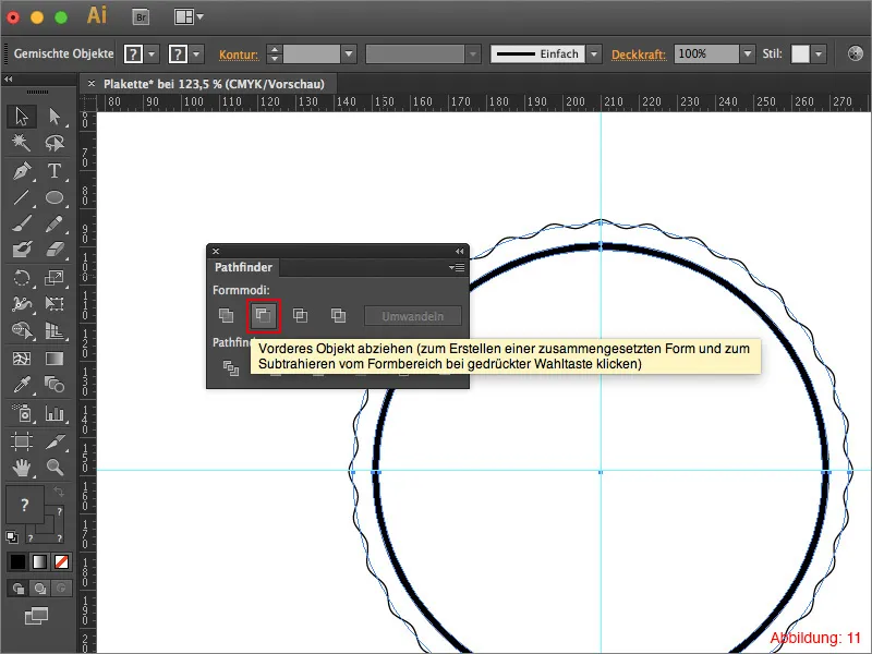
Now select everything with Command+A (on PC - Ctrl+A) and click on Drag to front object in the Pathfinder palette. (See Figure 11). This will make our plaque transparent at the point where our second ellipse was.
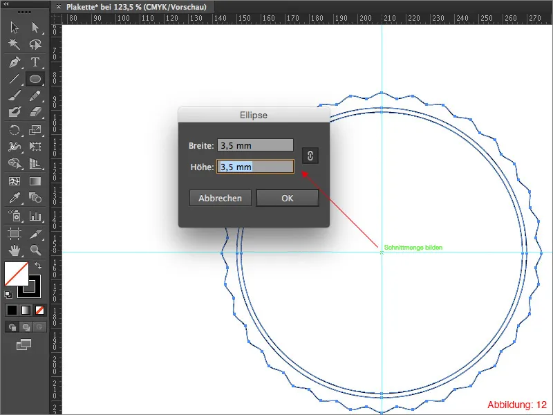
Next, you will need the ellipse tool again. As usual, hold down the Alt key and click on your center point and create a small ellipse with the dimensions 3.5x3.5mm. (See figure 12). Select magenta for the outline color.
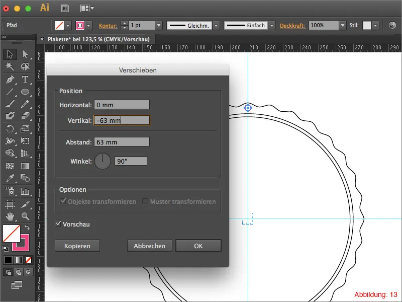
Double-click on the selection tool (black mouse pointer) to open the Move dialog. Set the horizontal shift to 0mm and enter a value of -63mm for the vertical shift.
The whole thing should then look something like this. (See Figure 14):
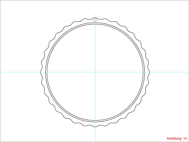
The small ellipse that we have just shifted must now be rotated so that there is an ellipse in each wave of the plaque.
Select the shifted ellipse and then grab the rotate tool from the tool palette. Hold down the Alt key and click on your center point.
In the following window, you now need to enter the angle for the rotation. If you count how many waves our plaque has, you will see that there are exactly 32. As Illustrator is quite clever in this matter, you can simply enter 360°/32 and confirm by clicking on Copy. (Figure 15).
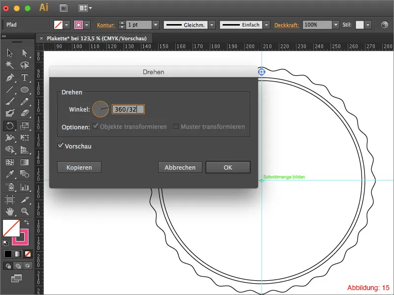
To avoid having to repeat this rotation process 30 times in the same way, you can make the whole thing a lot easier by using the shortcut Command+D (on PC - Ctrl+D).
Information in passing:
The Command+D or Ctrl+D shortcut in Illustrator always repeats the last action that was performed. In this case, the rotation.
After you have finished rotating, the whole thing should look something like this. (See Figure 16):
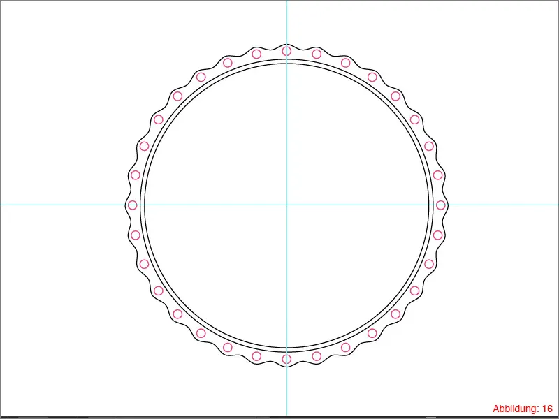
As the rotated circles are also to be punched out with the help of the pathfinder, it makes sense to group them all together first so that they are not all lying around individually in the layer palette.
Click on one of these small circles and then go to Selection>Appearance>Same. With this command you have now selected all the small circles and do not have to struggle to select them all individually. (See Figure 17).
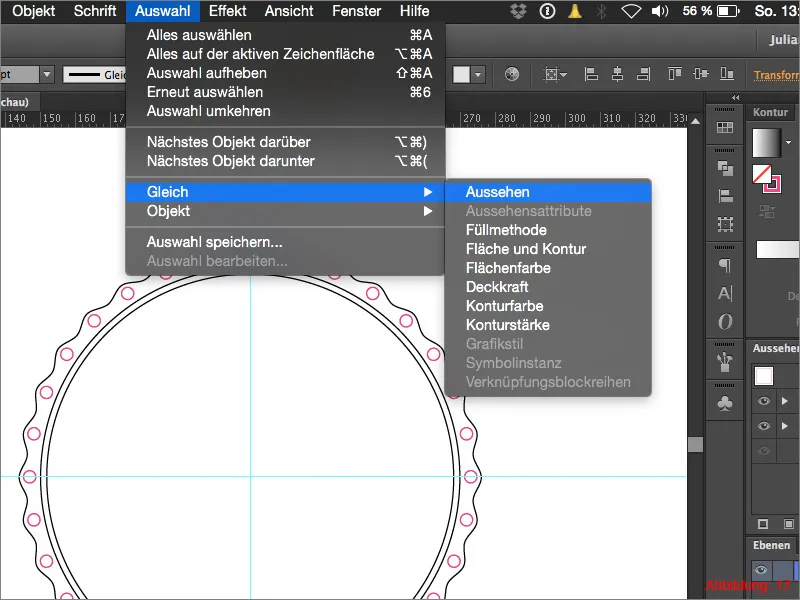
Then group all the circles with the shortcut Command+G (on PC - Ctrl+G).
Your layer palette should then look relatively tidy again. (Figure 18).
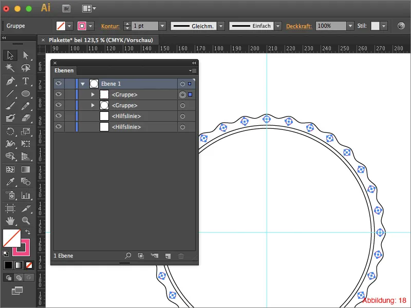
Before you can now punch out the small circles, you need to pay attention to two things. First of all, select the group you have just created and then click on the small arrow in the top right-hand corner of the Pathfinder to open a drop-down menu. Click on Create composite shape (Figure 19).
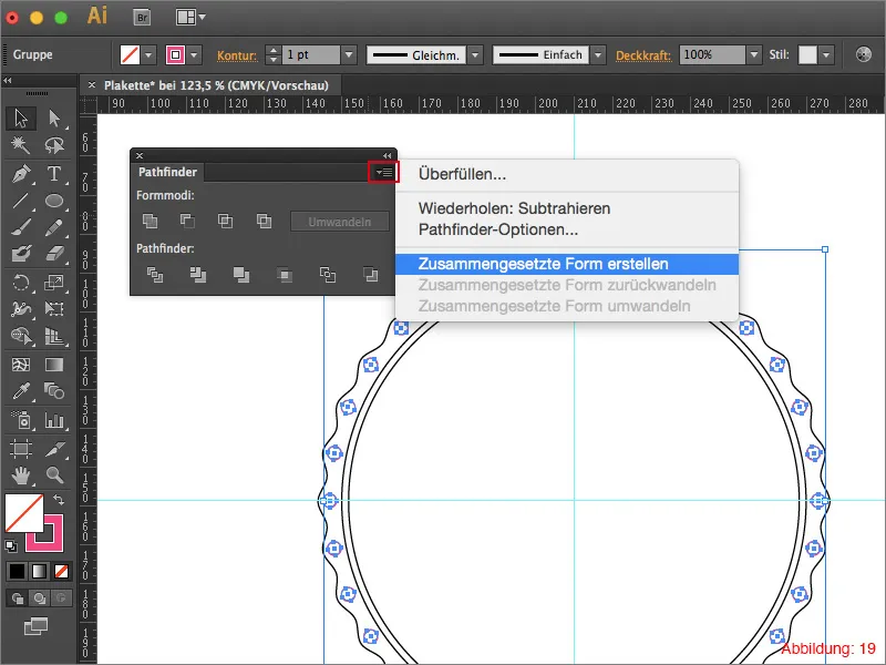
Shortly afterwards, you have the option to click on Convert. (See figure 20).
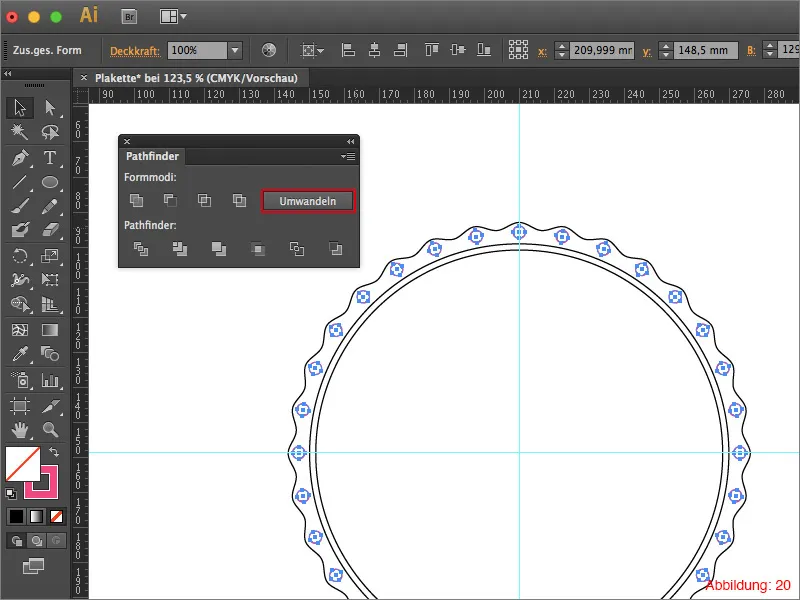
The group should then disappear from your layer palette and only exist as a single object.
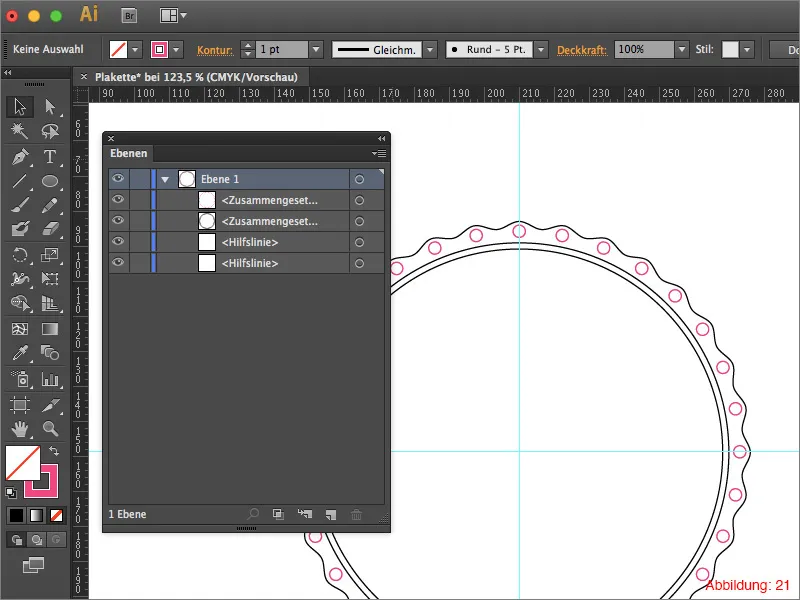
You now have to do the same procedure with the actual badge.
Afterwards, apart from the two guides, you should only find two objects in the layer palette. (See Figure 21).
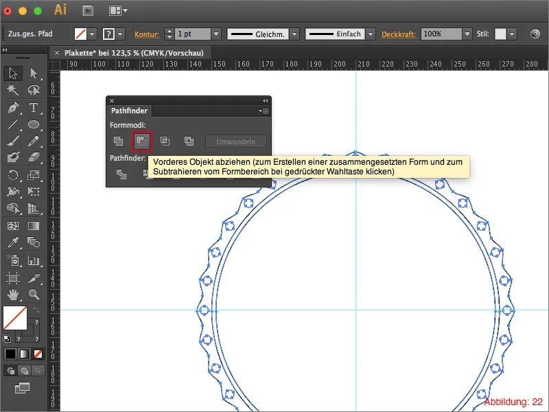
Select everything with Command+A or Ctrl+A and click on Subtract front object in the Pathfinder.
The basic shape of your plaque is ready.
Step 2: Color comes into play
We have now reached the point in the tutorial where we finally bring color into play. To be more precise, more than just one color, as we will be working with a color gradient.
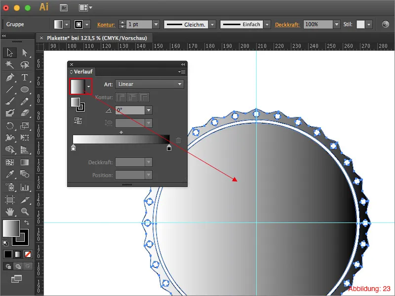
Select your badge and then click on the standard black/white grad ient in the gradient palette. (Figure 23).
Mini tip:
If the gradient palette is not yet open, you can find it via Window>Gradient.
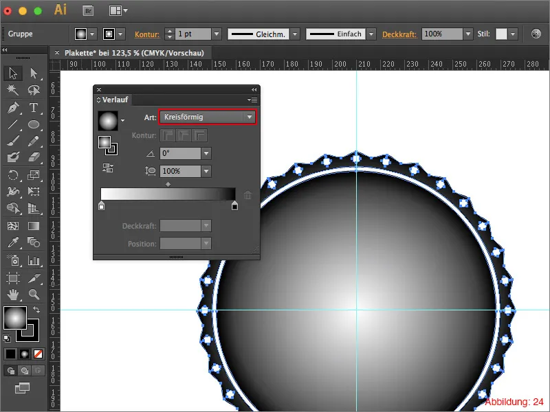
First of all, you need to convert the linear grad ient into a circular gradient. (See Figure 24).
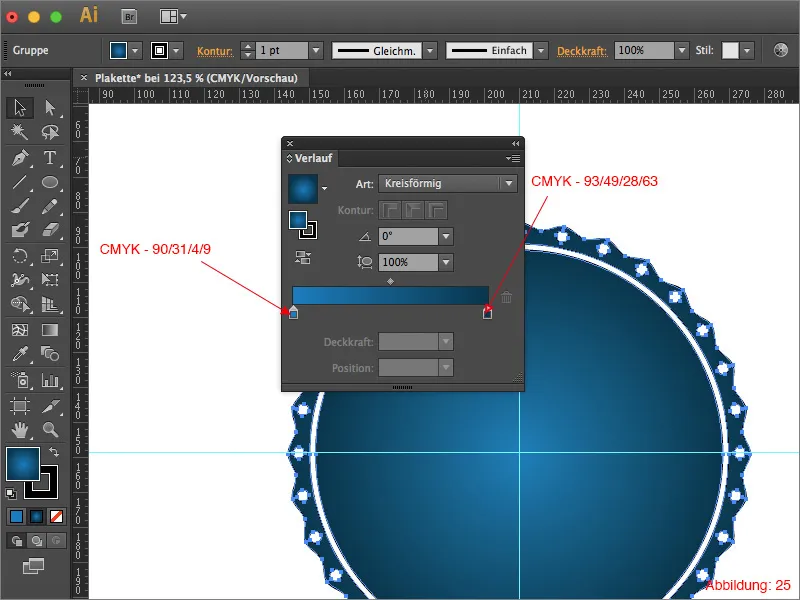
Next, you will need two different shades of blue. For this tutorial, I have chosen the following two CMYK values.
- light blue: CMYK - 90/31/4/9
- dark blue: CMYK - 93/49/28/63
You can assign the two colors by double-clicking on one of the gradient color fields. (See Figure 25).
Step 3: Text on path & logo
The basic shape of the badge is now complete and we have also created a suitable color gradient. What's missing now?
A suitable label and logo, of course.
Grab the ellipse tool and hold down the Alt key again to create an ellipse on the center point. Now enter a size of 113x113mm and confirm with OK.
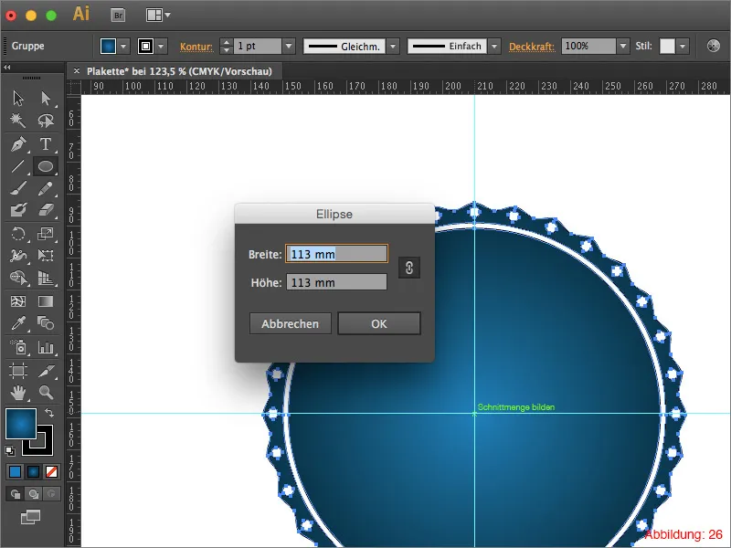
Now use the scissors tool to cut this ellipse horizontally so that you have two separate semicircles. (The scissors tool is hidden under the eraser tool). (Figure 27).
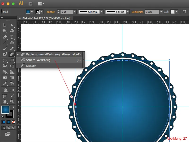
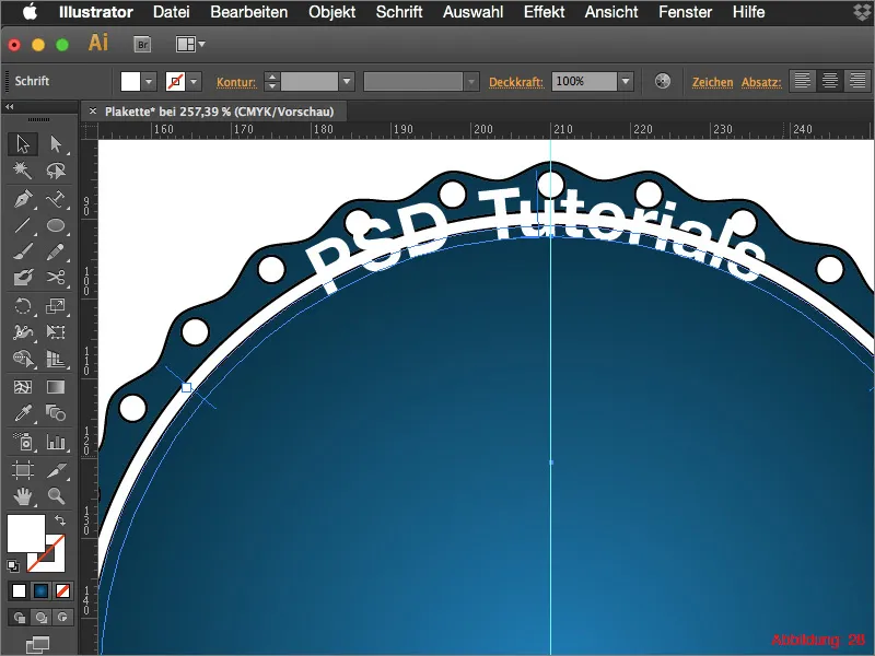
Then grab the path text tool and click on the upper semicircle. Write the words "PSD tutorials" on it. (Figure 28).
(For the font, you can select Helvetica Neue in the Bold font style and a font size of 25pt).
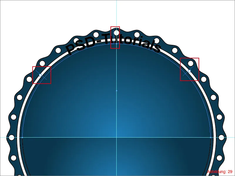
To adjust the position and alignment of the text, you can use these three handles. (See Figure 29).
As the text is currently still above the path, go to Font>Path text>Path text options ... In the following window, set the alignment to ascender and confirm with OK.
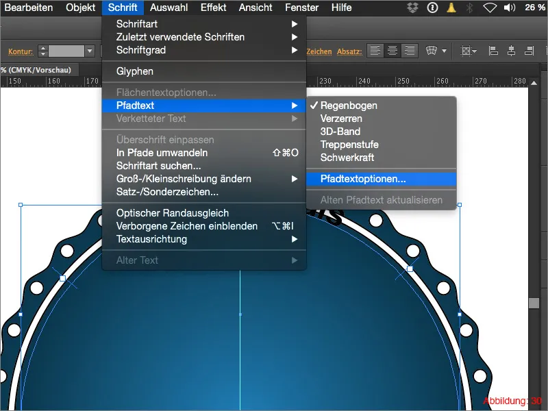
The whole thing should then look something like this. (Figure 31):
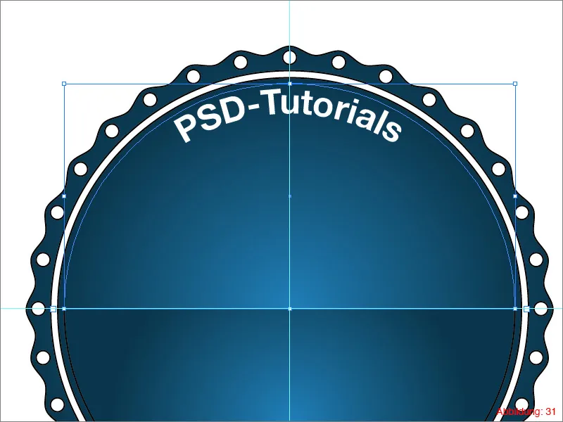
Write "Adobe Illustrator" on the lower semicircle. Again with the path text tool, of course.
As your text will most likely be upside down, you need to grab the middle handle with the mouse and drag it upwards. And poof ... the text is upside down.
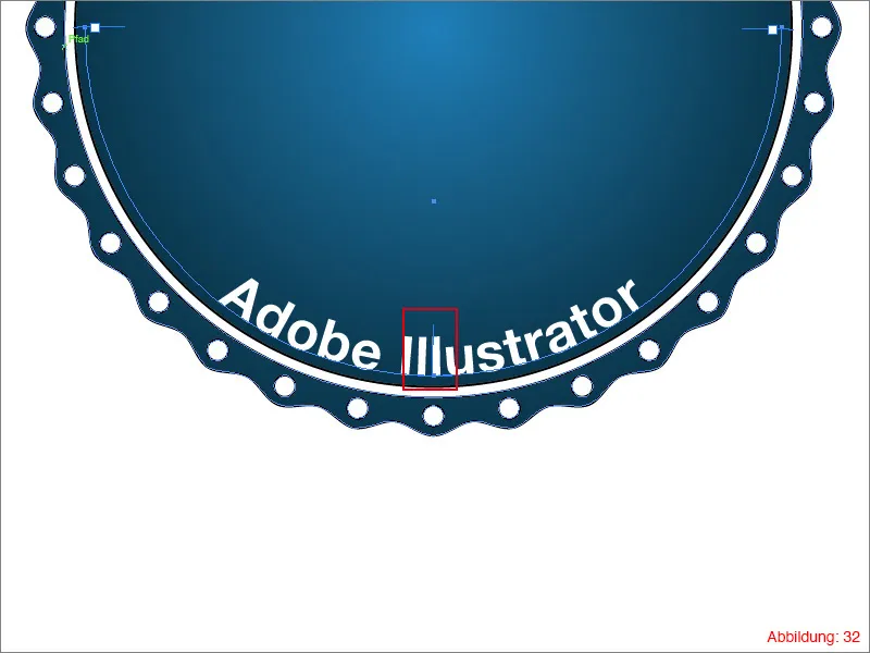
In the supplied working files you will find a file called "PSD-Logo.ai".
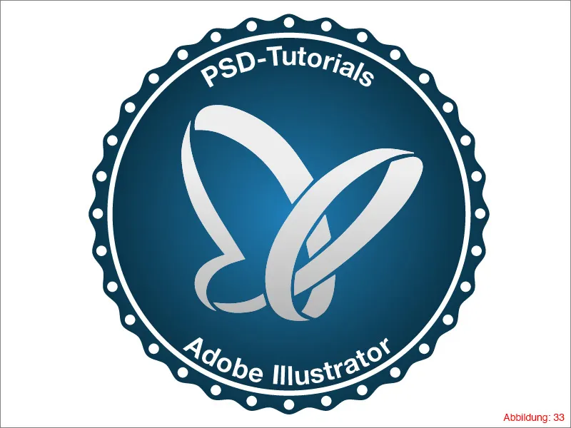
Place this file in the middle of your badge.
The whole thing should then look something like this. (Figure 33):
Step 4: Building the badge tail
The last step is to build the plaque tail to complete our project.
Grab the drawing pen tool and simply draw a kind of plaque tail with five corner points. (See Figure 34).

Duplicate this path once and position the two tails so that they are twisted at different angles. It is important that the two paths are in the background so that they partially disappear behind the plaque. (See Figure 35).
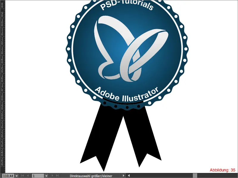
Give the tails a red surface color. (Figure 36).

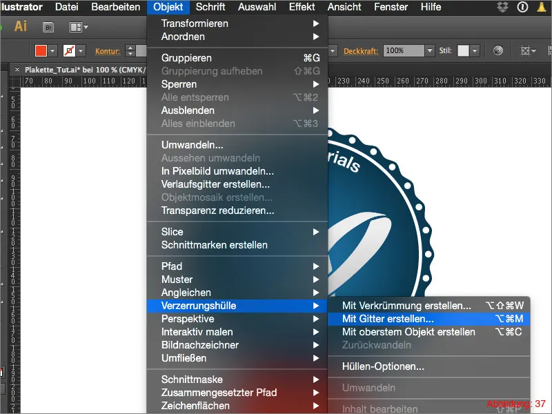
So that the whole thing doesn't look quite so static, you can select one tail each and then use Object>Distortion envelope>Create with grid ... to deform it so that the whole thing looks a little more dynamic. (Figure 37 & 38).
You can give free rein to your creativity when distorting. Once you are happy with your distortion, your plaque is finished. The fact that the punched-out elements allow the tail of the badge to shine through makes the whole thing look even more futuristic and unusual. If you don't like this transparency, you can of course simply place another white area between the badge and the badge tail.

Final words:
Once again, we have come to the end of a tutorial. As always, I hope you enjoyed it and learned a thing or two. If you still have any questions, please feel free to write them in the comments below this tutorial. I will do my best to answer them as soon as possible.
With this in mind ...
Stay creative
Yours, Julian


