The power of the look palette
Introduction:
Hello dear PSD community. I'm delighted that you've joined me again for one of my tutorials. Today we are going to create such a button together (Figure 01). However, this button has a special feature. Because if you change the lettering here, the button always resizes automatically. The following tutorial will show you how this works and how you can create such a button or something similar in Adobe Illustrator. Have fun with it ...

Step 1: Create lettering
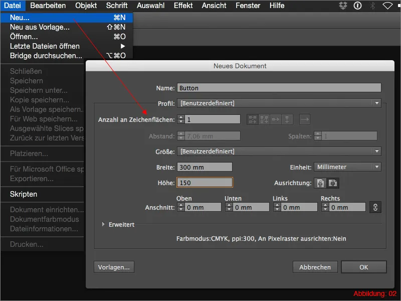
Once in Illustrator, go to File>New and create a new workspace. Select a size of 300x150mm and confirm with OK.
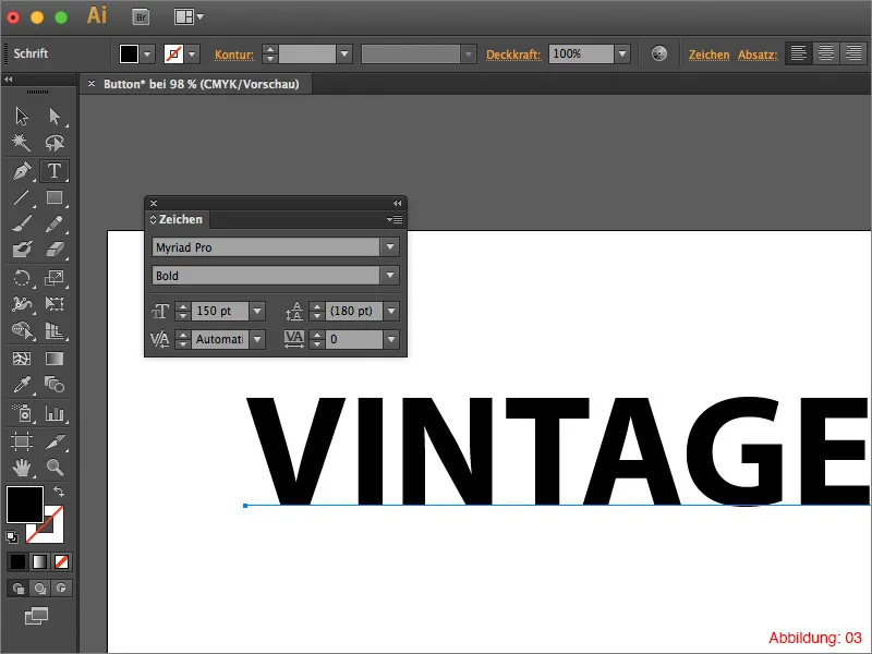
Now grab the text tool from the tool palette and click once on your workspace. You can now use any word of your choice. In my case, I am writing the word VINTAGE in capital letters. I have used the font Myriad Pro in Bold for this. I chose 150pt for the font size.
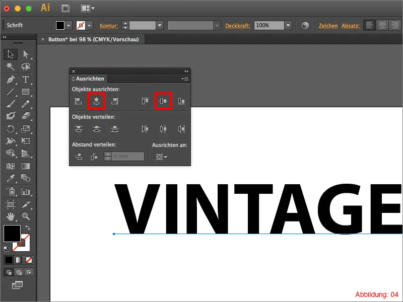
Use the Align palette to ensure that your text is centered on your workspace (Figure 04).
If you are looking for this palette in vain, you can find it via Window>Align.
Mini tip:
To ensure that your button looks good later on, I recommend that you choose a fairly thick and bold font, as we will also be working with a subtle color gradient later on and this would not come into its own on a very fine font.
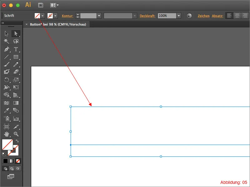
Now select your lettering and switch off the solid color so that you can no longer see the lettering. (Don't be alarmed, it has to be like this ;-) ) (see Figure 05).
Step 2: Now comes the special thing about this button
Now that you have created your lettering, we can start building the button around the lettering. And now comes the special part: We will build and design the entire button in the look palette. (You will only find a single object in your layer palette later on).
First you need to show the Appearance palette in Illustrator. If this is not yet the case for you, you can find it via Window>Appearance.
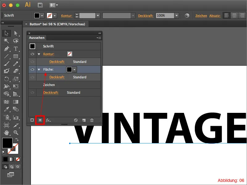
Now select your lettering and click on the small button in the lower left area of the Appearance palette (see Figure 06). This creates a new surface color and you can see your font again.
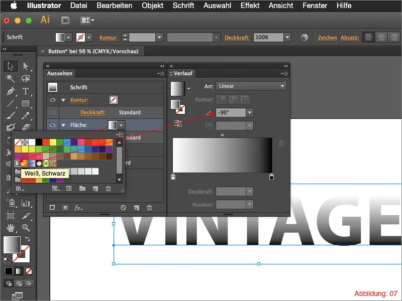
Now click on the black/white gradient and rotate it by -90° in the gradient palette (Figure 07).
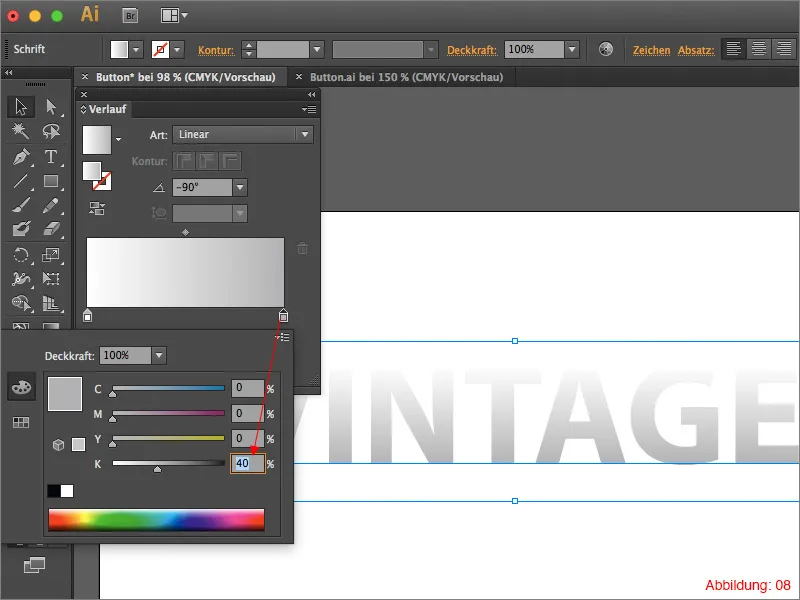
Now you need to soften this gradient, which is still very hard at the moment. To do this, click on the black color field in the gradient pal ette and change the pure black to a light gray (Figure 08).
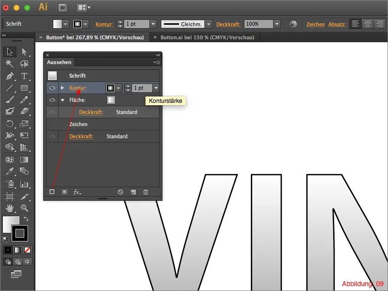
Then go back to the Appearance palette and this time create an outline. (This can also be done via a small button at the bottom left - see Figure 09).
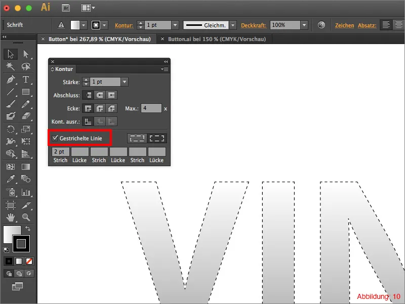
Now go to the Outline palette (if this is not displayed, you can find it via Window>Outline or via the shortcut Command+F10) and check the box next to Dashed line (Figure 10).
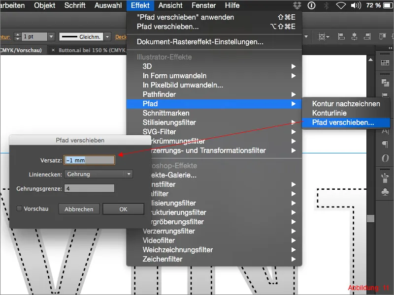
As this outline is supposed to represent something similar to a seam, you need to move it inwards a little so that it sits on the font. You can do this via Effect>Path>Move Path ... Enter -1mm in the following window and confirm with OK.
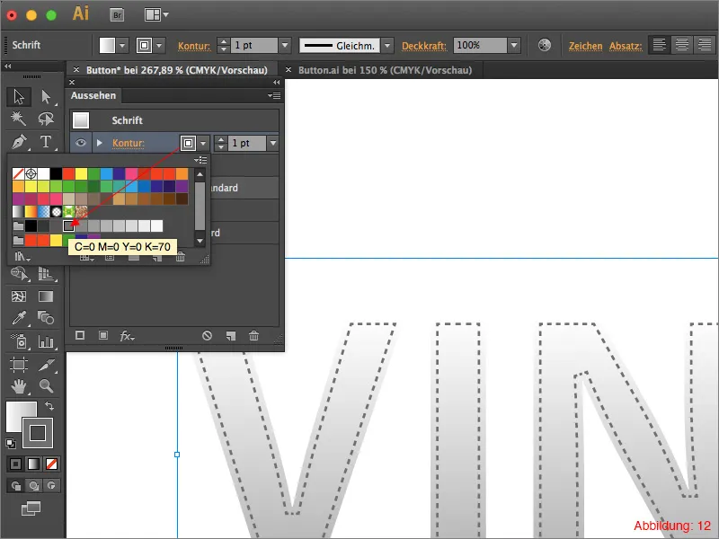
Then give this dashed outline a color of 70% gray (Figure 12).
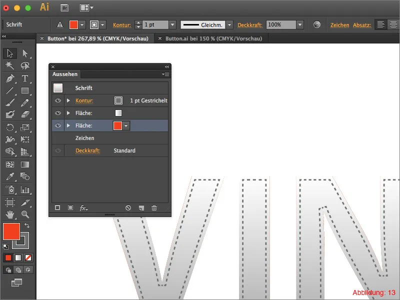
The next step is to create the frame for the button. To do this, go to the Appearance palette again and create a new area color as in the previous steps. Assign a red color to this area and make sure that this area is at the bottom of the Appearance palette (Figure 13). (If this is not the case for you, you can simply drag and drop the area color to the bottom).
At the moment, this surface color still has the shape of the lettering and is therefore not visible. To turn the whole thing into a rectangle, go to Effect>Convert to shape>Rounded rectangle. In the following dialog box, you can keep the default values or change them to your liking. Confirm the window with OK.
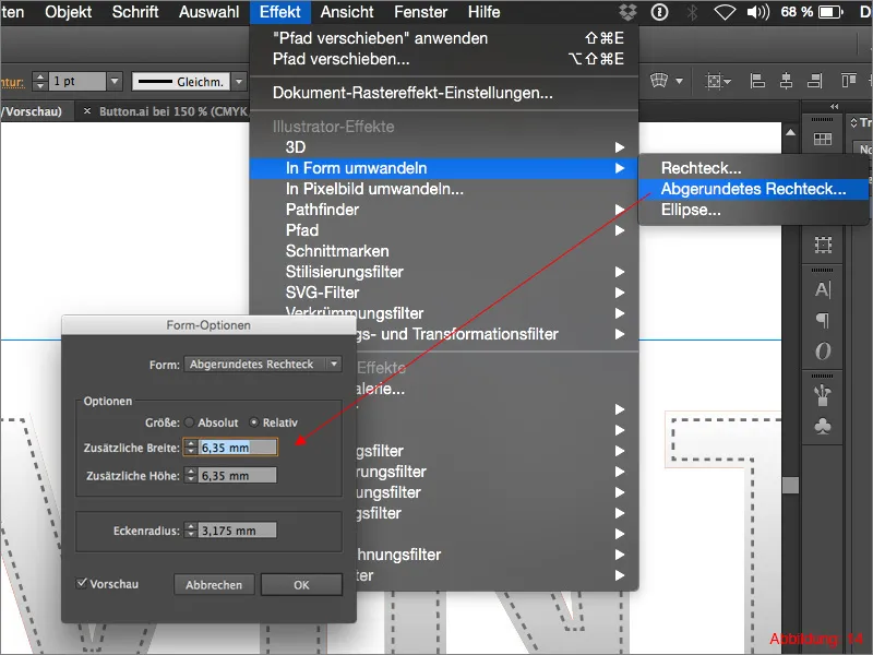
You must now duplicate the red rectangle you have just created. To do this, click on the area in the Appearance palette and then click on the small symbol in the bottom right-hand corner (see Figure 15).
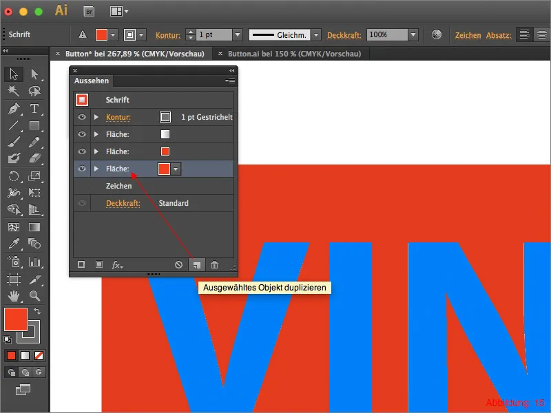
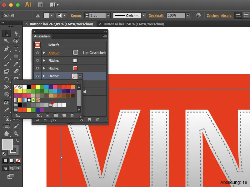
You now have two red area colors in your appearance palette. Fill the lower of the two with a light gray (30% black).
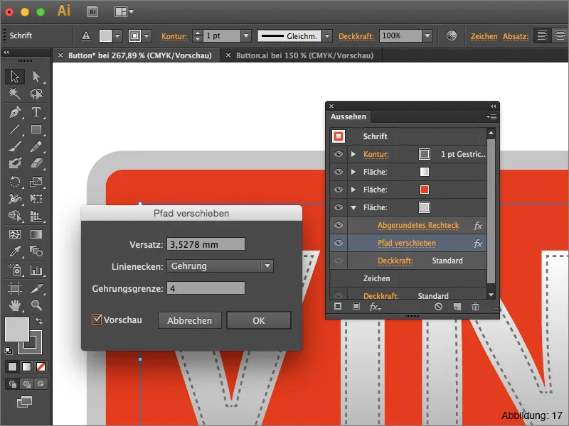
Then go to Effect>Path>Move Path ... In the following window, you can use the default values (3.5278 mm) again and confirm with OK. With this command you have now created a thin gray frame around your red rectangle.
The whole thing should now look something like this (Figure 17):
The next step is to integrate another seam or dashed line into the red area. To do this, go to the Appearance palette as usual and create a new outline over the red area (again using the small button in the lower left area of the Appearance palette).
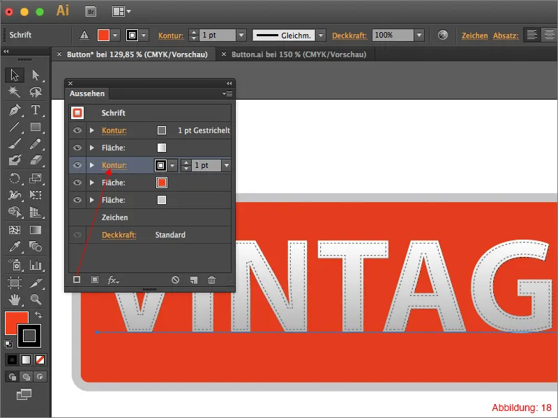
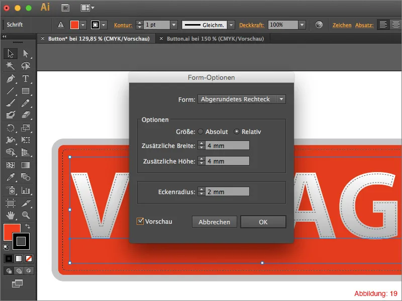
By default, this outline is again created directly around the lettering and also has the shape of the individual letters. To convert this outline into a rectangle with rounded corners, click on Effect>Convert to shape>Rounded rectangle ... in the top menu bar.
Activate the preview in the following dialog box and select a value of 4mm for the width. Do the same for the height. To make this outline harmonize even better with the red area behind it, set the corner radius to 2mm and confirm with OK.
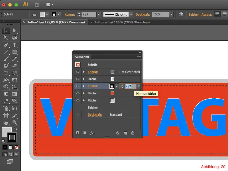
The outline is still a little too narrow with the preset thickness of 1pt. Therefore, increase it to 2pt in the appearance palette.
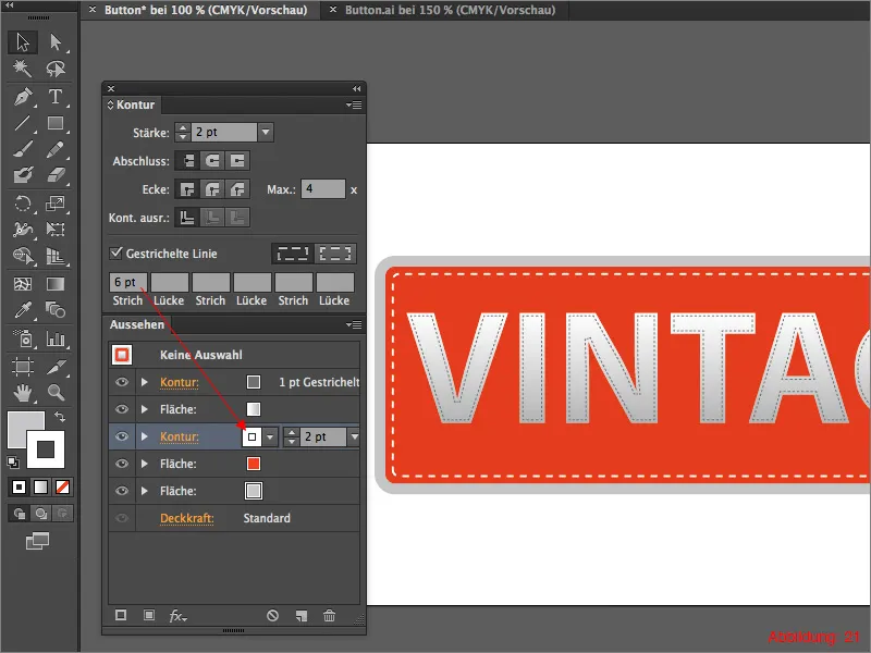
As this line still looks rather compressed and not really nice, increase the stroke in the outline pal ette from 2pt to 6pt. Then change the outline color from black to white.
The whole thing should then look something like this (Figure 21):
Step 3: Finishing touches
Now that the basic structure for our button is in place, it's time for a few finishing touches to make the whole thing look a little nicer.
The following steps of this tutorial are chosen at my own discretion and can also be changed individually by everyone. I recommend that you experiment with the settings to create a button that is as individual as possible.
As a first step, we will assign a slight gradient to the red area to add a little more depth to the button. To do this, go back to the Appearance palette as usual and assign a black/white gradient to the red area.
As this gradient should not run from left to right, as with the font, but from top to bottom, you must again enter a 90° angle in the gradient palette (Figure 22).
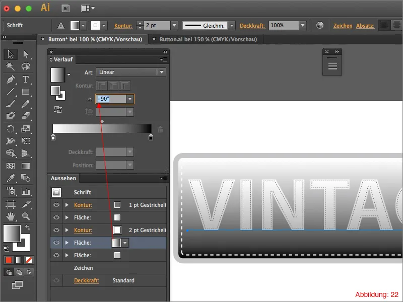
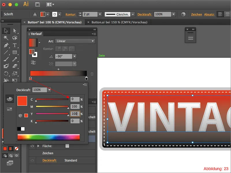
I have prepared two CMYK values for the red gradient, which you can either use as they are or, of course, change as you see fit.
For the upper area of the gradient, I have decided on a slightly lighter red color: CMYK - 0/100/100/0
I used a darker shade in the lower area: CMYK - 0/100/90/20.
To assign these colors to the black/white gradient, you have to double-click on a color field in the gradient palette as usual and then enter the respective CMYK value (Figure 23).
The whole thing should then look something like this (Figure 24):

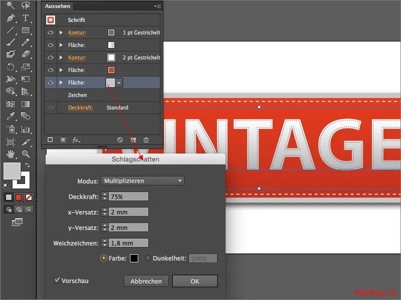
Finally, we give the button a light drop shadow. To do this, click on the outermost grey area in the Appearance palette and then go to Effect>Stylization filter> Drop shadow ... In the following window, you can set the direction in which your shadow should run and how soft the edges should be displayed. For my drop shadow, I decided on 2mm for x-offset and y-offset. I chose a value of 1.8mm for the blur. When you are happy with your settings, confirm the window with OK.
Your button is ready.

Pros & cons:
For all those who are now wondering after this tutorial what the advantages and disadvantages of such a button created in the Appearance palette are, I have prepared a short list of pros and cons.
Pros:
- If you realize after creating such a button that you would like to change the text, you can do this without any further problems, because the size of the button always adapts automatically to the height and length of the text.
- All contours, surface colors and color gradients are arranged centrally in the appearance palette and can be easily changed and adjusted at any time.
- Such a button is only displayed as a single object in the layer palette and ensures that everything remains clear when working with other objects in the same file.
Contra:
- At first it may be a little complicated to set everything using only the appearance palette, but once you have created one or two such buttons, you will get the hang of it pretty quickly and can work with it quickly.
- If you want to convert the text into paths, this is possible, but the individual areas, contours and color gradients are divided into different objects in the layer palette.
Final words:
We have now reached the end of the tutorial. I hope you enjoyed it and that you were able to pick up one or two tips or tricks. If you still have any questions about this topic, just write them in the comments below this tutorial. I will do my best to answer them as soon as possible.
Yours, Julian


