This is what it will look like. But enough talk now. Let's get started directly in Illustrator ...

Step 1: Create a background
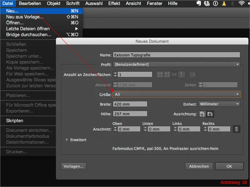
Before we can start with the actual work, you need to create a new workspace. You can do this using FileNew or the shortcut Command/Ctrl+N. Select a format of DIN A3 in landscape format and then confirm with OK.
Now we can finally get started.
Grab the rectangle tool and use it to create a rectangle that stretches across the entire workspace.
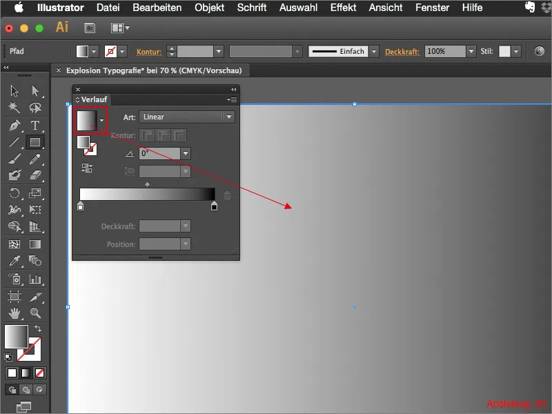
We now need to fill this rectangle with a gradient. Blender the gradient palette and then click on the standard black/white gradient (see Figure 03):
(If you can't find the gradient palette in your workspace, you can show it via WindowGradient ):
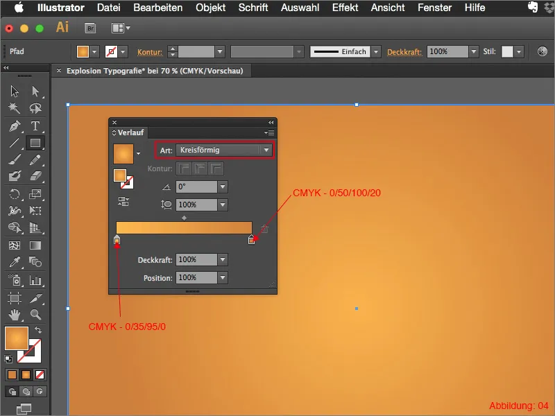
Since we need a circular gradient, you need to change the gradient type from Linear to Circular.
Now it's time to bring some color into play. I have prepared two CMYK color values for this tutorial.
- light orange: CMYK - 0/35/95/0
- dark orange: CMYK - 0/50/100/20
Double-click on one of the gradient color fieldsto assign the two colors to the gradient. The whole thing should then look something like this (see Figure 04):
To ensure that the gradient is not positioned quite so accurately in the middle, you now need the gradient tool from the tool palette (see Figure 05):
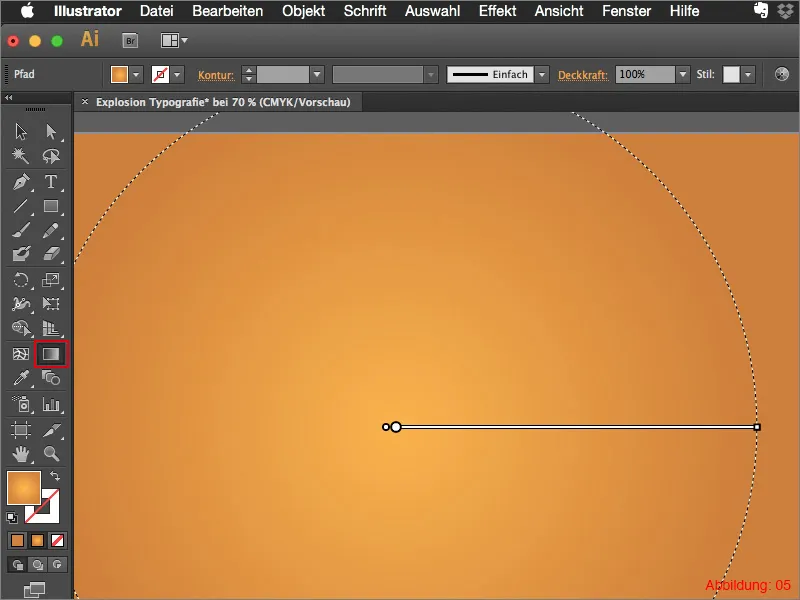
As soon as you have activated this, a kind of gradient line should appear on your orange gradient. Move this line slightly to the top right (see Figure 06) until the center point is no longer in the middle.
The background gradient is finished.
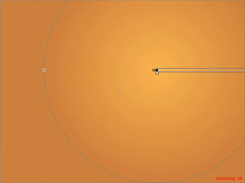
Now we will work on the swirl, which will also serve as a background element.
Grab the rectangle tool and create a rectangle with the dimensions 30x410mm.
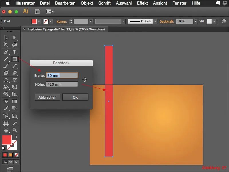
Then use the direct selection tool (white mouse pointer) and move the corner points of the rectangle so that it is slightly narrower at the bottom than at the top (see Figure 08):
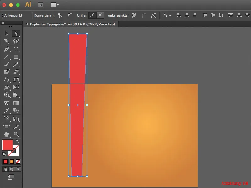
When you are happy with this, you will need the Rotate tool from the tool palette. Hold down the Alt key and click on the lower center point of the rectangle you have just created. (Figure 09):
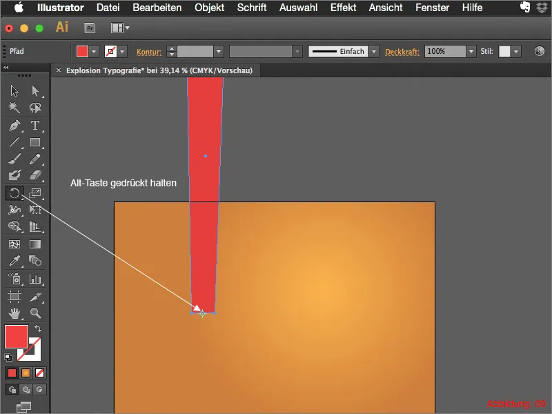
This will open a new dialog box in which you can enter the angle for the rotation.
You will need a total of 14 copies of this rectangle. These copies should all be rotated at the same distance from each other. As Illustrator is quite clever in such matters, it is sufficient to enter 360/14 and confirm by clicking on Copy.
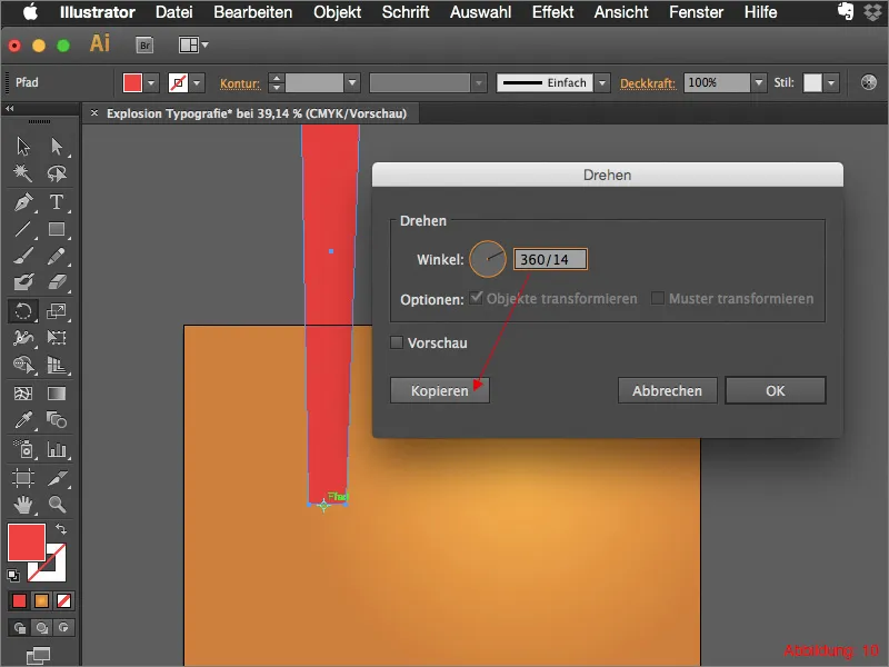
Then repeat this process 13 more times. But don't worry, you don't have to do this again and again using the rotate tool. It is now sufficient to press the shortcut Command/Ctrl+D 13 more times.
(Command/Ctrl+D always repeats the last operation you performed in Illustrator).
It should then look like this (see Figure 11):
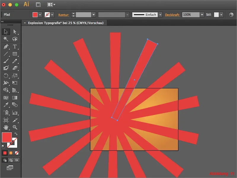
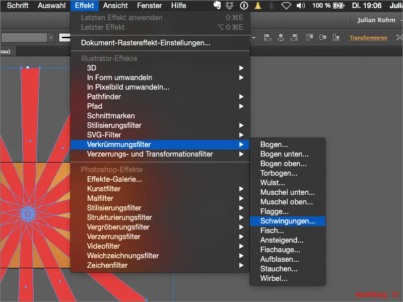
Group all rectangles with Command/Ctrl+G and then go to Effect>Curvature Filter>Vibrations... (Figure 12):
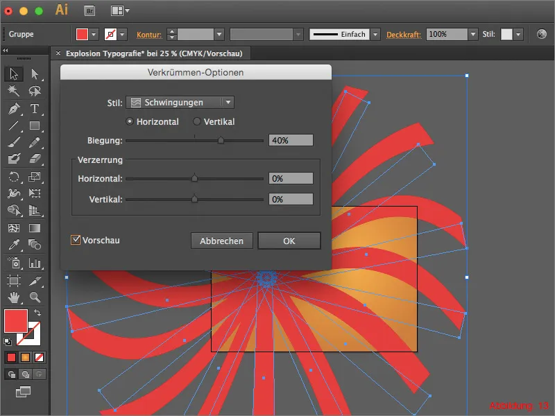
In the following window you can set 40% for the bend and then confirm with OK (Figure 13):
Now grab the whole group and move the center point to approximately the same point as the gradient center point. Make sure that your work surface is completely covered by your swirl (Figure 14):

To prevent the swirl from protruding wildly over your work surface, create a new rectangle that is the same size as your work surface.
Then select the swirl and the rectangle you have just created and right-click on it. In the following menu, simply click on Create clipping mask (see Figure 15):

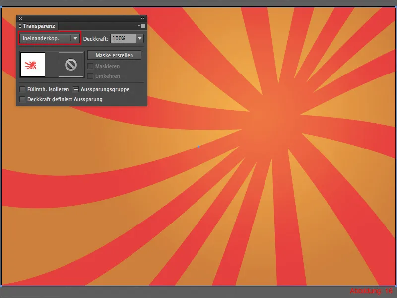
As the swirl should not be completely opaque in front of the orange gradient, I would like to offset it with a fill method. To do this, go to the Transparency palette and set the mode from Normal to Overlay or Soft Light. You can then decide for yourself what you like better.
Your background is ready. I recommend that you lock this layer with a lock so that nothing is moved there.
Step 2: Exploding typography
Now that we've finished with the background, we can start with the exploding or splintered typography. Create a new layer for the font and name it "Text" or "Typography".
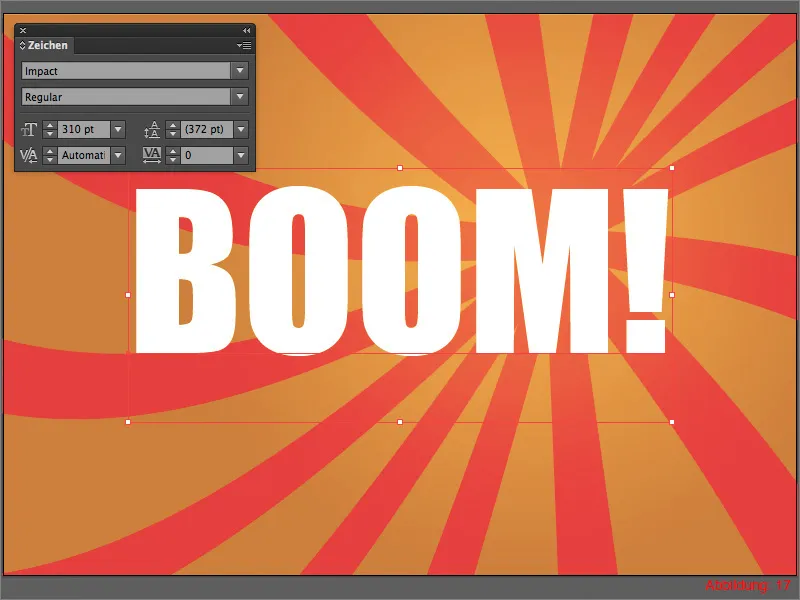
Grab the text tool and write the word "Boom!" or something similar on your workspace. I recommend using a font that looks relatively thick and stable. For this tutorial, I have chosen the font Impact with a font size of 310pt. You can leave the font color white (see Figure 17):
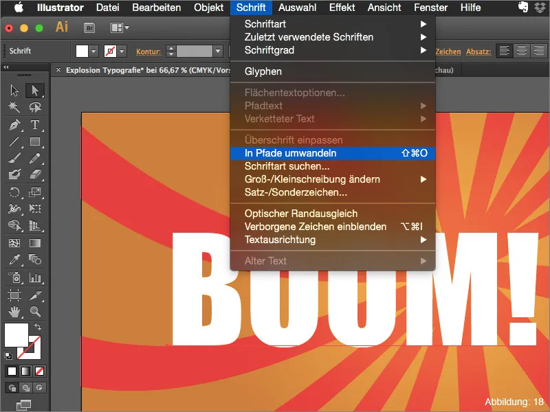
So that we can make the text split, you have to convert the font into paths. To do this, go to Convert font to paths. Alternatively, you can simply use the shortcut Command+Shift+O (on PC: Ctrl+Shift+O) (Figure 18):
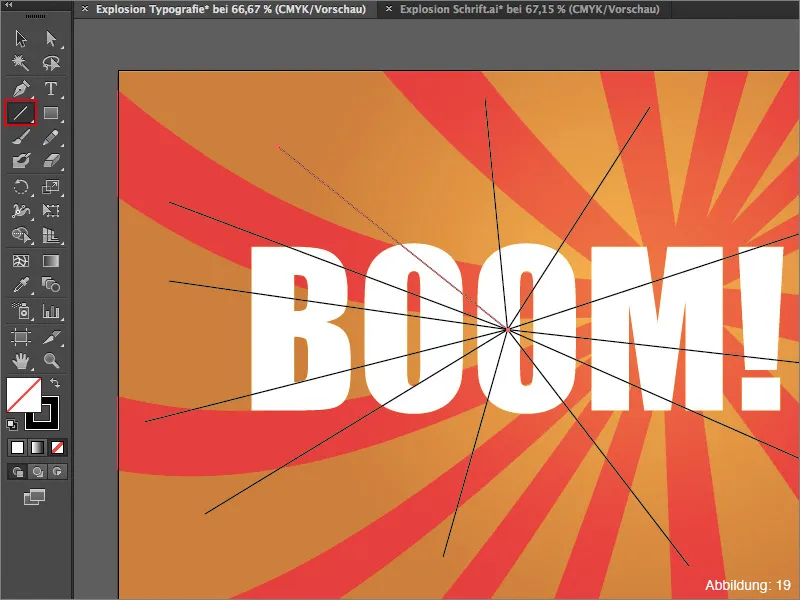
Now it's time for us to create the division where our font will later burst apart. To do this, take the line segment tool from the tool palette and draw several lines from the middle of the letter "O". The whole thing should then look something like this (see Figure 19):
So that the explosion doesn't look so uniform later, you can now draw more lines through your text (see Figure 20). Do this until you are satisfied. The wilder the lines, the more violently your text will shatter later.
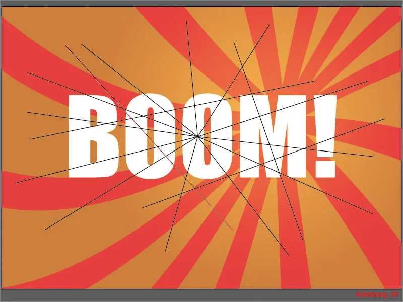
Once you have finished with the lines, you must mark all the lines and the text. (If you have created a new layer for this, as described at the beginning of step two, it is sufficient to simply select the entire layer).
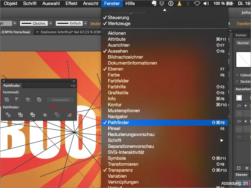
Then we need the Pathfinder. If you have not yet shown it, you can find it via WindowPathfinder (see Figure 21):
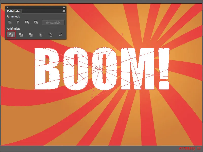
Click on Split area in the Pathfinder (Figure 22):
If you now take a look at your layer palette, you will notice that a new group has been created there (see Figure 23):
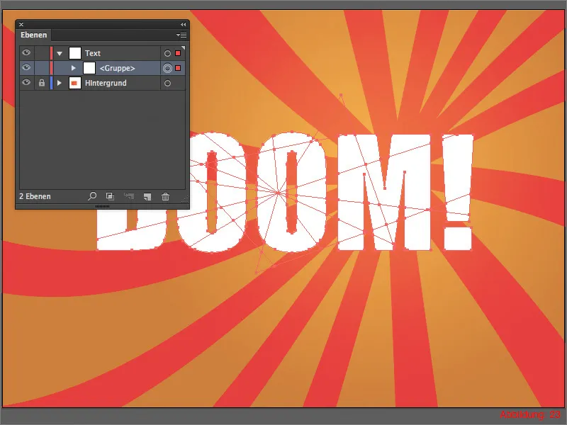
We now need to ungroup this group. To do this, use the shortcut Command/Ctrl+Shift+G.
You should now find lots and lots of individual parts in your layer palette (see Figure 24):
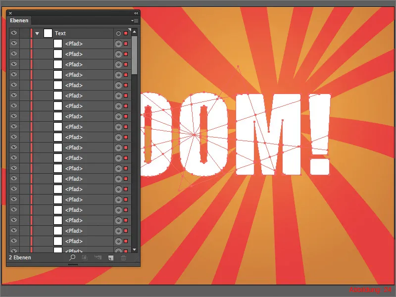
Now the time has finally come ... Everything is ready for the big explosion ... :-)
To do this, go to ObjectTransformTransform individually ...
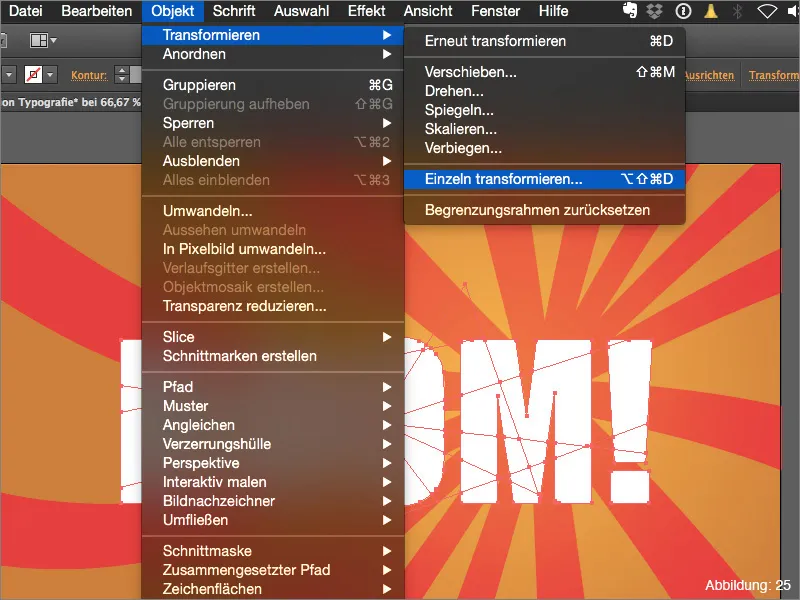
You can now control your explosion in the following window. For the whole thing to work properly, it is very important that you check the Random value and Transform objects boxes.
I recommend 1°-5° for the angle. For the tutorial, I decided on 3°. However, as we are working with random values here, you will have to play around a bit until you get it right.
You can control the dispersion of your explosion using the two sliders Horizontal and Vertical in Move. I have used the two values -4 and 3 here (see Figure 26):
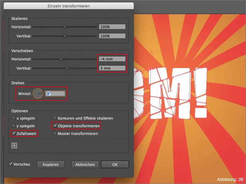
As soon as you are satisfied with your settings, you can confirm this dialog box with OK.
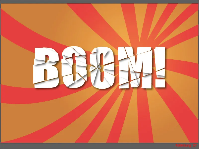
At the moment you can see that the text has been splintered, but that it is still quite flat. But I also have a solution for this.
Use the selection tool (black mouse pointer) to select all the text splinters and then go to EffectStylingFilterShadow. This will open a new dialog box in which you can control the settings for the drop shadow. In our case, we do not need to change anything there and can confirm directly with OK (see Figure 27):
Your split font is ready.
Step 3: Finishing touches
How could you make the font you have just created look even better? Quite simple ... I have included a kind of comic bomb in the supplied working files.
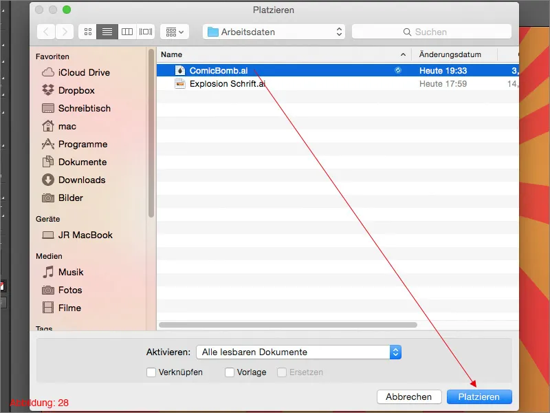
Place it on your workspace using FilePlace. The file is called "ComicBomb.ai" (see Figure 28). You can freely adjust the size.
In my case, I placed the bomb in the lower right part of the workspace and rotated the text slightly upwards (see Figure 29). Now it looks as if the boom is a kind of noise/sound from the bomb. Since such an explosion naturally generates heat and one naturally associates warm colors with heat, the orange-red background also fits very well with our entire composition, I think.

Final words:
Now we've come to the end of this tutorial. I hope you enjoyed it and can now explode, shatter or burst fonts yourself. If you have any further questions on this topic, please feel free to write them in the comments below this tutorial. I will do my best to answer them as soon as possible. With this in mind ...
Stay creative
Yours, Julian


