In the following, I will go into the individual changes in the program interface and what has changed in the background of InDesign:
1.1 New look of InDesign CC
The new dark user interface greets us as soon as we enter the CC version of InDesign. What was already introduced in Photoshop and Illustrator at the time of the CS6 launch has now been brought to Adobe's DTP program InDesign. The menu controls, control panels and selection windows are now also "mid-dark" by default.
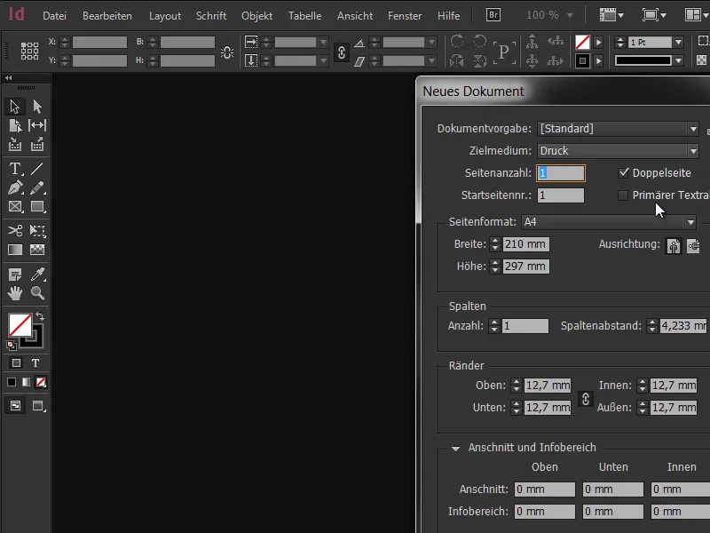
However, if you are not happy with this, there is certainly no need to despair at this point. The user interface can be changed back to the familiar light environment with just a few clicks in the default settings. To do this, simply follow the path Edit>Preferences>User interface.
At the top right you will find the corresponding selection field Color theme. InDesign offers four predefined motifs. In addition, it is also possible to adjust the brightness and appearance continuously using the slider to the right. From a threshold value of 50%, the colors invert and the design changes to the light version.
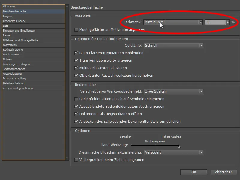
The advantage is quickly apparent: Depending on the working environment and lighting conditions in the premises, the display and presentation can be adapted to the circumstances. A practical checkbox on the left-hand side of the menu tells us what else is possible. With the Adapt mounting surface to subject color function, it is also possible to adapt the display of the mounting surface to your own requirements.
This should be a great advantage, especially if you want to focus and concentrate more on the document. Incidentally, this can also be deactivated by right-clicking on the assembly area. This was not the case in the previous version CS6, in which the assembly area was generally bright white.

1.2 The new preview option
We now also have a great feature when creating documents. The preview optionis already familiar to us from many menus and allows us to check in real time what effect the change will have on our document. Finally, this function is also available when creating new documents - whether for print / web or digital publication.
If the checkbox is activated, every change is immediately displayed in the background, making it easier to define whether we would prefer to work in portrait or landscape format, with 2 or 3 columns or with large or small margins. This is a great addition, as in the past errors were often only recognized after the document had been created and the entire procedure had to be repeated.
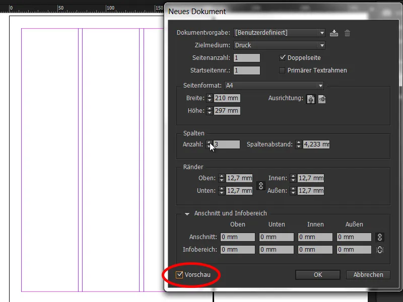
Of course, all presets can also be saved so that they can be loaded again later with a single click.
1.3 Font view now grouped
Font selection in InDesign is now practical and simple. The placement of text has always played an essential role in InDesign, so it's no surprise that the huge range of font families has been equipped with a few small tools that make a big difference.
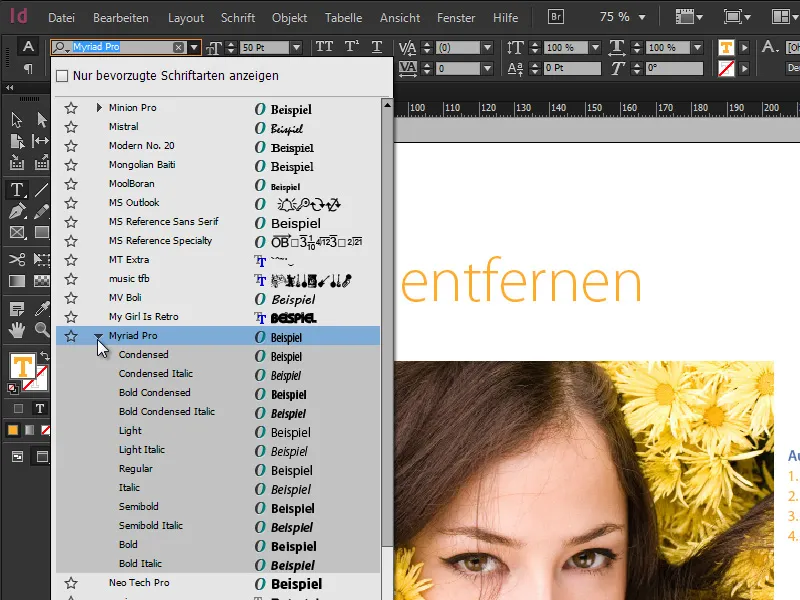
Font families are now grouped together in the drop-down list, which makes navigation much faster. This little gadget is something that has unfortunately been too long in coming, but fortunately has now found its way into the program. However, individual cuts are not included.
1.4 Set favorites
Working with texts also requires a certain knowledge of various fonts. Favorite font families that are frequently reused quickly emerge. A new feature is that the drop-down menu now not only provides a preview of the collected fonts, but that these can also be marked as favorites by clicking on the adjacent star. Clicking on the checkbox for Show only favorite fonts then significantly reduces the selection and makes it much easier to find your way around.
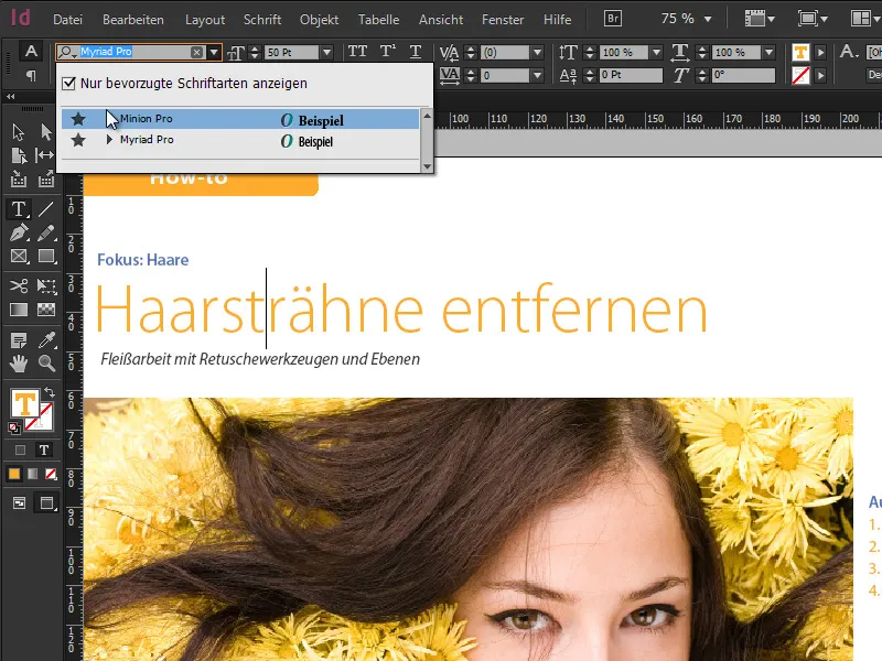
1.5 Search for fonts directly by typing
Last but not least, the search field for fonts has now also been equipped with a new function. The first letter of a font can be entered here as required or only partial words of the name can be set as a filter. For example, if I enter the word "Sans" in the search field, I get all font families and individual fonts that contain the word "Sans" somewhere in the name - live with every letter typed.
Really handy if you don't have the exact name of the font memorized. The principle is very similar to Google search. The same applies to various font styles: if I enter "semibold" in the search field, I get all font styles that are also available in semibold or where the word semibold is included in the name.
1.6 64-bit support
Operating systems have long been available in 64-bit mode, which leads to faster results in the calculation of process-based graphics applications. Photoshop has supported 64-bit mode since Creative Suite 6, while InDesign has been the laggard in this respect until now. With the introduction of the Creative Cloud, Adobe now also offers InDesign in 64-bit mode, which leads to faster results and more effective compression and can better utilize the available resources.
All in all, this speeds up the workflow, which is always welcome in principle. However, a 64-bit operating system is required, which should be checked in detail for Windows users due to the 32-bit operating systems of Windows 7 and Windows 8 that are also available.
1.7 HiDPI response
Everyone is talking about high-resolution displays and Adobe refers to this topic as HiDPI. Apple already uses so-called Retina displays, which means that the display shows so many pixels that you can no longer see a pixel with the naked eye. The pixel density has increased 4-fold. As a result, all icons and control elements in ID have been redesigned and redrawn. The result is the reproduction of all elements in the best quality without any noticeable blurring. However, the hardware must also be available here, i.e. a Retina display as the output medium.


