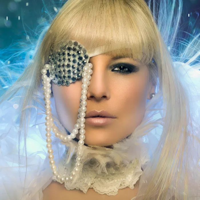
In this tutorial, I'll show you how to create a look with the Adobe Camera Raw converter using ACR, which you can also modify non-destructively at any time. I've already opened a RAW image from a Canon camera, a CR2 file, here in ACR. And now you have thousands of possibilities and the nice thing is: Normally you would say open image at some point, when you're done with the RAW development, and then the retouching starts or the color look, whatever. But if you hold down the Shift key, the Open image option at the bottom becomes Open object.
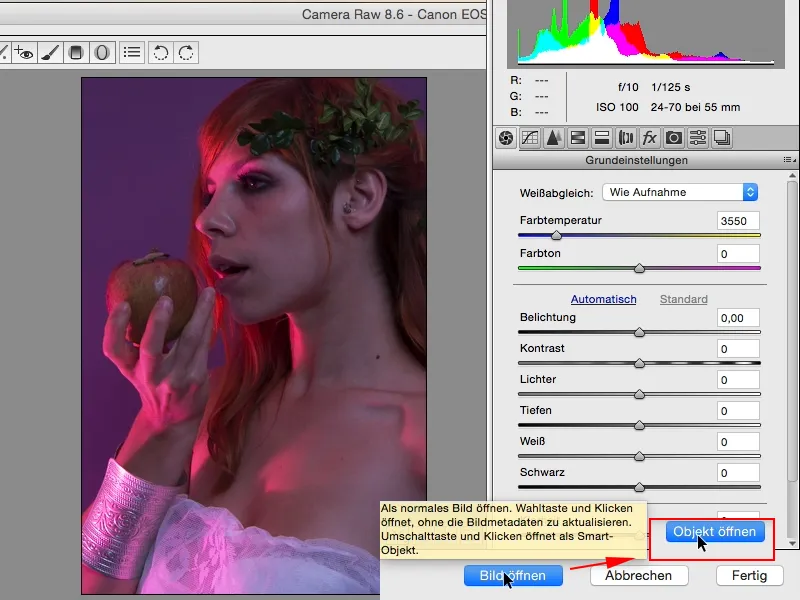
I'm going to open it up here and what Photoshop is going to do is it's going to open a smart object. You can see that down here, and whenever you double-click on it, you'll be taken back to the RAW file in your RAW converter.
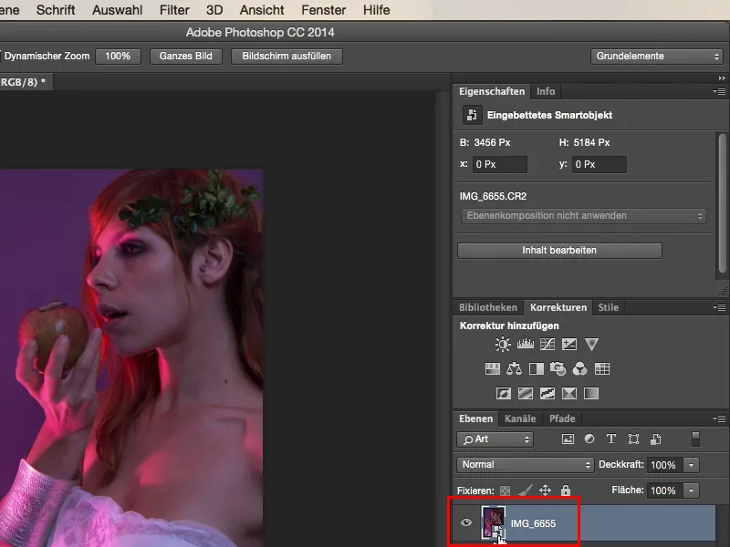
And the possibilities are almost endless. For example, if you want to load an unprocessed RAW here in Photoshop, you can duplicate the whole thing, but you mustn't make the mistake of dragging it onto the icon for a layer copy (1), because then this link (2) on the second layer to the RAW is not separated, which means that no matter which layer you change something on in the RAW, it will always affect both. Yes, and there is a simple command here, and all you need to do is right-click on it, and that is called here: New smart object by copy (3).
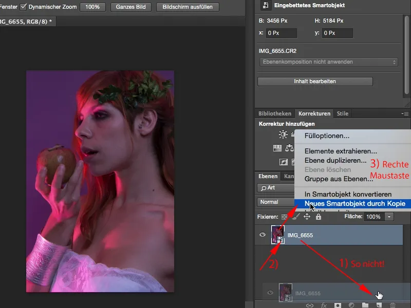
Now I have an absolutely independent smart object from the one below and I can also go back to the RAW file. Yes, and then the fun begins. The simplest thing I can do here with the image is: I look at how does the white balance look extremely warm. That's a cool look that I can definitely use.
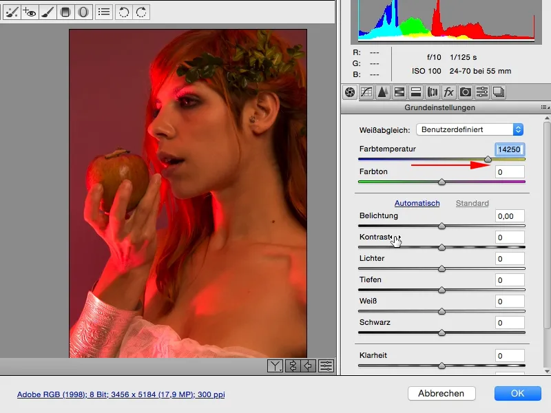
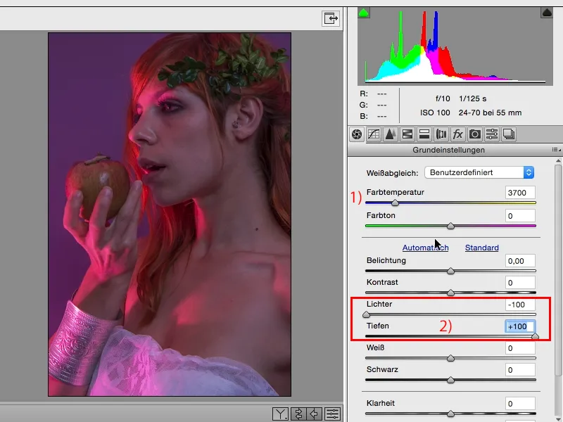
I might leave it like this for the time being (1), I can of course play with exposure, clarity etc., I can lower the highlights here, I can pull up the depths (2), and the whole thing looks a bit different again.
Next, I personally always like to look at this HSL/grayscale slider. Hue, saturation, luminance (1). For me, this is THE tool in ACR, because I can use it to influence colors in terms of hue, saturation and, last but not least, brightness and luminance. In this case, that means I have to analyze my image: Which colors are predominant? I will definitely have magenta, purple, orange and red in it, these are the main components of the image. I'll have almost no green, a little bit here at the top (2) in the branch, and I have almost no blue in the picture, I guess. And accordingly, I can adjust the luminance here with the sliders. I see what happens when I pull up the red (3), and I immediately have the learning effect: Aha, this pink grazing light here on the left (4) has a high proportion of red.
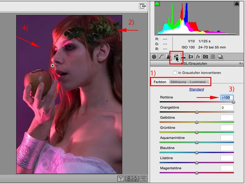
If I want to make it brighter or darker, I have the option of fine-tuning it in RAW. And for my taste, I'd like it to be a little darker (1). Then I look at orange: There's a bit of orange in the skin, at the far left in the hair and in the apple. Yes, I'll pull it down, I'll pull it up, I'll definitely go all the way (2), because then the apple gets a bit more definition and the hair back here gets a bit more shine (3).
These are all things that, if I were to do this in Photoshop afterwards with a layer stack, I would probably have already used up four or five layers just for the two or three changes, I would have to use masks and brushes to crop the hair or painstakingly brush around the fingers and then I would get a color shift that I don't want, so it's a lot more complex. So my tip: everything you can already do in RAW, including color shifts, do it in RAW, make a layer copy of your RAW file and then you can mask it out later.
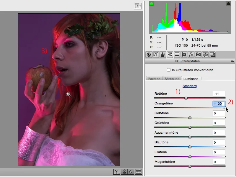
Yes, then we'll see what happens. There won't be that much yellow, maybe a little in the skin, but not much will happen there. Purple, there should be a lot going on now. Aha, I can see, for example, that I can make the background lighter. I can't make it too light (1), because then I'll get unsightly edges on the hair (2).
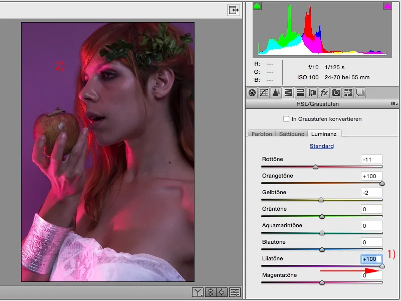
And if I darken it, my dress down here and the bracelet, which is made of metal, probably won't look quite as good.
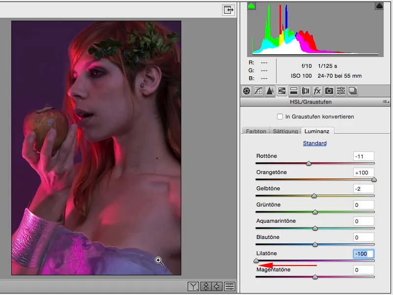
But I can lighten it up a bit so that the dress looks a bit better and also appears a bit whiter.

I have a lot of magenta in the skin, I can see very clearly here that where there is a lot of magenta, it gets really, really bright when I pull the luminance to the limit. Of course, this looks a bit broken and like tonal value breaks on the skin ...
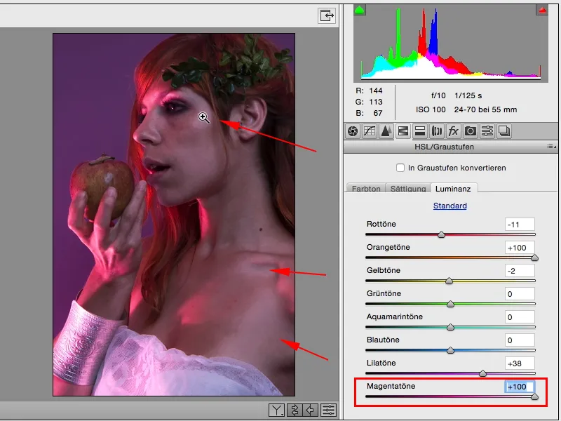
... and I deliberately make it a little darker (1), then I might have the opportunity to lighten the face later with Dodge & Burn and, and, and. If the face is a bit too dark for you, you can use the radial filter (2) above, for example.
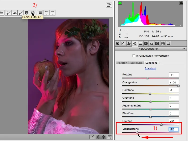
The problem with the radial filter and the graduated filter is that they are built in here: It always, always, always remembers the last setting you made on any RAW image. This means that the very first thing to do is to check whether everything (1) is really set to zero. You can do this by simply double-clicking on the slider (2), then all these settings will be reset to zero. And now I can apply a local correction here, for example. Photoshop only ever wants one value to be changed, otherwise it won't do it (3) ...
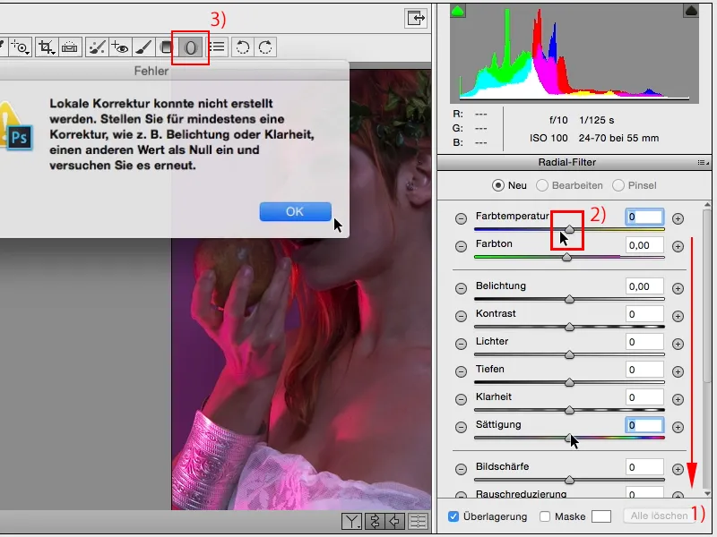
... (1) and says: Here, this area (2), I would like it to be brighter, I can also rotate it, funny handles appear around it, ...
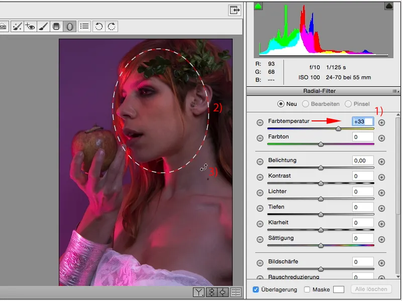
... and then I go back and pull up the exposure a little. And the face is already shining and now I've really arrived here with the focus.
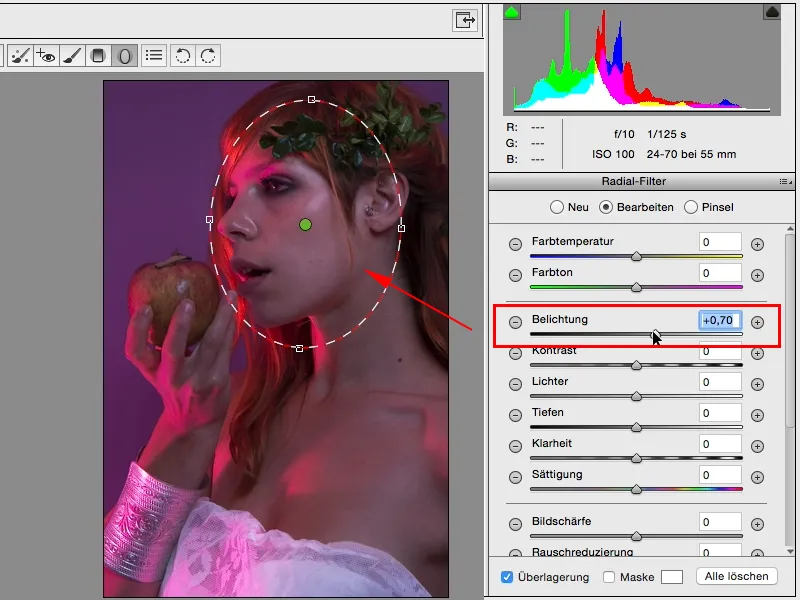
If you click somewhere else (1), you can continue working as normal with these functions (2).
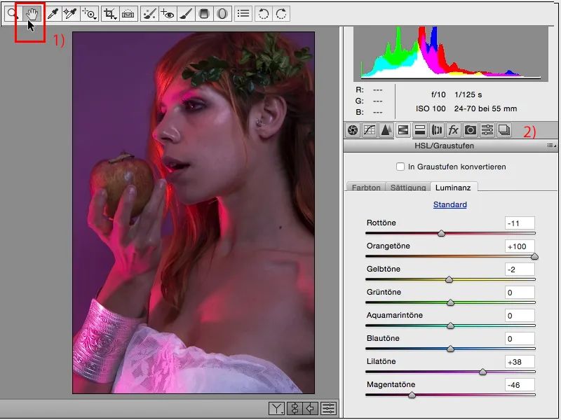
If you click on the radial line (1) again, you will always have this marker; if you move the mouse lightly over it (2), you will also see what effect it has, namely on this area. So here too, you can still adjust this area afterwards. And that's a great option. Everything without masks, everything in this Smart Object, in ACR.
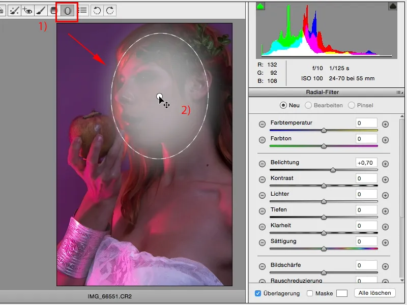
Let's see what else we can improve or what kind of look we can generate here. At the moment, we've only optimized the color and contrast a little. In terms of saturation, I wouldn't do much more, and in terms of hue: I can now see what happens here if I pull the sliders a little more extreme. So I get orange strands in here, the apple looks quite cool, but ultimately that's not what I want ...
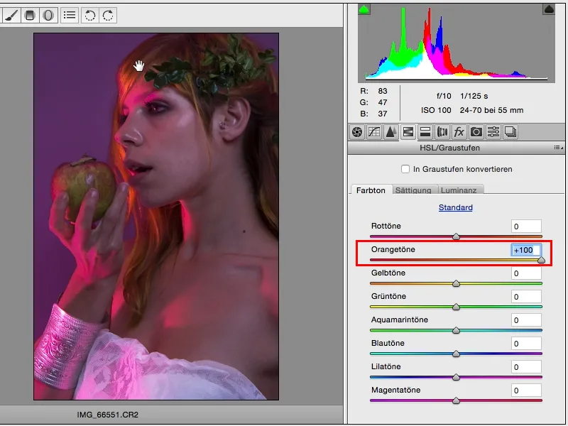
... so I just go over here a little and there: there's just so much red in this picture, there's a lot going on now.
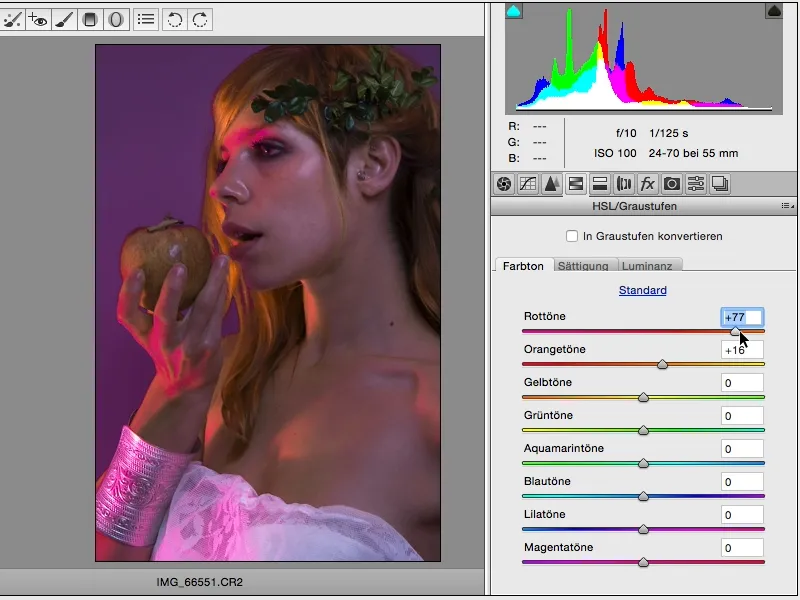
I can think to myself, do I want the whole thing to be pink? Which would be absolutely fine for this picture.
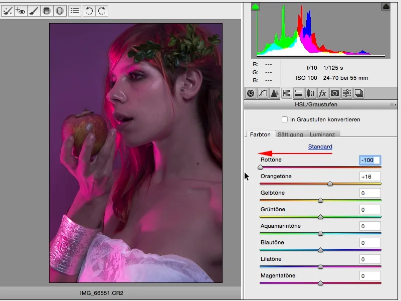
Or I could go a bit more red, but then there would be a few pink areas left, which would probably be more in the magenta range.
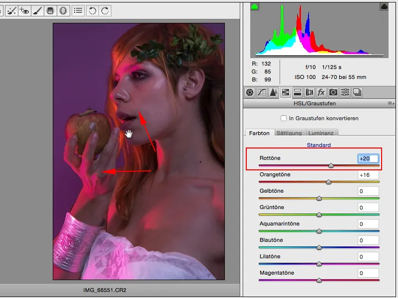
Now I would have to say okay, then I'll just have to add magenta. But it's not quite enough, so it still looks a bit unattractive.
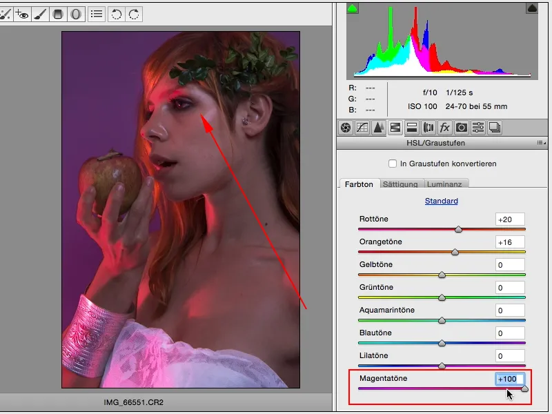
So maybe I'll just add a little more magenta (1) and with the red tones, I'm still thinking about going in the other direction (2). I'll leave it at that.
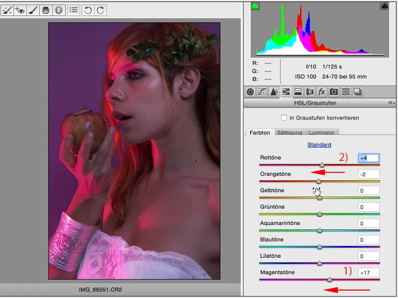
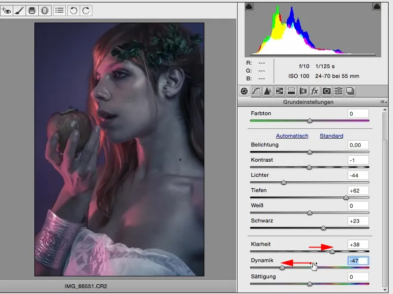
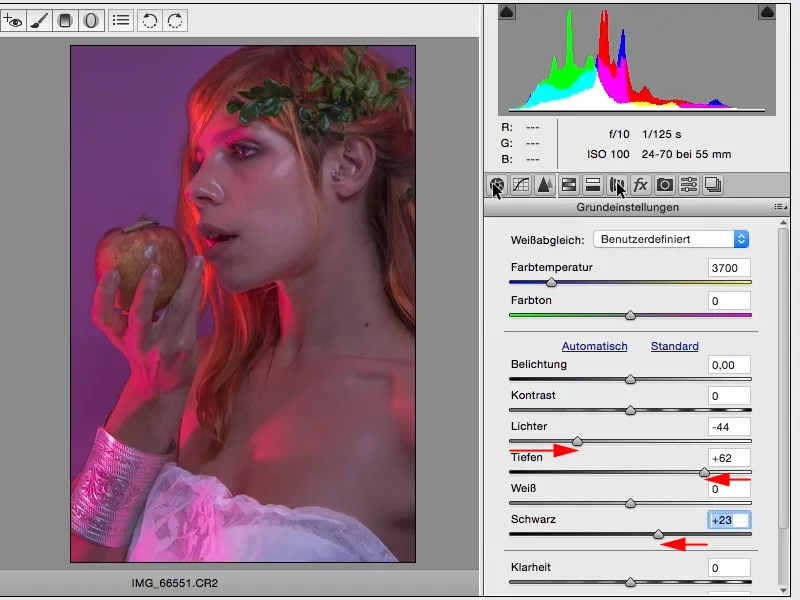
What kind of look can I create here (1)? For example, I can pull down the black level and the highlights and pull up the depths and I've almost created an HDR portrait. This would look very, very good with landscapes, at least for my taste, add a bit of clarity and the look is finished.
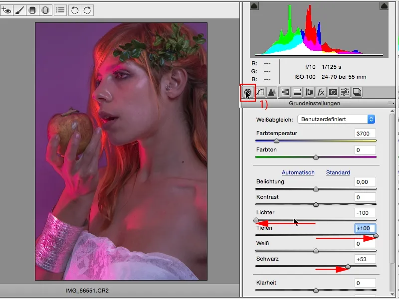
With people, I only give half power here, I take it back a bit, but it still means that I've already created a slightly more three-dimensional look.
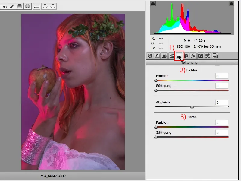
Yes, then the next thing I look at here is this partial toning tab (1), where I now have the option of coloring the highlights (2) and the shadows (3) separately from each other and determining the balance. So how many highlights compared to how many shadows should actually be working in my picture.
If you drag the color slider here (1), nothing happens at first. Nothing happens because the saturation is set to zero here (2, 3).
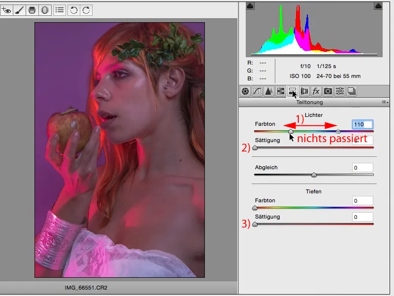
That's why I like to simply set the saturation in the middle of both sliders, then it usually looks like this: both are set to red here.
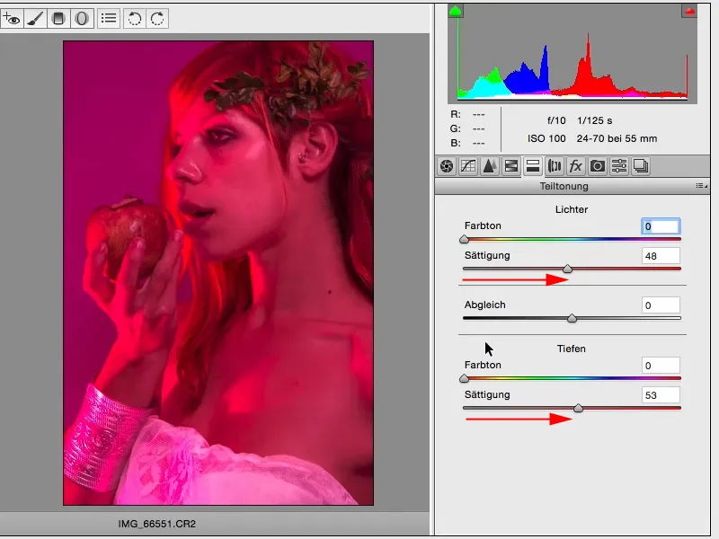
And then I start and look for a tone that I like in the highlights. Then I move to a yellow tone and then I reduce the saturation a little. I usually end up with almost exactly the same setting here, so that the sliders are one below the other, ...
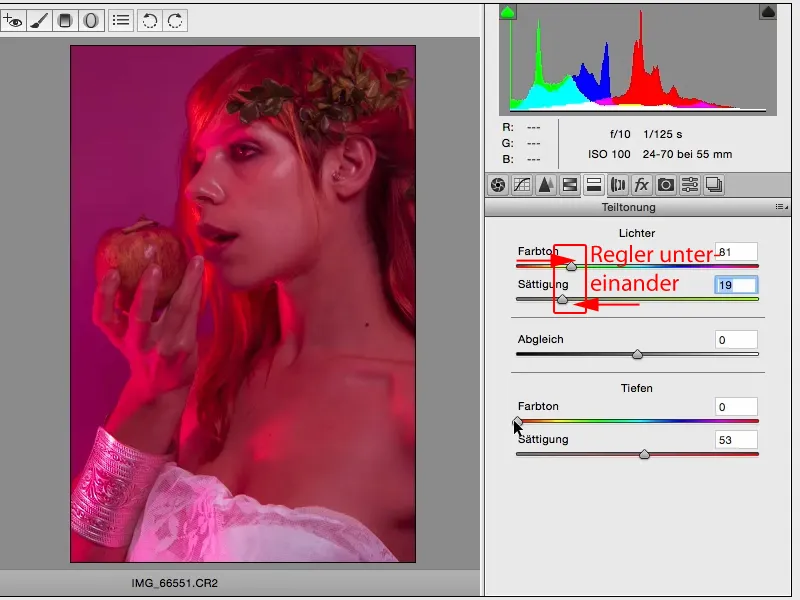
... and then I do the same with the depths. I can also create very unattractive colors here, especially skin tones, ...
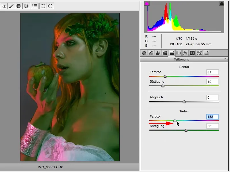
... and now I just have a look: What appeals to me? And if I have (1) blue depths, cyan depths, something like that, between cyan and purple, that doesn't look so bad. And here (2) I reduce the saturation a little. Yes, and when I look at it like this, I think it's absolutely right as a color look.
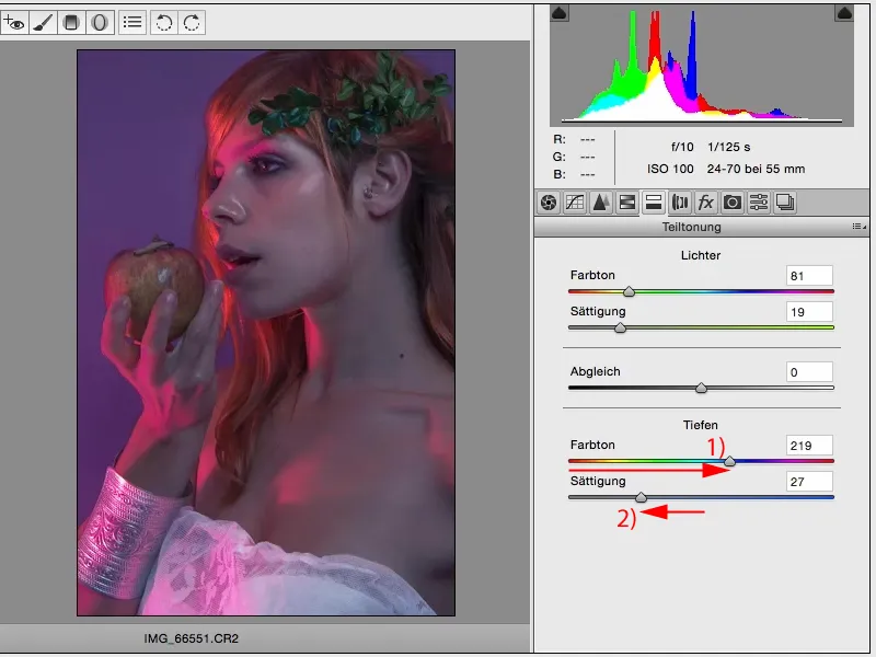
Now I can still do dodge & burn in Photoshop, skin editing etc. But this look, or this technique of creating a look in general, is basically nothing more than RAW development. And anyone can really do it, because the moment you say, I've now adjusted 50 sliders here (1), I'll just go to Cancel or something here (2), or I'll reset the settings in the top right-hand corner (3), you'll start all over again. Or you delete layers and make a new layer copy, separate the smart object and you can start again immediately. For me, this is a very, very nice way to create different ACR looks.
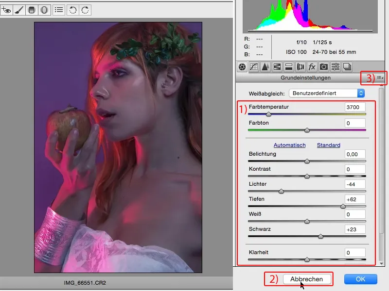
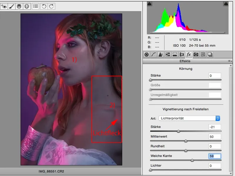
Here at fx (1), you can also very, very quickly create a black ...
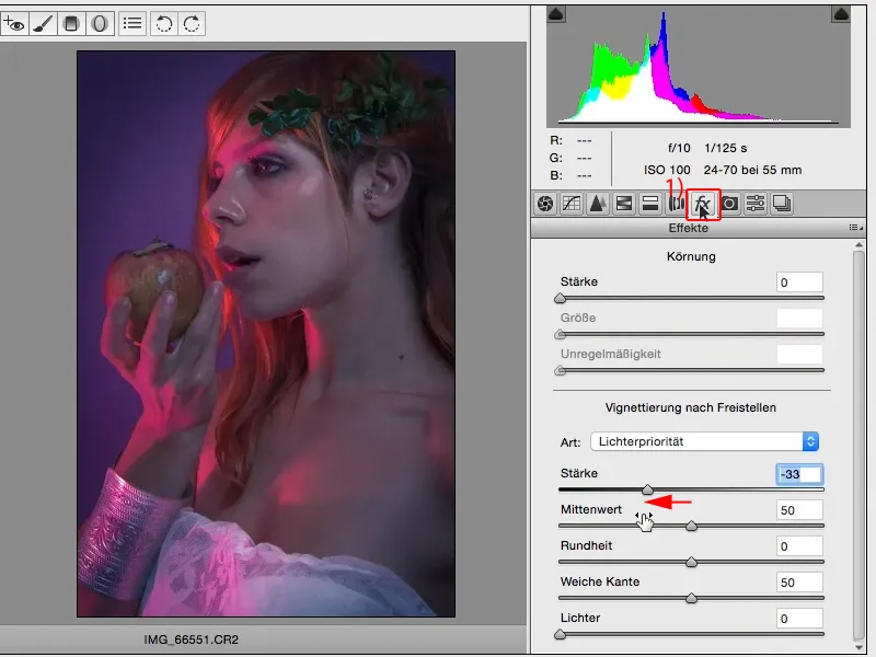
... or a white vignette, and that's also a kind of look, if you like.
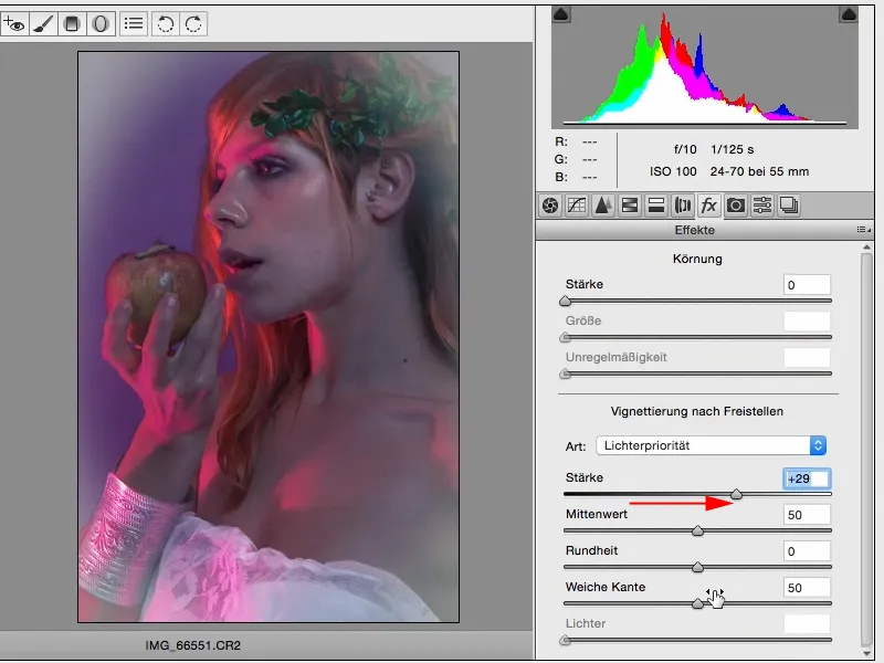
I'm going to add a slightly dark vignette here and soften the edge a bit, and that would be the basic editing image for me to start with.
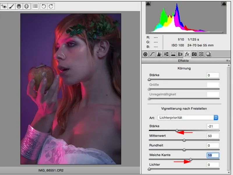
The longer I look at it, the more I realize that I've lightened the face (1), but here from the right (2), it's a bit flat in this area. It's all so gray, except for this bright spot of light ...
... and here, for example, I can draw a linear gradient (1) into the image (2).
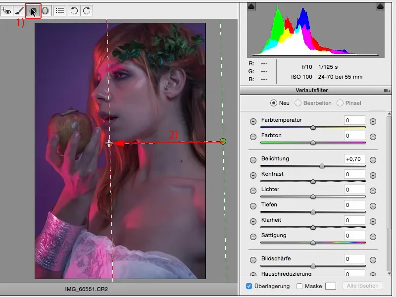
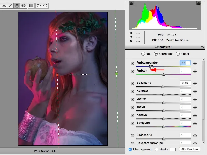
Here, too, I now have the option of playing with the individual areas first. I think that if I move it into the blue, into the cold, it fits the picture perfectly.
But I also want to see how it looks warm and I could also imagine that very well.
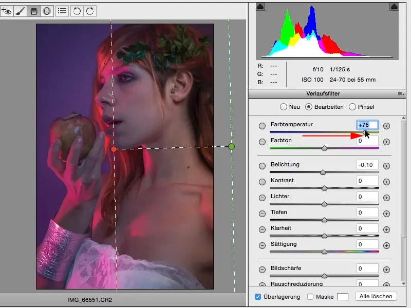
But I'm going for the cold version here. It goes so well with the whole color mood in the picture. I can also play with the exposure a bit and I definitely decide to go half a Blender brighter here.
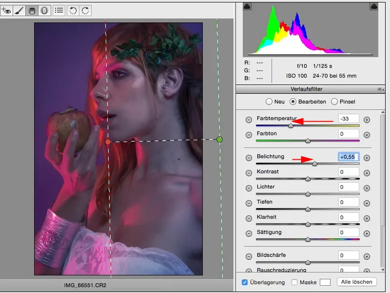
And now I've teased one more step out of my image, which I didn't actually expose at all, and that's what makes the ACR, the Camera Raw converter, so special for me. I can try out so many things here, such as color looks.
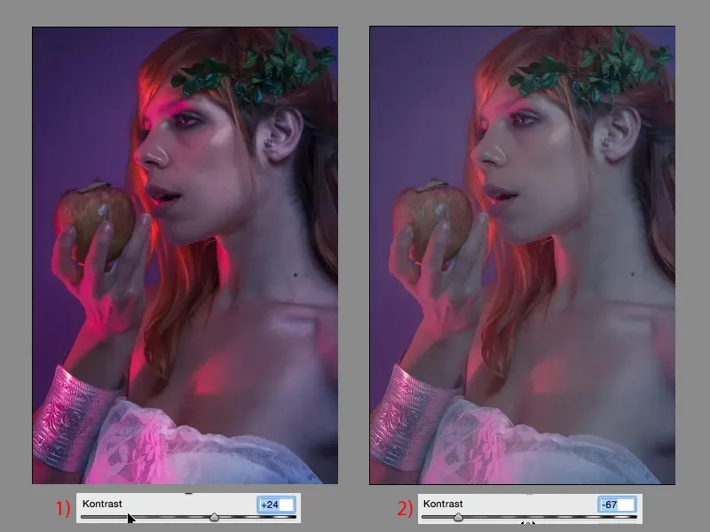
I can now also play with the contrast. I can pull the contrast up (1) or down (2), I can make it very dull, I can prepare the perfect basis for everything else and give my look a certain direction.
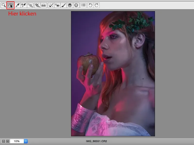
I can now also increase the clarity and reduce the dynamic range and I have already created a completely different image look. That's the beauty of ACR: just play around and try it out. Of course, you should know what the controls do, but when in doubt, the rule is: what you see is what you get. What you see is what you get, and that's what makes working with Adobe Camera Raw so easy. I drag a slider and immediately see the effect here.
