When working with data in Excel, it can often be advantageous not only to display this data in tabular form, but also to visualize it. Particularly practical is to integrate charts directly in cells. In this tutorial, you will learn a clever trick to add Sparklines – small charts – to your cells. This technique is particularly useful for quickly grasping trends and patterns without overcrowding your Excel sheet.
Main Insights
In this tutorial, you will learn how to create Sparklines in Excel to insert charts in cells. Sparklines are great visual aids for evaluating data and they do not take up space in your sheet. You can create two main types of Sparklines: line charts and bar charts. Additionally, you can customize the Sparklines to match your visual preferences. The functionality of Sparklines allows you to make your data interactive, so visual changes immediately reflect the underlying data.
Getting Started with Sparklines
First, open your Excel application and select the cell where you want to insert your Sparkline.
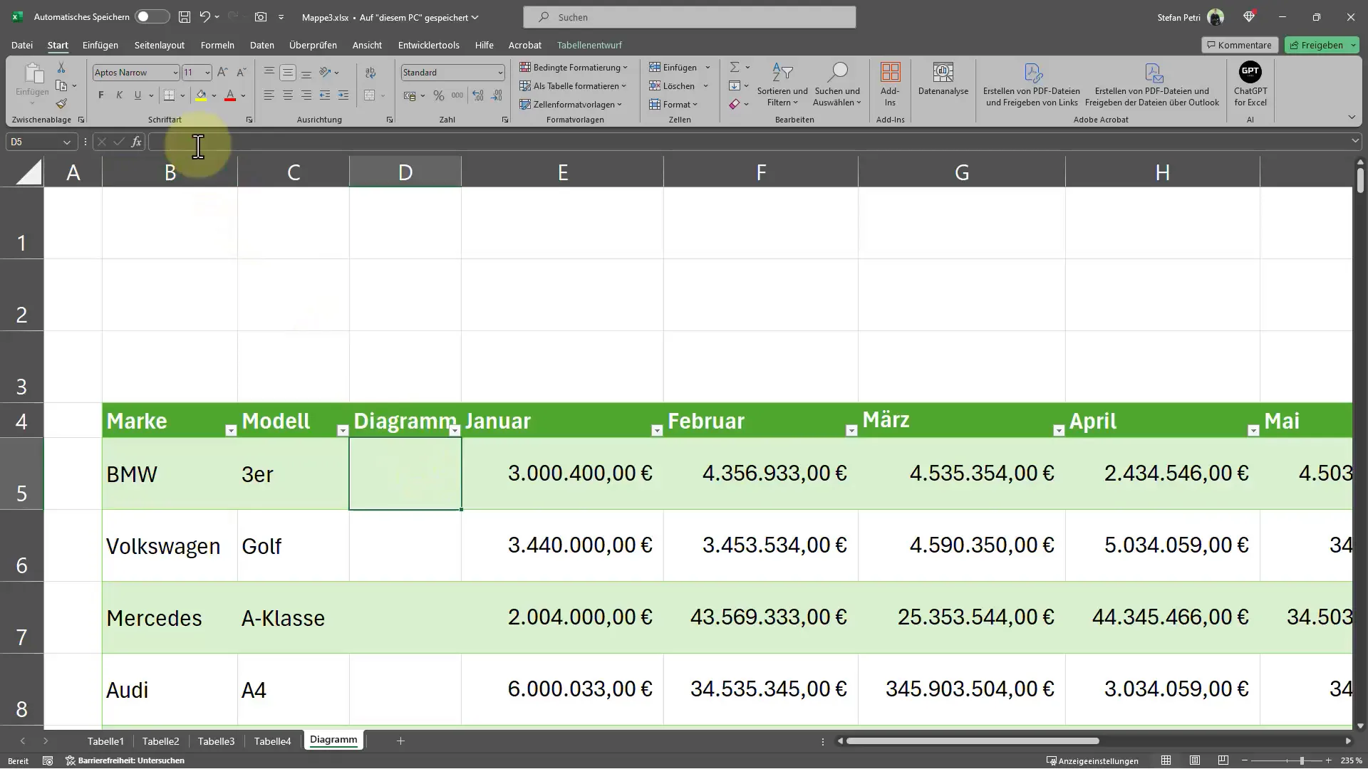
Click on the empty cell and then go to the "Insert" tab. Here you will find the "Sparklines" option. First, choose whether you want to create a line or bar chart.
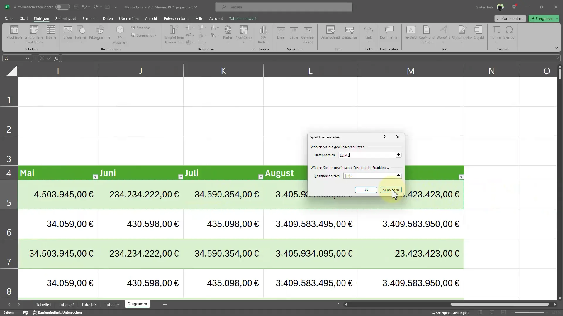
After selecting the appropriate chart type, you will be prompted to select the data range that the Sparkline should represent. You can do this by dragging the mouse over the cells containing the data to be visualized in the Sparkline.
Finalizing the Sparkline
Once you have selected the data range, click "OK" to create the Sparkline. You can repeat this for each individual cell or simply drag the Sparkline down if you want to represent the same data in multiple cells.
Interactive Customizations
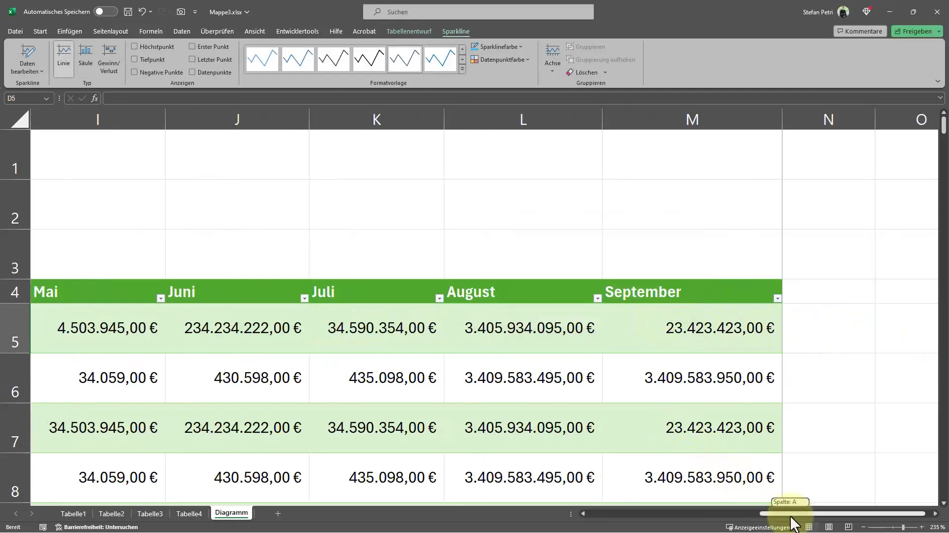
One of the biggest strengths of Sparklines is their interactivity. When you change one of the numbers, the Sparkline automatically adjusts to display the current data. This provides instant visual feedback on changes in your data. For example, if you want to increase or decrease a value, observe how the line in the Sparkline changes accordingly.
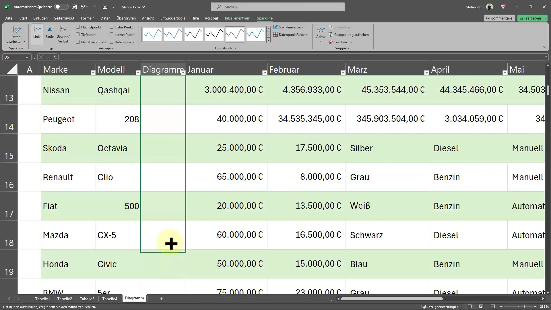
If you want to add Sparklines to multiple cells, you can also select all the desired cells before inserting the Sparklines. This saves time and ensures a consistent look in your sheet.
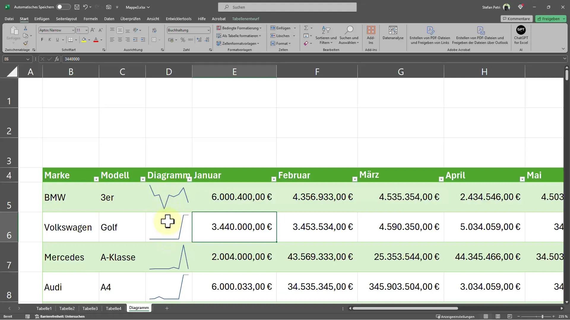
Customizing the Sparklines
To further customize the appearance of your Sparklines, you can change the size of cells and ensure that the Sparklines are responsive. This means that if you enlarge the cell, the chart will be adjusted accordingly.
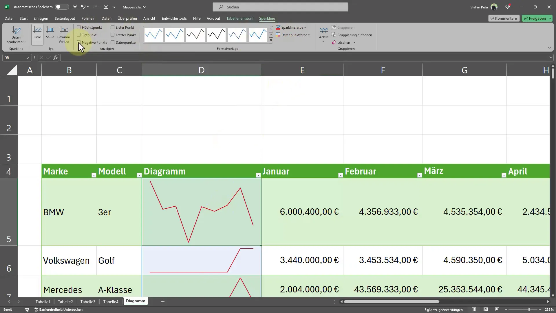
You also have the option to style your Sparklines. Under "Sparklines," you will find an option to change the color of the lines or bars. You can choose whether you prefer a black or red line, for example, or if you want to highlight specific colors.
There is also the option to mark specific data points in your Sparkline. This allows you to insert highlighted points that illustrate important numbers or trends. This feature is particularly helpful when you want to point out specific data in your analysis.
Additional Chart Types
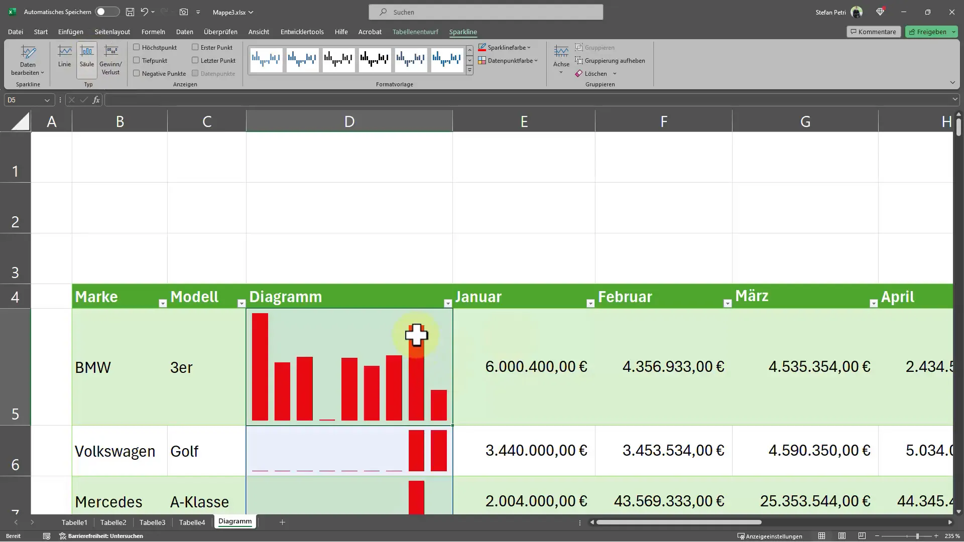
Finally, you have the option to change your Sparklines into a column chart. This allows for a different visual representation of your data, which can be more effective depending on the context. Experiment with the different chart types and find out what works best for your data.
Summary
In this guide, you have learned how to insert small diagrams directly into Excel cells using Sparklines. We have covered the steps for creating, customizing, and formatting Sparklines. This technique allows you to visually represent data and make it interactive, enabling you to quickly identify trends and patterns in your data. The ability to choose different chart types and colors provides you with additional flexibility to optimize your data analysis.
Frequently Asked Questions
How do I insert a chart into an Excel cell?You can select Sparklines under the "Insert" tab and then define the corresponding data range.
Can I create Sparklines for multiple cells at once?Yes, you can select multiple cells and then insert the Sparkline into all selected cells.
How can I change the appearance of my Sparklines?You can customize the color and type of Sparklines under the Sparklines options.
Can I highlight data points in my Sparklines?Yes, you can mark specific data points in your Sparklines to represent important trends.
What chart types are available for Sparklines?You can choose between line and bar charts, and even use a column representation.


